Some buildings are just four walls and a roof, but when they're the work of British-Ghanian architect David Adjaye, they're masterful compositions of light, materials, and scale that ultimately speak to "atmosphere as an emotional space for human beings," as he once said.
One underutilized sense that contributes deeply to the overall effect of architecture is sound, Adjaye argues.
"I think people are overly obsessed with the visual in architecture," Adjaye says in a video produced by The Spaces about the album he recently released with his brother Peter, a DJ who goes by AJ Kwame. "For me, it's not really about the visual markers, but the way it 'lifts up' people. I think that's a multi-sensorial experience."
The songs—which are instrumental—represent Peter's interpretation to David's designs. For example, when David gave Peter a drawing of the Asymmetric Chamber, a 2003 installation, Peter "thought about the sounds that would make that space come alive in terms of the materials." Since the structure was made from wood, he used a koto, a wooden Japanese instrument, in the piece. For the Dirty House, which is austere on the outside but light and bright inside, Peter began the track with brooding sounds before transitioning to a disco beat.
"I was inspired by the actual building and the aesthetics and the reasoning behind the building and the music tries to have a duality to it," Peter says in the video.
While architects have sometimes turned to music and acoustics as inspiration (i.e. Le Corbusier's jazz obsession and Steven Holl's Architectonics of Music), as a way to design for accessibility, to diversify the profession, Peter and David's collaboration shows how the very close relationship between a musician and an architect can yield more expressive buildings.
"Hearing a musician or composer play back what they think they're seeing or feeling is powerful feedback for an architect receive," Adjaye says.
This week, the American Institute of Architects announced seven new, stand-out structures designed to help heal patients, whether the focus is cancer treatment, reproductive health, or pediatrics. One constant that runs through these diverse buildings, though, is green space.
As innovations in the medical field make their way from theory to practice, the architecture of health care facilities often follows suit. The idea that access to nature improves patient health isn't new: In the 19th century, asylums often reflected a V-shaped footprint based on the now-debunked theories of psychiatrist Thomas Story Kirkbride—who argued that the shape would allow all the wings to get fresh air and light, part of his "morality" cure for mental illness. Finnish architect Alvar Aalto incorporated numerous balconies and loads of windows into the iconic Paimio Sanatorium, since fresh air and sunlight were considered essential for curing tuberculosis. In the 1970s, Danish artist Poul Gernes festooned Copenhagen's Herlev Hospital with vibrant colors since the doctors believed a "nice" environment would help speed patient recovery.
For example, at the Memorial Sloan Kettering Regional Ambulatory Cancer Center in West Harrison, New York, the architects at EwingCole conceived of the lobby as a "garden room" overlooking an upper and lower green space. On the top floor, the architects also built special zones for gardens.
Meanwhile, architects at ZGF built a healing garden at the The University of Arizona Cancer Center in Phoenix and enclosed it with a shade structure so that patients and providers can use it even during the hot summers.
Bruce Damonte
Zen gardens at Kaiser's Radiation Oncology Center in Anaheim, California, help ease patients' minds as they undergo physically grueling cancer treatment. Stress-relief was a prime motivator for Yazdani Studio of CannonDesign as it conceived of the design and views to the landscape are emphasized wherever possible.
Tom Rossiter
Throughout the Christ Hospital Joint and Spine Center in Cincinnati, Ohio, SOM incorporated spaces for family and patients to retreat to for a little rest and solitude. Outside, this strategy includes a courtyard and rooftop garden.
Ben Schneider
Home of the only level-one trauma care center in southeastern Louisiana, the University Medical Center New Orleans by NBBJ has three wings extending from the building. (From above it looks like a letter "E.") The architects incorporated courtyards that offer a visual reprieve from the hospital rooms, areas for staff and patients to have lunch, and a site for hosting special events.
Spy these structures and more in the slide show above.
Results so far include $96,000 for a sign, a table that jumped from $500 to $28,000 in a minute, and a pair of bar stools that fetched $15,000.
Designed by legendary architects Philip Johnson and Mies van der Rohe, the Four Seasons has been a mainstay of Manhattan's elite dining scene since 1959. The owners of the landmarked restaurant sparked controversy earlier this year when they announced they'd be shuttering the space and auctioning off its custom-designed decor.
Watch the frenzied live auction above—which will continue well into the evening—to see rich design fiends drop thousands like they're drunk at a strip club. We'll update you on the top results.
It's a great atmospheric Catch 22 that polluted air yields the most beautiful sunsets. The same paradox holds true for Aerochromics: a new line of shirts whose patterns are awoken by carbon monoxide, particulates, and radiation in the air.
Part fashion, part activism, the project is the brainchild of designer Nikolas Bentel. It came out of a thought exercise in which Bentel imagined what the world would be like 20 years from now. One of the problems he saw was the worsening of air pollution around the world, and in the way the air quality index (AQI) for each city is measured—at stationary points. In reality, the actual pollution at a given place could be far worse, or better, depending on where an individual stands. "I am not a politician and I'm not an actor so my medium [to effect change] is designed objects," he says.
A more effective way to understand air pollution, he reasoned, was at the individual level. His Aerochromic garments are essentially a litmus test for air quality. When the air quality is good, they're solid in color. When the air quality becomes unhealthy, as determined by the standards in the AQI, a pattern materializes. The more polluted the air, the more pronounced the pattern.
Each of the three shirts reacts to a different element in the air using a different type of ink—and surprisingly enough, the technology that enables these reactions has been around for a while. Over the course of "one long year," Bentel (with the assistance of the Autodesk Applied Research Lab) both developed his own recipes and looked to commercially available inks to yield the reactive patterns.
For carbon monoxide, Bentel looked to the ink used in common, low-tech household CO detectors and used the same substance—metal salts—in the fabric dye. As the dye comes in contact with carbon monoxide, a camouflage motif appears. As the ratio of oxygen to carbon monoxide increases, another chemical reaction takes place and the fabric returns to white.
For the particulate-matter detecting shirt ("particulates" can refer to anything tiny enough to become lodged in your lungs, like dust or exhaust, and is potentially harmful), Bentel embedded sensors in the shirt and a micro-controller in the collar. Small heat pads are woven throughout the shirt and when the sensors detect an unhealthy level of particulates, the micro-controller sends a signal for those pads to warm up, which activates a thermo-sensitive dye. Voila, a polka-dot pattern materializes. Since the heating dot pads are pretty thick, wearers don't notice a change in temperature.
The radiation-activated shirt, which is still under development, is the only one that doesn't return back to its original state after coming in contact pollutants. "One change is enough because you don't want to get next to radioactivity often," Bentel says. Using a chemical indicator dye similar to what's in commercial radiation-detecting products, the shirt detects electron-beam radiation (the same radiation that's sometimes used to treat cancer).
Seeing your shirt come alive with patterns as you walk through a polluted area sounds horrifying, but that's the goal. "It's definitely a little bit disconcerting, which is what gives the project a little bit more potency," Bentel says. Outrage-inducing awareness is the first step to positive change, right?
Bentel has priced the shirts at about $500 a pop (a too-expensive sum, he admits) to see what kind of demand exists. If you like the shirts' patterns more so than their party tricks, non-reactive versions are available for $90. Find them for sale at aerochromics.com.
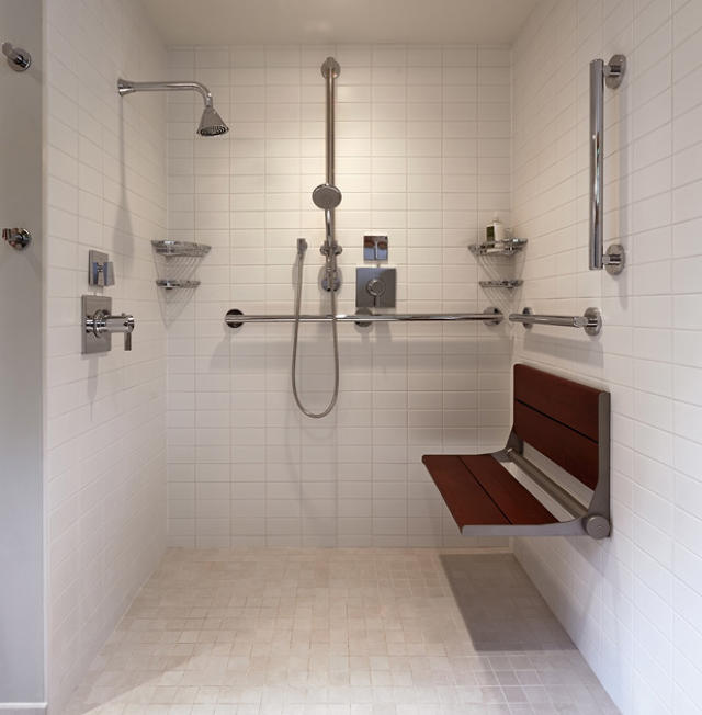
When Judi and David Cornis, who is a wheelchair user, enlisted the Seattle-based prefab company FabCab to build their residence in Port Townsend, Washington, they asked for a space that would permit free movement inside and out, allow them to age in place, and look like a stylish home—not a sterile institution.
"When clients think of universal design they think of hospital rooms," Don Argus, an architect at FabCab, says. "We strive to make beautiful interiors and exteriors that just, by the way, don't get in the way as your needs change."
Universal Design is the umbrella term for a philosophy that products, spaces, and environments should work for an entire population, regardless of age or ability. Accessible products often get a bad reputation for having a geriatric sensibility, but that's only when universal design principles are applied without care. OXO's Good Grips line and these punchy yet minimalist bathroom products from Sabi exemplify universal design's rich potential. It is now even driving user-experience innovation at tech companies, like Microsoft, and automotive companies, like Ford.
Perhaps nowhere is universal design more relevant than in a house, where our needs shift dramatically as we age—but the design rarely follows suit.
At the Port Townsend Residence, details large and small, obvious and incognito, help the Cornises have a highly usable house now and in the future.
Circulation was at the heart of the challenge. "If you can't get around inside or in and out of the house, that's a deal breaker," Argus says. To that end, the architects ensured that there was ample space to accommodate David's power chair in spite of the house's fairly compact size, just 1,300 square feet.
The architects installed pocket doors inside and made them wider than usual. "We're thinking that certain ADA requirements are minimal," Argus says about going above the baseline for accessibility. "Because our clients really zip around in their wheelchairs, we like our doors to have a clear opening of 36 inches rather than 32 if we can do it." Additionally, the handles are easily accessible, even when the door is open (often, pocket doors slide completely flush with the frame and have handles that disappear).
Kitchens and bathrooms are often the most challenging spaces for accessibility. In both rooms, FabCab left space underneath the sinks for knee clearance. In the kitchen, the low cabinets are mostly drawers to make it easier to reach their contents. Using the same logic, Argus specified a drawer dishwasher and microwave. A pot filler over the stove helps to eliminate the difficulty of carrying heavy things from the sink and the countertop also allows wheelchair users to slide things back and forth.
In the bathroom, Argus specified large-format tile to reduce the risk of slipping. The entire floor is one level to make it easy to roll into the shower, and a linear drain ensures that the room doesn't flood. The shower, with its fold-down seat and grab bars, is one of the more "obvious" of the accessible spaces, but attractive chrome plumbing and teak details make it feel spa-like. Grab bars are around the toilet as well and are positioned specifically for the users as opposed to the measurements dictated by the ADA (they're still within range, just at the higher end).
As we age, our vision and hearing deteriorate. Recognizing this, Argus installed plenty of can lights in the ceiling and even under cabinet lights in the kitchen to ensure that countertops are adequately bright for tasks like slicing and dicing. Moreover, there are big windows in the main living space to let daylight in. The angled shed roof creates asymmetry in the overall space, which helps those with extremely low vision orient themselves more. Muffling outside noise helps make it easier for those with hearing loss to follow conversations and the prefabricated structurally insulated panels that comprise the exterior shell help insulate the interior.
While the broad gestures make the house usable, the small elements make it feel personal. "Being well detailed and choosing appealing materials is part of what we do," Argus says. Warm finishes help achieve a homey character, like the bamboo flooring, wood cabinets, and Paperstone countertops.
The accessibility measures extend outside, too. The patio, which leads to an open space shared with the neighbors is lined with brick, which is easier for a wheelchair to travel across. Argus also designed a porte cochere to protect Judi and David as they get in and out of their van—a necessity in the rainy Pacific Northwest. "We need to be very concerned with site design so even if they have an accessible home they're not trapped in it," Argus says.
Thanks to considered design, the Cornises will have a home that they can live in for years to come. "Our company was established in major part to 'mainstream' universal design," Argus says. "We want to demonstrate that universal design does not mean clinical."
The house was recently celebrated by the U.S. Department of Housing and Urban Development and the American Institute of Architects. Read more here.
Museums, too, wrestle with why and how they collect and interpret these items. For New York City's New Museum, which doesn't have a permanent collection, examining what people hold onto offers a more personal narrative of history rather than the sanctioned version we consume in school, from books, and from museums and institutions that use their collections to reinforce their own importance.
Henrik Olesen, Some Gay-Lesbian Artists and/or Artists relevant to Homo-Social Culture Born between c. 1300–1870, III. Some Faggy Gestures, 2007. Collage with computer prints on board, 55 1/8 x 236 1/4 in (140 x 600 cm).Courtesy Galerie Buchholz, Berlin/Cologne/New York
"It's the small rather than the large, the private rather than the state or hegemonic or dominant view," Natalie Bell, an assistant curator at the New Museum, says of the new exhibition called The Keeper, on view until September 26. "Museums are constantly thinking about how to expand their audience and how to create exhibitions and environments that reflect the interests of more people. How is it that we create systems of value and how can these systems speak to more people? One of the lessons of this show is how to think beyond these grander narratives and this system of art as we tend to know it. We're looking outside the box at what makes a work of art a work of art and what makes an artist an artist."
Rather than calling the people collectors, Bell likes to use the word "keepers," hence the show's name. "It comes to a sense of desire and urgency and subjectivity than simply "collecting," which can often have a detached connotation. "These figures left us a self-portrait though the things they kept."
Here, Bell walks us through a few of her favorite collections in the exhibition.
"Wilson Bentley is the first person to photograph snowflakes and we're exhibiting a number of his early snapshots. In a scientific sense he was capturing images for his hypothesis that no two snowflakes are alike. It's widely accepted now, but niche then. This project shows how accumulation could lead to future knowledge."
"Each day, Yuji Agematsu would take the cellophane sleeves from a pack of cigarettes, slip it in this pocket, and use it to hold scraps of street trash that had a texture or shape that captured his eye. Each cellophane wrapper represents a single day and what he collected on his daily walks in New York City. These stunning miniature compositions are basically very little documents and time capsules. It's maximalist accumulation, but simple and accessible."
"There are no images and only sound with this, but in The Last Silent Movie she collected the voices of speakers of dying or extinct languages, thinking that they might be the last people to speak it."
Ydessa Hendeles, Partners (The Teddy Bear Project), 2002Robert Keziere
"It's an enormous museum within the museum and it's an exhibition onto itself composed of nearly 3,000 photos. They're mostly family photos of people posing with teddy bears. Hendeles became fascinated with photos of people with teddy bears. It was invented around 1902 or 1903 and in a decade it became what she called an epidemic. What's fascinating in the photographs is you see how thoroughly the teddy bear infiltrated life in the early 20th century. It wasn't just a child's toy; it shows up at weddings, funerals, with varsity teams posing with them. Through these images, you're understanding something about history. You see parallels with WWII, with the Holocaust, which stands out as a particular trauma of the century and it's interesting to see that thought family photos. So there's something intimate about the nature of the photos but also though the teddy bear, it initiates the reflection on how we become attached to things."
"An insurance clerk from Vienna named Peter Fritz created 387 model houses and not much else is known about their origin. They were found in a garbage bag in a thrift store so this is an instance where you have multiple keepers with one body of work. First, there's Peter Fritz that becomes a cataloger of vernacular architecture, then you have the people who found them and deemed the worth preserving. What's really interesting is that they are provincial, look European, and catalogue different styles of farm houses, banks, villas, and gas stations. There's nothing too vernacular or banal. And they're made with simple materials, like a lot of cardboard, magazine pages, and wallpaper."
Roger Caillois, Paradoxical agate with a polygonal cut of quartz, from the stone collection of Roger Caillois, n.d. Stone, 11 x 4 3/4 in (28 x 12 cm).Courtesy Muséum national d'Histoire naturelle, Paris
"He was a French theorist active in the 1930s and 1940s and very influential in the Parisian avant grade. He had an interest in empirical discovery and thinking about science through nature and was interested in the dimensions of experience. He collected stones and saw something in them that he deemed precious. He took up the project of analyzing them through a written text. In the exhibition, there are collectors who might be classified as academics, or theorists or amateur scholars. For some of these keepers, the fascination went beyond collecting to dedicating some thought to the objects. It wasn't just about leaving works to people, but also a theory."
"Keeping objects takes even more dedication at this point and maybe something people take away is a questioning of what objects have value to them and reaffirming that some are worth keeping," Bell says.
So go ahead, unabashedly display those Beanie Babies with pride.
Travel agents were among the first casualties of the Internet age, rendered obsolete by websites that let travelers select and book their own flights. But considering how time-consuming and complex it can be to hunt down the right seat at the right time and for the best price (be honest—how many airline tabs did you have open the last time you tried to fly?), some of us may be nostalgic for the golden age of travel in which your trusted agent knew your preferences—where you fly most frequently, window or aisle seat, first class or economy—completed the booking to those specifications, and bid you a polite bon voyage.
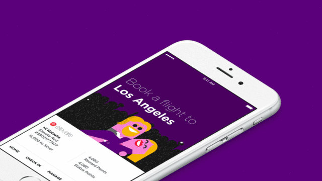
With its new app by the digital product design firm Work & Co, Virgin America aims to make booking and managing your flights as easy as it would be with a travel agent. It's also designed to act like a concierge once it's time to check in and board. The app launches in beta today and is expected to go fully public at the end of August.
"Unlike other airline apps, we were focused equally on utility and beautiful design throughout the development of the [product]," says Luanne Calvert, Virgin America's Chief Marketing Officer. "We wanted to make sure that the app makes the booking process in particular, simple, intuitive and fast—but that it also makes our guests feel good and excited about their travel journey."
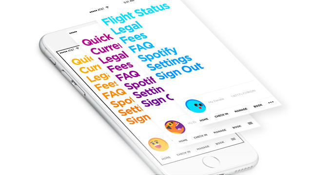
Instead of the standard template most carriers have adopted—photographs of soaring planes and happy travelers, a slew of drop-down menus on a single page—the designers opted to dedicate a screen to every step of the process and remove the burden of making decisions wherever possible. User testing showed that this actually made the process faster and reduced errors since there was only one thing to focus on at a time. In lieu of stock travel images, quirky illustrations by the London-based studio Build punched up the otherwise Spartan scheme.
"How stress-free can you make it is part one and that is where the strict UX stuff comes in,"Joe Stewart, a partner at Work & Co and lead on the project, says about what a good digital experience embodies. "But then the goal for everyone is trying to make something that you like using. That's what you shoot for. Can you have used it and put it down and say, 'Oh that was nice.'"
Many of the same best practices Work & Co developed for the website are at play in the mobile app, but are complemented by additional features that are better suited for an app. So while you can book a flight on both the app and the website, the app gives you extra layers of functionality in notifications, security, and ease.
"There are tremendous advantages for an app that a website just can't do," Stewart says. "One, the hardware is pretty incredible when you're pre-loading so much of the code onto it. Speed is one big thing. And personalization is the huge one. The other big thing that customers have been clamoring for is day-of-travel stuff. That's the primary reason you have a mobile app—checking in, getting a boarding pass, and gate-change information. All that 'I'm going to the airport' stuff and 'at the airport stuff' is where an app can do what a website physically cannot do. That's where the magic is."
So while the website was a starting point for the app, Virgin viewed the new product as an opportunity to make the digital experience even better for customers. "We'll be the first to admit that we've lagged in delivering an app to our guests...[but] when we do something, we do it right" Calvert says.
The process of designing and developing the app took about one and a half years, due in part because Virgin America wanted to release iOS- and Android-native apps so that there would be as few bugs as possible.
When it came to the app's core proposition, it was, like with the website, about making it as uncomplicated as possible for users.
"For every screen, it's 'What's the least amount of stuff on there and is it legible?'" Stewart says. "One of the big problems with screens on an app is there's no appreciation for space. You can really use negative space and the lack of stuff to instill a sense of 'I can do this' and calm so there's very, very little here."
Reducing the number of steps users need to take to get to their end goal, whether that's booking a flight or checking in, began with adding a layer of personalization to the app. Customers can set preferences for window or aisle seats, what class they like to fly, and their most frequent destination. They can also save credit card payment information (in the future there will be Apple Pay and Android Pay integration), which is more secure in an app than on a website. In-line form validation lets you know if you've entered information correctly and makes it easier to fix mistakes.
When users open the app, the landing screen is split in two. The top half is a carousel in which the first screen reflects what the app thinks you want to do based on your preferences, like booking a flight to Los Angeles if you told it that's where you fly most. "In future states, it can be more predictive based on your behavior, but in this instance it's an act personalization," Stewart says. Cycling to the next graphic reveals promotions, though marketing isn't the end goal for the app.
"Virgin America understood that if you're already using the app, you're sold," Stewart says. "You don't really need to market to this person. They're here to achieve a task, which is almost definitely checking in and secondly booking a flight, those are the two."
The bottom half is all of the essential information most people like to see: their frequent flier number, reward points, and the number of points it'll take for them to reach the next "status" level. ("Frequent flier miles are the original gamification [of airlines] and it really works," Stewart says.) There are also shortcuts to the most common actions someone would need to take: booking, managing existing flights, and checking in.
To book a flight, the app leads you through a series of steps just like the website, asking for your destination, date of travel, number of travelers, and type of traveler (adults, children, lap infants) before bringing you to list of flights for the day organized by price. If you're booking a return flight, it then brings you to a calendar so you can see the lowest price for flights on the entire calendar month so users can price compare for that leg of your journey as well. The entire process takes about a minute. Once you're done booking, you see a screen showing your flight information, a QR code, and an illustration themed to your destination. (Moose for Denver, doughnuts for Portland, and a man caught in the wind for Chicago.)
"I'm a big proponent of minimalism, the least amount of stuff that can be there in order for it to work is the correct amount of stuff," Stewart says. "But that can get cold so you kind of need to mix that with moments of fun."
24 hours before your flight, the app changes into "serious" mode since it assumes the reason you're opening it is to check in. The color scheme switches from a white background to a black background and gone are the whimsical colors and graphics users saw during the booking phase. It's all text to help you check in as efficiently as possible.
Closer to your departure time, the app will tell you the gate location, keep you apprised of delays, let you know of any changes to your flight, and tell you when to board—just like having a personal concierge to tell you where to be and when. So if you're perusing the newsstand, you don't have to load a website and hit refresh to give you relevant flight info—the information comes to you, not the other way around.
The digital presence of a company and brand is often the first thing customers experience. And while airlines have focused on ways to improve the in-flight amenities—like service trays, meals, and leg room—Stewart believes there's a lot of headway still to be made on part of the journey that comes before getting to your seat.
"Customer service is one of the biggest factors in the impression that companies make," he says. "The tip of the iceberg is buying a ticket and for the majority I think it's largely ignored. A lot are doing the bare minimum and some aren't even doing it at all in mobile. There's not enough love there."
For a small carrier, like Virgin America, which is in the process of being acquired by Alaska Airlines, every detail counts. "Virgin doesn't fly to 500 cities, but these big guys do," Stewart says. "So if they want to compete, the biggest way is though experience."
In the mobile era, having a functional app that makes things easier for travelers seems like a no-brainer. "The shift to mobile bookings certainly continues to grow and it is estimated by some that by the end of 2016, more than 50% of overall travel bookings will occur on mobile devices," Calvert says. And as companies look for new ways to retain customers and increase satisfaction it can be a competitive edge.
"There are so many ways to do everything and 'I just like using this one better' is a perfectly good reason to do it," Stewart says. "It's like streaming music services. A lot of them have very similar song databases, but you're going to choose the one that you like using the most for whatever reason."
So maybe you like funny illustrations, maybe you're more keen on booking things quickly. Either way, Virgin's app aims to make the first step of your flying experience a great one.
Marble has been prized for centuries for its innate beauty and has captivated creatives for just as long. At the hands of Greek sculptors it can look as supple as flesh, artists can make it as fluid as water, and architects can make it take on the guise of a delicate bloom. Even the grueling mining process can become as elegant as a ballet.
Doppelgangers for classic strains like white Carrara marble and inky black Nero Marquina are offered along pastel-hued pinks and greens and start at $25 a pop.
If only laptops were as indestructible as the real thing.
Tucked inside every Moleskine notebook is a slip of paper that tells the brand's history. Picasso, Hemingway, and Matisse famously sketched, wrote, and mused in generic black notebooks made by a small family-owned bindery in France who supplied all the stationary shops in Paris until it went out of business in 1986. The notebooks started to become scarce after that and Moleskine, founded in 1997, decided to resurrect and commercialize the style. So while you may never reach the same artistic breakthroughs of the 20th century's creative elite, you can at least have the same tools. And now, thanks to a new branded cafe in the heart of Milan, you can hone your ideas in a modernized version of the spaces that the artists frequented.
The cafe—which was developed with the help of the brand consultancy Interbrand—is divided into a dining-working area complete with a communal table (and ample outlets), retail area (selling Moleskine merchandise, naturally), and gallery exhibiting work from select artists and designers (Kengo Kuma, John Alcorn, Salvatore Ferragamo) as well as crowdsourced from fans of the brand through a digital interface. The tasteful, albeit nondescript, two-story space is furnished with simple tables, blond-wood chairs, bar-height seats, and white pendant lights. Punches of color are reserved for the upholstery, and the food-service area is painted black. It's as if the designers intentionally held back on the flourishes to give you a distraction-free environment and room for your own brilliant ideas to breathe.
Get coffee and a pastry, and buy a new notebook while you're at it.
"The founders' vision from the beginning was to leverage the incredible story behind Moleskine," Arrigo Berni, the company's CEO, says. "Being associated with great artists and thinkers identifies the brand with a certain lifestyle and values: culture, memory, and exploration. These are the values we have been emphasizing more and more in our activities."
For the past few years, the company has been steadily diversifying into a lifestyle brand, creating everything from digital products to bags that speak to a lifestyle. Moleskine licensed a cafe in the Geneva airport last year, but the Milan location is the first in an urban area, and is owned and operated by the brand.
"The cafe is a way for us to provide a physical experience of the intangible dimension of the lifestyle brand we've been defining," Berni says. "The main challenge in building Moleskine is keeping the right balance between protecting the brand values and growing. You want to develop the business and the company, but at the same time you have to be careful. There's a risk of diluting the brand if you don't respect authenticity."
Since cafe culture has long been associated with creative exploits, it's a natural, not contrived, expansion for Moleskine. The company wants to open more in major metropolitan areas in Europe, Asia, and North America—where the brand is already recognized—though it's not sure where or when.
"We're focused on making this work [before expanding]," Berni says. "I don't want to jinx it."
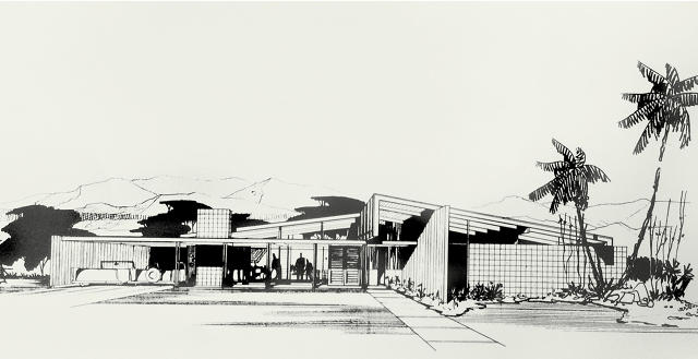
A new book on the masterful architect William Krisel documents the golden age of midcentury-modern design.
The midcentury-modern houses of Palm Springs, California, are unmistakable. With their strong geometric lines, post-and-beam construction, open-plan interiors, and floor-to-ceiling windows, they celebrate the dramatic desert landscape and communicate a casual way of living that many of us fantasize about. Just don't call this a "style," proclaims William Krisel, the architect who helped define one of the most iconic design movements of the 20th century—and bring it to the masses.
"Modernism is a philosophy that creates better living through design," he writes in a manifesto that appears in William Krisel's Palm Springs: The Language of Modernism (Gibbs Smith, 2016). It's thanks to this emphasis on how people actually use his homes, as opposed to a dogged obsession over Ivory Tower architectural theory, that earned Krisel popular appeal and has likely fueled present-day interest in his work.
Darren Bradley
Though Krisel started out designing custom residences with his business partner Dan Palmer, it's tract housing that became his bread and butter—a typology that was long ignored by architects and had a reputation for uninspired monotony. It's estimated that Krisel and Palmer designed more than 40,000 housing units (meaning single-family homes and condos) over the course of their careers. In Palm Springs alone, Krisel and Palmer built more than 1,500 single-family homes, making the city feel like a living museum of their work.
West-Prinzmetal Architectural Archives, Palm Desert, California
"There is nothing being done in the present architecture world that has the philosophy and beliefs that MCM has," Krisel, who is 92, says via email. "Today's architecture is influenced by 'style' and we all know that style comes and goes. MCM is the same today as it was in the 1950s because it is not a style and is based on solid principles of design and human needs, along with functionalism, respect for the environment, and solving the basic human desires for livability. MCM is capable of enfolding and including new technology and still maintaining the basics of MCM. New energy standards easily fit into MCM. New materials that were not available before also are easily enfolded in MCM. It's a living concept with solid, basic theories all aimed at the human and environmental needs of the day. It will be applicable forever."
The Palm Springs tract houses that Krisel designed celebrate their surroundings, despite being in the harsh desert. Clerestory windows let light shine into the interior rooms and make the roof appear to float over the house. In addition to offering the residents views of the surrounding mountains, they also promoted air circulation. Semi-enclosed patios and swimming pools emphasized indoor-outdoor living and shaded breezeways in some designs helped to lessen the impact of the blazing sun. Although the interiors share similar floor plans, there was opportunity to customize them as an owner desired through the use of flexible room dividers. Lastly, the houses' original finishes and colors (like cactus green, sky blue, and orange) were inspired by the natural landscape.
While many architects are preoccupied with creating a physical signature, midcentury modernists were supposedly more attuned to the inhabitants and users of their designs, according to Krisel. Perhaps some of the present-day nostalgia for what was first developed in the postwar era is a rejection of the obsession with newness.
"There is too much emphasis on being unique with 'look at me' as the driving basis for design without solving the real problem of the human use of a space," Krisel says about the present day architectural profession. "Architects being treated as 'stars' and doing a 'one of a kind' structure appeals to the modus operandi of those practicing architecture today—the total opposite in theory of MCM architecture."
Moral of the story? There could stand to be less ego in contemporary architecture—and perhaps more butterfly roofs.
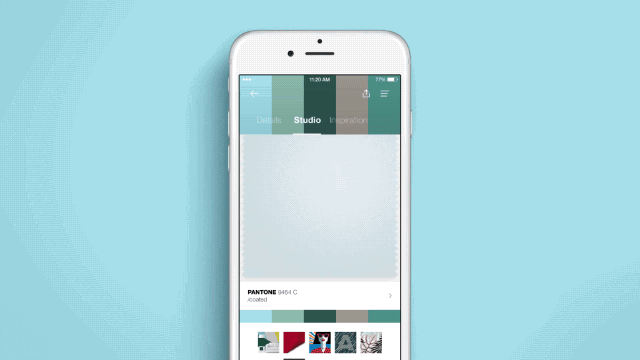
Pantone Studio launches this week in the App Store and is targeted to digital designers and the color-obsessed.
From its humble roots as a printing company in suburban New Jersey to becoming the definitive language of color, Pantone has transformed into a global design force. But when your core consumers are print designers and the world is becoming increasingly digital, you look for new ways to sustain your grip on the industry. With the launch of Pantone Studio, a new iOS app, the company is offering a glimpse into its next ambition: becoming a software developer.
While Pantone has created apps before—like the MyPantone app launched in 2009—the company is hoping this new product will become an indispensable tool for designers who may never have to pick up one of its famous chip books or color forecasting trend guides.
"In our [market] research, we saw that designers are using mobile tools and they want their phone to be a platform for design and a hub for gathering inspiration," says Ron Potesky, senior vice president of Pantone. "If we're not mobile, we're not Pantone in 10 years. It's a must for us to be important and valuable to designers."
The Pantone Studio app aims to put everything the company is known for in your pocket. There are color guides with thousands of hues. A section of the app is dedicated to research, articles, and trend reports from experts at the Pantone Color Institute. But one of the most valuable features is the color picker, which is a more robust version of the MyPantone app's core offering: It essentially turns your phone into an eyedropper tool that dissects images and tells you their color composition.
Spot the perfect shade of pink in the wild? Snap a photo and use the app to tell you the RGB, CMYK, and Hex breakdown. If you link the app to Adobe creative Cloud—another one of the functionalities—you can send the precise information to your computer so you have it at the ready for a design project. If you're not certain exactly how to use the color, the app tells you different color harmonies to help you build a palette. Love the mixtures of hues in a certain image? The tool will make a palette based on the colors that appear in it.
Another feature, targeted to fashion designers and those who work with textiles, lets you look as a fabric swatch and move it around to see how the color and texture changes as if it were a 3D swatch.
"The app was building off of two fundamentals: inspiration and workspace," says John Noe, CEO of Rokkan, the design firm Pantone collaborated with on the app. "How does Pantone serve as a greater part of how designers find inspiration and how does Pantone bring work to life in a more fluid and seamless way given how designers think and make today."
Pantone Studio lets you save colors and palettes and share them with other users through the app or by linking it to your social media account. If you're hunting for your next stroke of inspiration, you can also browse color palettes other people use.
"It's moving from designing with color to designing because of color," Noe says.
Even those who aren't designers—like myself—will find something useful, or at least mildly addictive, in the app. When I was testing it, I quickly became obsessed with finding out the color values of everything in my apartment. Turns out my favorite shoes are Pantone 2126 CP, a deep blue hue. My favorite feature, however, was the app's Instagram integration that places color swatches over photos I've taken, which translates the mood of the image into colors.
"You start looking at the world around you differently," Noe says.
Pantone sees the app as a way to appeal to younger designers who might not be able to afford its expensive chip books or who may know the company for that offering, but who don't use it as a tool in their process. The price is structured as a subscription model that costs $8 per month (or $5 a month if you bill a year's subscription up front). It's steep if you're using it as a novelty and also considering that the color picker is only as accurate as the photograph you take; lighting and your phone's camera can turn blush pink into gray putty, as it did when I used the color picker with a shirt of mine. For precise color matching you'll still need a chip book, but replacing those guides is not the app's intention; it's a way to interpret the world around you through color as opposed to form. "We believe this is going to offer more value to the design audience and bring in a wider audience [to Pantone]," Potesky says.
Time will tell if this becomes a relevant tool, or just another app cluttering your phone.
In the fifth book of her "Prefabulous" series, author Sheri Koones hits upon "the ideal method" for building homes.
Housing trends come and go, but Prefabulous Small Houses, the latest book from prefab evangelist Sheri Koones, isn't about a flavor of the month. She argues that this is the most efficient, sustainable, and happiest way to build our homes.
This is the eighth tome on residential design Koones has penned and the fifth in her Prefabulous series. When she began delving into the world of housing design in the early 2000s, prefabs had a low-brow reputation.
"People were saying, modular housing? Those are double-wides, like trailer homes," she says. No longer.
KOCASITA3A
Since then, prefab has evolved and become part of a broader conversation about how we build. And thanks in part to publications like Dwell, factory-made homes have shed their banal stereotypes and have become luxurious status symbols in and of themselves.
But to Koones, building small using prefabrication methods—which can involve modules or kit of parts and SIP construction (short for structurally insulated panels, which are like Oreos, but the filling is insulation and the cookies are usually oriented strand board)—are destined to become the status quo for a slew of reasons, namely that they are more resource efficient to build and maintain, since they require fewer materials to construct and less energy to heat and cool.
"My books have evolved and [through my research] I've gotten to the point where I think this is the ideal method," she says. "People should aspire to having these houses as a goal now and in their future."
KOEHAB5
Changing demographics, the volatile housing market, and lifestyle shifts are pushing prefab mainstream as well.
While prefab has been touted as a solution for single-family homes, or remote sites where it's challenging to build, or as a way to quickly fulfill the multi-family housing shortages in urban environments, one of the lesser-explored typologies is the accessory dwelling unit—or ADU—which is gaining momentum as cities are looking for ways to increase density in a way that respects the existing urban fabric, meaning more housing without intrusive high-rises or condos in low-rise neighborhoods.
ADUs are structures that exist on the same lot as a single-family house. Cities like Los Angeles, Seattle, San Francisco, and Austin are all loosening permitting restrictions on this type of infill development. Far from a shoddy backyard sheds, ADUs can be well-appointed abodes outright.
"There are a million reasons why prefab is better, but it's particularly so for ADUs," Koones says. "If you're going to build on someone's property, the burden of the mess of what goes on for a site-built house would be unnecessary if you build with prefab. It's a much more practical way to build. It's faster, so you're not disturbing neighbors. And they're efficient and better for the environment."
Of the 32 houses in Koones's book, only one is technically an ADU—a 1,050-square-foot laneway house in Vancouver, British Columbia, by Lanefab Design/Build. Building this way allowed the family of three to spend their $800,000 budget on design and construction as opposed to land. It's a smaller, but nicer, house.
The other designs in the book range include a petite 350-square-foot house in Tampa, a rural vacation homes in Sonoma, and a 2,500-square-foot abode in Santa Monica. While the aesthetics, location, and construction methodology all vary, Koones noticed that many of the residents shared the same sentiments over living small.
"I was very surprised to hear how happy people were in their smaller houses," she says. "Everyone I spoke to—many of whom who moved from a large house to a small one—didn't see it as a sacrifice. They felt like it was a cozier and a happier experience."
Peruse some of the designs in the slideshow above.
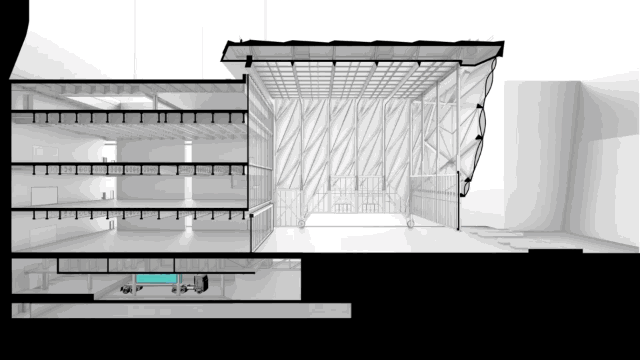
The Shed takes "multipurpose room" to the next level.
Like many of the experimental architects in the 1960s, Cedric Price had ideas so radical that they were destined to the confines of sketchbook pages and treatises. One such proposal is the "Fun Palace," a shape-shifting theater that reconfigures itself based on real-time data it collects on the preferences of people flowing thorough the space. To Price, the structure's metamorphic character embodied a democratic ideal: buildings should adapt for people; people shouldn't conform to buildings.
Fast-forward 50 years to the Shed, a nonprofit cultural venue that is currently under construction in Hudson Yards, the 17-million-square-foot development on Manhattan's West Side. The organization commissioned architects Diller Scofidio + Renfro and Rockwell Group to design the building, and they took a page from Price's playbook and conceived of a structure that achieves the Fun Palace's aim—a destination that can house whatever its users desire, whether that's a theatrical production, a gallery exhibition, a concert, a fashion show, or whatever harebrained scheme artists of the future concoct.
"Like its predecessor, our building is envisioned as open infrastructure that is versatile and responsive to the ever-changing demands of artistic endeavors in size, media, and technological complexity," the architects state in a release.
While renderings for the Shed—which was formerly called the Culture Shed—have circulated for a couple of years, a new animated video shows how the architects will construct a building whose only constant is that it is always in flux.
A mechanized 120-foot-tall telescoping roof set on a bogie—a type of chassis usually found on railroads—extends from the main structure to enclose part of the 20,000-square-foot public plaza adjacent to the building. Movable walls that raise up like garage doors and slide open allow the building to essentially become one big Tetris puzzle in which the users can slot in stadium seating for up to 1,250 people—or leave open for a standing audience of 3,000. The building can transform to hold one huge event or enclose select spaces to host multiple things simultaneously. The architects are adapting gantry crane technology—which is usually found in the shipping industry—to help the structure become nimble.
By delving into history and adapting present-day technology, Diller Scofidio + Renfro and Rockwell Group have created the destination of the future—a fitting contribution to New York's already robust cultural offerings. Let's just hope the building's mechanics and operators can keep the kinetic design shipshape after its scheduled completion in 2019.
One of Brazil's most celebrated filmmakers orchestrated the opening to Rio's Olympic games.
Over the years, the Olympic opening ceremonies have devolved into obscene pageantry, but tonight's might be worth watching. Its director, Fernando Meirelles was behind City of God—one of the most brutally honest films about what it was like to come of age in Rio's violent favelas.
"These are spectacles designed more than anything else to sell the country,"film historian Ernesto Acevedo-Muñoz told Wired. "Brazil has to show a really good face on that opening day. That makes the choice of Meirelles terribly important, as someone who knows his way around gritty subject matter."
Meirelles's vision for the event is to showcase a "synthesis of [Brazil's] popular culture." Recognizing that it would be inappropriate to spend lavish amounts of money on production design—the country's economy is ailing—he's opting to do more with people than physical props. Some 12,000 volunteers will be involved, but the budget will be slim. "It will be 10 times smaller than for the London 2012 opening ceremony," Meirelles said last year in a statement about the show. "It does not make sense to be extravagant in this moment that the country is facing. It will not be a high-tech ceremony, it will be high-concept."
For the Sochi winter games in 2014, Russia tapped George Tsypin, a production designer known for his work on Broadway musicals. Danny Boyle, the blockbuster filmmaker, directed the 2012 London Olympics opener, which had over 7,500 cast members. China spent an estimated $100 million on the Beijing Summer Olympics ceremony in 2008, which translates to $476,000 per minute.
Assuming Meirelles holds true to his plan for a high-concept—not high-tech—production, we can safely assume he'll do away with any saccharine pomp and circumstance, and deliver a thoughtful telling of Brazil's history and contemporary condition.
Tune into NBC at 7:30 p.m. ET, or stream it at nbcolympics.com.
Related Video: Are the Olympics still a good idea?
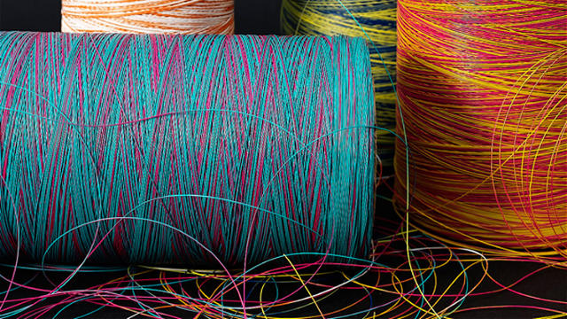
Sandy Chilewich started out dyeing fabric in a washing machine in the '70s. Today, her company makes 40,000 place mats a week.
The place mat sits low on the totem pole of design objects, but for Sandy Chilewich, it's the basis of successful brand. The New York-based designer and lifelong entrepreneur launched her eponymous company in 2000 with one product—a woven vinyl place mat—and has since spun that into a home textiles empire built on the assumption that the everyday things we use in our homes should be affordable, easy to maintain, and beautiful.
[Photo: Kristin Gladney]
There's a good chance you've eaten at a table that's been set with one of Chilewich's place mats or table runners—even the Obamas have—but before she developed products that can be found in homes and restaurants around the world, she cofounded Hue, the fashion company known for its colorful tights. While it seems like a leap to move from hosiery to housewares, there was one constant: adapting new materials and tweaking manufacturing processes to innovate new mass-produceable designs.
"You only know what you've done in retrospect," Chilewich says of the business ambitions that got her to the point where she's making 40,000 place mats per week and earning $35 million in revenue. "I only see the connections now . . . My passion is really this balance between art and commerce. I'm not interested in making one-offs of things, and I like to reach a bigger audience without compromising an aesthetic too much—it's a constant balancing act."
Here's how Chilewich built her brand on the back of what's arguably one of the most overlooked household objects.
Chilewich's foray into design happened in the late 1970s when she was living in Downtown Manhattan.
"The Cliffs Notes version is I was kind of a stumbling twentysomething," she says. "Maybe I was an artist, I didn't know what I was doing. I dropped out of college, and I started designing jewelry." When she was showing her jewelry to a buyer, she wore a pair of inexpensive Mary Janes she bought in Chinatown, bleached and re-dyed. The jewelry didn't stick, but the shoes did. The buyer asked Chilewich if she could make more. Chilewich and her friend and eventual business partner Kathy Moskal scooped up all the shoes they could and set out bleaching and dyeing them in their washing machine at home.
Soon, they were buying up whatever white apparel and garments they could and repeating the process—and their company, Hue, was officially born in 1978. One of the more popular items they hacked were white nurse stockings. In the '70s, women had two options for leg wear: ballet tights or pantyhose, both of which came in basic, neutral colors. Hue's prismatic tights were a hugely popular alternative.
As they scaled up, Chilewich and Moskol decided to stop buying tights at retail price and go straight to the source, which led them to factories in Mount Pleasant, North Carolina—where they'd eventually have their breakthrough. There, they saw all the different cottons and lycras with which the mill was working. And like mad scientists let loose in a lab, they began experimenting on ways to achieve a comfortable tight that could be worn without a garter.
"We'd get to the factory at 4 a.m. and we'd experiment," Chilewich says. "They'd have all these machines they let us play with them—I wonder if it was because we were cute girls—but we were there forever."
They ended up developing a one-size-fits-all cotton-and-lycra tight that "stretched and recovered like crazy and put us on the map," Chilewich says.
After selling Hue in 1991, Chilewich began producing fruit bowls that used stretch mesh to aerate the produce and keep it fresher longer. Soon, they were being sold at MoMA. While that was a successful design, Chilewich was eager for the next step.
"Ultimately, I wanted a business, and a single product is not a business," she says. "I could not have sustained myself [with that]. There are only so many people with modern tastes and I think they all bought a bowl. I thought, I'm going to run out of customers. I needed something I could keep going with."
To find inspiration for her next endeavor, she combed through the specimens at the materials library MaterialConnexion and came across a flexible vinyl that was used in outdoor furniture. Recognizing that this was a vastly underutilized textile—it was durable, easy to clean, and looked like a traditional woven fabric—she took it home to experiment. Her instinct was that it would make a great substitute for fabric table linens, which are easy to stain and often require delicate washing. Chilewich's place mat was born.
Thanks to her prior success with the fruit bowls at the MoMA Store, the museum picked up the place mats. It was part of Chilewich's business strategy to start with design-minded retailers, specialty stores, and independent boutiques. "There's a limit to how 'box' I would go," she says. Today, Chilewich sells an arsenal of textiles for the home in myriad colors, patterns, and textures, but it's all durable vinyl. "I don't rest from trying to be innovative and original with new products," Chilewich says. "I crave product."
There are basket-weave and bouclé place mats and runners. To fabricate her Petal collection, Chilewich looked to a molding process used by a Taiwanese manufacturer of faux lace. Her floor mats have the texture of shag carpets and her window coverings offer the look of natural linen.
Now Chilewich is sold in department stores, through its e-commerce platform, and in its brick-and-mortar shop in Manhattan. The brand could be ordered from Design Within Reach in the past, but it's about to open a series of shop-within-a-shop locations with DWR, starting with its location in Washington, D.C.'s Georgetown neighborhood. Chilewich's textiles will be among the few cash-and-carry items available in the retailer's showrooms.
The company releases new products seasonally, but doesn't try to follow trends. "I don't like to look at other people's finished work very much," Chilewich says. "I look at art, we look at nature, we look at machinery—that's a big part of it, capability, like taking a process."
Over time, Chilewich has developed its own machinery, processes, and materials—like custom vinyl yarn—to make its products. Chilewich's husband and current business partner, Joe Sultan, helped to set up the company's infrastructure. Most of the products are made in the U.S., a move dictated not so much by patriotism as convenience. "I needed be very in touch with the process," Chilewich says. "I needed to get to the products in a few hours to be able to work on them. I don't want to be removed and I don't want to deal with long lead times." For example, the Basketweave collection features subtle color gradations in each place mat and runner. To perfect the look, Chilewich made a custom vinyl yarn that changes color every few inches. Achieving the look involved trial and error to get the right mix of hues in the finished product.
Chilewich is intent on continuing to keep making new products, but one of her more recent interests is getting the recognition as a capital-D designer. Recently, the Cooper-Hewitt brought eight of her runners into its textiles collection.
"I feel to some extent that because I've been commercially successful, that somehow I'm not a real designer," she says. "Having the Cooper-Hewitt come in was kind of getting recognition for the innovations that I've done, even if it's just a place mat. It's a humble product. It's in so many people's homes, it's not an expensive product, it's not very precious or for a limited audience. It reaches so many people with different tastes. To get recognized is really nice at this stage of the game."
Though receiving validation for her work was gratifying, she's not seeing that as the ultimate brass ring. "What do I want to do next? I want to do what I'm doing, just keep getting better," she says.
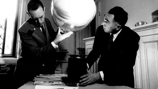
It took nearly 60 years for technology to catch up with Achille and Pier Giacomo Castiglioni's vision for the Taccia lamp.
Many ahead-of-their-time designers had to wait for technological breakthroughs to realize the inventions they dreamt up on paper. Charles and Ray Eames had to develop the machinery and processes to produce a molded plywood chair that would be as comfortable as an upholstered perch; Diller, Scofidio + Renfro and Rockwell Group are currently constructing an arts center based on a radical, shapeshifting 1960s building concept; and science fiction recently became fact when the startup Scanadu turned a medical gadget that appeared on Star Trek into a real product.
Now, the increasing prevalence of LED lighting has brought to fruition a "failed" table lamp concept originally designed in the 1950s by Pier Giacomo and Achille Castiglioni—two of Italy's greatest design legends.
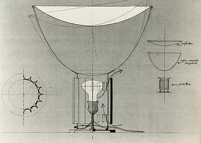
The Castiglioni brothers made their first prototype for the Taccia lamp in 1958. Seeking to design a piece that would provide ambient—as opposed to focused—lighting, they fashioned a shade out of plastic and set it atop a corrugated metal base that would help disperse the lightbulb's heat. It turned out that the bulb still became too hot below the plastic and actually melted the shade, so they opted to make it out of aluminum and glass for the final design, which entered production in 1962.
In a 1986 lecture, Achille Castiglioni said of the move to glass: "When we had this nice unveiling and put the object there, the heated plastic material went flat, and so our design was completely wrong. Yes, it was totally wrong because only when we tested the materials could we see that [the plastic] returned from the shape we had given it to its original shape, which was that of a flat sheet. So we made it from glass."
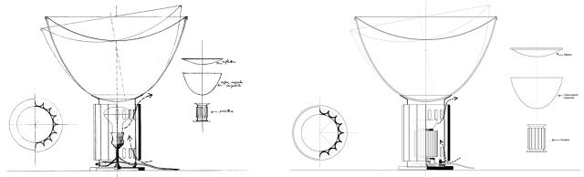
In the quest for more energy-efficient illumination in the decades since, LEDs have become a favorite light source for their longevity, low power consumption, and small size. High-end lighting companies have adapted, too. For example, Flos—an Italian lighting manufacturer known for working with design heavyweights like Philippe Starck, the Bouroullecs, and Patricia Urquiola—has steadily updated some of its classic models, including the Taccia, to use LEDs rather than incandescent bulbs.
The company first adapted the design for LEDs back in 2010. But after revisiting its archives of design patents and drawings—which it does periodically to uncover more about the conceptual underpinnings of famous products—Flos decided to see if it could bring the Castiglionis's original vision to fruition, since LEDs don't emit much heat. Motivated by fidelity to the original design intent, the manufacturer set out to see how it could harness new materials and processes that have come into play since the original design debuted.
Part of the challenge was making a plastic diffuser that would be as transparent as glass, but wouldn't degrade over time. Some plastics yellow as they age because of UV rays, but the material FLOS chose—PMMA, the same material in Plexiglass—doesn't. Meanwhile, laser-cutting allowed the company to seamlessly trim off excess material from the injection-molding process.
In addition to being less breakable, acrylic is cheaper, which translates into a lower sticker price for the new Taccia option. While Flos says cost wasn't a motivation—it was a desire to be more faithful to the designers' original vision—it's hard to ignore the $1,000 difference in price. Though it's still squarely a luxury product, the move makes the design slightly more accessible, some consumers will surely rejoice in saving a few simoleons.
The acrylic version of the Taccia LED runs $1,795 and launches in September; the glass LED version is $2,995. Find them both at Flos.
Madrid-based designer Ana Arana is well versed in the game of hide-and-seek. Case in point? Her unassuming kitchen in a box that holds an arsenal of appliances and cooking accoutrements in a two-foot-by-two-foot space. Arana's latest project, a room divider dubbed Tromploeil, riffs on this notion.
The perforated screen—which takes its name from the French word trompe l'oeil (visual illusion)—is composed of asymmetrical, white iron panels held together by vividly painted geometric magnets set on hinges. Users can configure the panels and magnets however they please, creating an abstract 3D composition. It's a veritable Kandisnky painting come to life. The design also makes it easy to create privacy in small apartments. (And provide a shield for clutter.)
A new degree program with SCAD aims to "fill the gaps" in user experience design education.
As a profession, "designer" is constantly evolving. Fifty years ago, chances are you'd either be a graphic designer, industrial designer, or furniture designer. In five decades, you might be an artificial organ designer, a cybernetic director, or fusionist, according to some futurecasting pros. But today, one of the most in-demand jobs is that of the user experience (UX) designer—a by-product of our increasingly digital world, where a strong user experience is essential to remain competitive.
One challenge for this relatively new job title? There hasn't been a clear path toward acquiring the skills. Likewise, discovering employees with the right set of talents is difficult for employers. That's according to Google, which along with the Savannah College of Art and Design (SCAD) has developed a BFA in User Experience Design, one of the first four-year undergraduate degrees to be offered in the field. The partnership came about naturally—as Google was familiar with SCAD's diverse design course offerings—SCAD is willing to experiment with its approach, and both felt like there was "gap" in design education that needed to be filled.
A corporation taking a heavy hand in education raises some eyebrows with respect to potential conflicts of interest. Who's profiting from the arrangement—the corporate sponsor, the university, or the students? Is receiving a degree with Google's seal of approval the digital design equivalent of getting certified in entrepreneurship from Trump U or in burger chefing from Hamburger University?
Not quite (thankfully).
Mike Buzzard, a UX design manager at Google, is working closely with SCAD's leadership and professors to develop the curriculum and argues that the rationale behind the course isn't to turn SCAD into a feeder school. "Its teachings are more general to the UX profession at large," he says. "We're really trying to create a pipeline that's larger than Google's needs."
Here's how the tech giant and the design school are shaping the curriculum.
While the new degree might be focused on an emerging type of design, Google and SCAD mined the existing course catalog to form the interdisciplinary curriculum. It includes foundational studies in drawing, color theory, and the basics of design. From there, students move to more advanced classes in typography, logic, art history. anthropology, math, programming, and information architecture, to name a few. Students learn the basics—but from many different fields.
Of the 34 required classes students must complete to earn the degree in UX design, five are brand-new courses developed by Google and SCAD: studios on research, ideation, prototyping, communication, and a sponsored collaboration.
The program aims to equip students with the foundation they need enter the UX design job market—whether their potential employer is Google or another entity. Google serves on the steering committee for the major and will continue to tweak the curriculum as it evolves. Though the Silicon Valley tech giant has lent its name and expertise to the program, it receives no financial kickbacks. Moreover, it costs the same for students as any other undergraduate field of study. (Total full-time tuition for one academic year is $35,190.)
Jason Fox, chair of the graphic design department at SCAD, has been leading the strategy from the university's side of things, along with deans from the School of Digital Media, School of Design, and School of Communication Arts. To him, teaching scientific methods alongside more traditional creative pursuits is the strength of the program.
"When you think of teaching someone visual design, it's about the aesthetics and the understanding of visual trends that compel people to act," Fox says. "But in the digital world, the interactions become critically important. The immersive experiences that Google, Facebook, and Twitter are creating require anthropological understanding of how behavior informs decisions."
To Buzzard, using research to guide and inform decision-making is essential for user experience design (UXD). For example, the most obvious problem might only be evidence of a much larger issue. "You can teach craft, but there's a break between decorating and designing and we have to teach students about finding the primary problems and how to respond," he says.
Students learn about human behavior, how to conduct user testing, and other research methods to sleuth user insights. The core of the behavioral research component of the program is rooted in anthropology and SCAD's design methods focus on "rapid ethnography," or learning as much as possible about a group or individual quickly.
While research is the foundation for UXD, interpreting that information and developing solutions using design fundamentals is critical to executing a product well. "It does not do any good to make decisions that defy the laws of physics," Fox says.
Another essential part of the program is making students comfortable with leaning on the expertise of others, since the complexity of digital problems often involves calling upon experts from different fields—programming, visual design, marketing, etc.—and synthesizing what they have to say.
"We want to teach the students confidence in collaboration," Buzzard says.
James Simmons entered SCAD as a graphic design student, and though he liked the classes he was taking, he wasn't sure if they had enough breadth. When he learned of the UX program, which was introduced in November 2015, he liked the multidisciplinary approach and switched majors. In addition to learning from professors in different departments, he also works with students who come from different backgrounds.
Recently, he worked on a group project that involved coding and visual design to make a better program. Seeing how everyone approached the problem and used the research to inform solutions was enlightening. "The most influential part of the team was that none of us were specifically designers or developers. We all had multiple hats," he says.
Collaborating with other students is one half of the lesson; learning how to work within companies is another. To that end, Google is sponsoring a course in SCAD's Collaborative Learning Center, an internship-like program in which outside companies—like BMW, HP, Microsoft, and Adobe—provide a problem as a case study for students to solve. This gives students insight into how companies think, and companies get a fresher perspective on what they're tackling. (Depending on how you value "experience" and résumé building, this also treads into the murky area of young designers essentially giving away their work unpaid.)
While Google is still deciding upon the "problem" that it wants to solve during its fall CLC program, students can expect to have direct access to employees at the company.
"The major shift here, which is university-wide but the UX program really encapsulates, is [an emphasis on] industry partnerships," Fox says. "It's saying 'I'm ready' as opposed to saying, 'I have a foundation, now teach me your process.' Students in CLC-sponsored classes sometimes leave with texting-level relationships with people at companies. These are classes where you work with someone for 10 weeks, and it's so immersive that you begin to know each other on a personal basis. That's invaluable in this industry. Even if you don't get a job [at the company who sponsored the CLC class], you might get recommended for another."
The UXD program was introduced in November 2015, and there are about 26 students currently enrolled, most of whom will be sophomores in the 2016-2017 school year. Google hopes that the framework that it set up serves as an open-source model that other universities can replicate or augment if they so desire. You can see the rubric of classes that compose the degree here.
"We're trying to understand how we can open source something like this so other schools can figure out their own recipe and influence and provoke each other," Buzzard says. Eventually he'd like to build up an alumni network that can bring the program to other universities. "We'd like to share what has worked, what hasn't worked, and what the solid building blocks are. We don't want to be overly prescriptive, but share what we believe to be essential."
The UX designers of the future don't necessarily need SCAD and Google to become great—just as any degree from any institution is never a golden ticket—but the road the two organizations are paving is one way to get there. The cachet of Google is big right now, but who knows what the future holds. If the program does what it intends—arming students with the foundation to become independent thinkers—they should be equipped to evolve along with the industry, even if Google is no longer the industry darling.
"Everything will change," Simmons says, "and you need to learn the fundamentals to be comfortable with change."
If a group of activist designers has its way, Trump may actually get a wall of his very own very soon—in front of one of his skyscrapers.
"Wall In Trump," a crowdfunding campaign on Indiegogo, is raising cash to construct a "wall of solidarity" made from sandbags. Expected to measure 200 feet long, three feet wide, and four feet tall, the wall will be "just big enough to retain this guy's ego," one of the organizers says in a video about the activist installation. (Though let's be honest, there isn't a wall big enough to barricade Trump off from the world.)
The hope is this stunt—which will require 10,000 25-pound sandbags to pull off—will raise awareness about what's really at stake come election day. As the organizers explain:
We want to start a conversation—to remind people that this election is about much more than Republicans or Democrats. We are deciding on the next role model for the youth of our country, on whether or not diversity is seen as something to celebrate or fear. We need to make the right decision.
While the group hopes to construct the wall sometime in August, it hasn't picked the exact location yet. They're deciding between three spots: in front of Trump International Realty at Sixth Avenue and West 59th Street, at Trump International Tower at Central Park West and West 59th, or at a backup location near Central Park. If the $60,000 goal isn't met, the designers will donate whatever's raised to the I Have A Dream Foundation.
Walls may never talk, but if this installation gets built, it'll send a powerful message. Visit indiegogo.com for more.
Essential phone numbers and display type by Milton Glaser and Seymour Chwast, all in one retro poster.
Push Pin—the graphic design studio founded in 1954 by Milton Glaser, Seymour Chwast, and Edward Sorel—was well-versed in the art of self promotion. To get their fledgling firm off the ground and attract the clients they wanted to work with, they mailed zines to 3,000 art directors around New York. But the Push Pin Almanak, as it was know, wasn't the only way they got the word out about their capabilities.
To let prospective clients know about their display fonts that could be ordered from the type house Photolettering Inc. in a matter of hours, Push Pin created an "essential phone numbers" poster using their offerings. Back in the studio's heyday, there was no Google to look up businesses and numbers, no Contacts list stored in a phone—just a rotary handset and the Yellow Pages. The poster was a bit of clever marketing masquerading as an essential list to keep the digits for your hypnotist, barber, laundromat, and tailor handy. It's a relic from landline era that would never get made today.
The great graphic design historian and critic Steven Heller mused about this genius poster over at Print: "If you were designing like Push Pin in those days, this was a necessary studio or office accessory. Indeed one of the cleverest type specimens I've seen in quite a while."