There are certain celebrity fonts that get so much play, they're instantly recognizable. (Looking at you, Helvetica, Comic Sans, and Times New Roman.) But it can be frustrating to sleuth the true identities of more obscure fonts spotted in the wild; beyond playing a lengthy guessing game or paging through font dictionaries, there's no good way for designers—or design fans—to figure out what they're looking at.
Fiona O'Leary, a recent graduate of the Royal College of Art, recognized this challenge and designed Spector, a pocket-sized prototype gadget that reveals the true identity of type by taking photos and cross-referencing them against a font database. Plus, it can also read a color's RGB and CMYK values to help designers recreate a hue. Think of it as a visual equivalent to Shazam for graphic designers, asWired puts it.
In addition to sleuthing a font's name, Spector also analyzes type size, kerning, and leading. O'Leary's target audience? Print designers who work on a computer. Recognizing that it's time-consuming for some designers to judge the scale of words as they will appear on a page when they're creating layouts, she wanted to build a tool that would eliminate some of the guesswork. Here's how she envisions one use case for Spector: a designer sees a printed font that matches what they'd like to achieve in their project. The designer places Spector over the text and the gadget then connects to InDesign and matches it to what's on the screen.
For now, though, Spector is still a prototype under development. According to Wired, right now Spector is only able to distinguish between Apercu, Bureau Grot, Canela, and Founders Grotesk. O'Leary hopes to integrate her prototype with a larger font database in the future.
While this tool is appealing to those without an encyclopedic knowledge of fonts and can help increase visual literacy (if linked to a much larger database), it could also be a boon for small foundries looking for more publicity for their work. In the realm of visual design, lets hope that if Spector ever makes it to market, designers use it to sample—but not outright copy—inspirational fodder.
New York has some of the most beautiful parks in the world, but when you're in them you're always aware of the urban thrum. Even in the great Olmstedian masterpiece of Central Park, you can't quite escape the feeling of towering buildings flanking the perimeter.
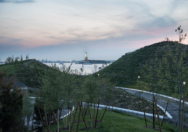
That's not the case on Governors Island, a 170-acre island accessible only by ferry located south of Manhattan, where the East River meets the New York Harbor. From atop the Hills, a new phase of the Governors Island master plan opening in late July, you can get a breath of fresh air and gain a new perspective on one of the most iconic skylines in the world.
Draped in native plants and accented with public art and a slide or two, the natural beauty of the Hills belies their highly functional character. The Dutch landscape architecture firm West 8 hid resiliency infrastructure in plain sight. In addition to offering killer panoramas of New York and sight lines that put you eye-to-eye with the Statue of Liberty, the Hills will protect the island from sea level rise and storms. In fact, the Hills already protected the island during Sandy, which hit during their construction.
Adriaan Geuze, a landscape architect and founder of West 8, believes that shaping public parks carries a great civic responsibility. To create a design that engages people in unexpected ways and speaks to the character of a location, he looked at the historic, climactic, and environmental context of the project, and manipulated the Hills' topography based on that research. "While we did think logically [about the design], we also had the pleasure to sculpt this feature, to undulate, to manipulate the horizon to create intimacy, views, and panoramas," he says. "We played that game to the maximum."
Hell-bent on making design his legacy, former mayor Michael Bloomberg poured millions into building new city parks during his tenure. One of his more ambitious plans was transforming the 172-acre Governors Island—a former military outpost—into a recreational idyll on the New York harbor. The city revealed its plans in 2010, but the planning process began in the mid 2000s.
The park was envisioned as an iconic space for future generations, so ensuring that the design could endure decades—if not centuries—of use was the starting point for the design. And in large part, that meant looking at how to deal with water.
"For us, resiliency wasn't an option, it was a necessity," says Leslie Koch, president and CEO at Trust for Governors Island, speaking to the confluence of extreme weather and rising tides that are already impacting the landscape Around the same time Koch and the Trust were thinking about plans for the island's future, MoMA was planning its Rising Currents exhibition of speculative projects to tackle the same problem. "We were using the same data [about the impact of climate change on New York] but designing in real time," Koch says.
FEMA flood-zone maps revealed that almost the entire southern half of the island might be submerged during a 100-year flood. Moreover, the scientists predicted with 99% confidence that there would be a two-foot sea level rise by 2100. With that information in mind, the logical solution was to raise the elevation of the land to keep the root systems of plants and trees away from brackish water.
"As landscape architects, we sculpt and design ecosystems, and we also engineer public space," Geuze says. "Our work never starts as a blank canvas; we are not artists. So I strongly believe that when a city or a mayor demands a park that is on an island, that is threatened by brackish water, that is so near to the ocean, and that is so vulnerable to flooding, it becomes about how we make this a legacy. In imagining this park for the next generation, brackish water is my enemy."
To counteract the threat of rising water and to also protect the island from storm surges, Geuze argued that the only solution was to raise the island itself. Building hills would ensure that the trees and vegetation would be safely away from salt water, which can infiltrate low-lying soil. The land masses would also buffer the rest of the island.
"Adriaan said we can't just build a park; he said you have to lift the island," Koch says. "I was skeptical. Because public money was involved, I needed to know it wasn't just an architect's thrill, that it was necessary." Yet the data from FEMA and scientists' predictions were convincing enough—so the Hills concept proceeded in the master plan.
View of Governors Island looking north, 2003.Andrew Moore
With the plan to raise the island's topography firmly in place, the challenge turned to building the land forms. Constructing a stable hill is not as easy as it seems. First there's the logistical hurdle of finding the materials. Then, adding more mass puts pressure on the existing land and can cause sinkage. The new hills themselves also had to be sturdy to handle people walking on top of and around them.
In the low-lying Netherlands, "lifting" a landscape is a fairly common strategy to mitigate flooding, and one that Geuze had used in the past frequently. His strategy in Europe is to typically find the least expensive fill material and pile that on to make a hill. In his experience, you only start to see deformation when a mass hits a height of 90 feet. Recognizing that constraint, he opted to build no taller than 70 feet—a height that would offer optimum views, fulfill the resiliency requirements, and leave as little negative impact as possible.
Because he was building in the United States, with its own regulations and where this type of intervention isn't as common, Geuze recruited a local engineering firm to work on the hill. The first firm said that he'd need to build a system of pilings, then a table, then another layer of pilings. "They engineered it like they would an airport or a complex infrastructural landform or a skyscraper," Geuze says. "Maybe that's good in those cases, but for a park suddenly 75% of your budget becomes invisible. So where is the money? We made the best piling in a hill. I was provoked and scared about the direction this took."
So West 8 looked for alternative engineering strategies, eventually enlisting the Seattle offices of Hart Crowser Geotechnical Engineers and Magnusson Klemencic Associates. Rather than using concrete and steel, West 8 and the engineers opted to use demolition materials from what was on the site prior: a parking lot and an 11-story building, supplemented with fill material from a quarry in the Hudson Valley. At the very top, they used a lightweight pumice imported from Greece that is just a quarter of the weight of sand by volume. Meanwhile, instead of using a "hard" structural system to reinforce the hill, the geotechnical engineer David Winter of Hart Crowser layered "geotextiles" made from a thermoplastic polymer resin, which is similar to polypropylene, throughout. Think of them as very strong support hosiery for the soil.
"My assumption was build a dumb hill, meaning just put the material there, sculpt it, and there you have it," Geuze says. "An American engineer's first assumption was to use half your budget for a structure. Then it became super technical mechanical engineering through fill material, then it became about the contractor finding new products on the market. The outcome is four concepts delivering one set of hills."
West 8 turned to the landscape architecture firm Mathews Nielsen (which was named to Fast Company's Most Innovative Companies list in 2015) to specify plants, shrubs, and trees whose roots would act as an organic and ever-growing structural system and help with erosion control. (Mathews Nielsen planted more than 40,000 shrubs alone.) The firm used a lot of maritime species that could withstand the salt spray and winds (dehydration through evapotranspiration is more harmful for plants than damage from the force of the wind itself) that hit this portion of the island. Then, they started picking varieties that would just look good.
"They're not all workhorses," Kim Mathews, a principal at the firm, says. She planted flowering blueberries and ginkgo trees, which have vivid yellow leaves in autumn. ("You have to feel bad for the female ginkgos since we only plant males," she jokes about avoiding the trees that bear smelly fruit.) Mathews also used plants as a wayfinding mechanism, placing trees near entry paths to let visitors know that there was something there. Inspired by a trip through Massachusetts, she mixed pine and birch trees together on one hill; on another, she opted for sumac, a tree that has red foliage in fall. "We wanted these moments of awe and excitement though the seasons," she says.
In terms of experiencing the final design, West 8 and the Governors Island Trust agreed that the Hills should entice and tease visitors with views of the harbor, horizon, and surrounding cityscape.
"The irony of New York is we are known to the world as the city of skyscrapers and for the Statue of Liberty," Koch says. "But if you live in the city, you don't have access to those skyscrapers unless you have an expensive apartment or work in one or pay $30 [to go to a viewing area], and the statue is something that New Yorkers never visit."
A winding path lined with white stone cuts between the hills. ("It's like eyeliner," Geuze remarks. "It makes the grass look greener.") At first the Statue of Liberty is visible, but as visitors journey deeper into the canyon. it plays a game of hide-and-seek, coming in and out of view.
Each of the four hills was assigned a character: The 26-foot-tall Grassy Hill is pretty self explanatory and is more of a transition piece between the gently sloped area preceding the Hills; the 36-foot-tall Slide Hill is fitted with three slides for recreation; visitors traverse Discovery Hill, at 39 feet tall, on a mulch-lined path that leads to a sweeping view of Governors Island, the harbor, and an installation by British artist Rachel Whiteread.
[quote=pull-right"]Everyone remarks that it's like you're Julie Andrews twirling on a hill in The Sound of Music."[/quote]
The real showstopper is the 70-foot-tall Outlook Hill, which features an accessible paved path to the top. More adventurous climbers can ascend on a staircase called "the Scramble," made from old granite blocks that once reinforced the island's edges. (West 8 removed them from the perimeter to make way for a public promenade.) From the top, you can see as far as the Verrazano Bridge to Staten Island, the Brooklyn neighborhoods adjacent to the island, the Financial District, the Statue of Liberty, Ellis Island, and clear across to New Jersey. There's also a viewing area positioned at about 60 feet—a height Koch and Geuze tested by standing in a cherry picker to pick the best vantage point.
"You have to go to the top of the hill to feel how life-changing it is," Koch says. "Everyone remarks that it's like you're Julie Andrews twirling on a hill in the Sound of Music."
Within the past few decades, New York reevaluated its relationship to the harbor. The waterfront was once reserved for industry, but new public spaces—like Hudson River Park, Brooklyn Bridge Park, the East River Blue Way Plan, and Hunters Point South Park—are showing how the areas can be transformed into green space for public enjoyment and often also for resiliency.
"The Hills make Governors Island a magnet in a huge city that's no longer turning it's back to the harbor," Koch says.
Like many of the public spaces planned in the Bloomberg era, Governors Island is a public-private partnership, a controversial funding mechanism that sells the right to develop on public land to commercial businesses to help pay for maintenance. (Brooklyn Bridge Park sold off a portion to a real estate developer and the High Line was built on the backs of private donors, for example.)
"The goal is economic development," Koch says of the overall plan to remake the island into a recreational destination. "A mix of uses should bring financial support as well as more access to the island."
While the Hills is now complete, the next major construction project on the island is a pool-equipped day spa set to open next summer. Governors Island plans to ramp up ferry service and open up the island year round. Right now, the island is accessible to the public only 120 days per year, and ferry service is scant, with the last ferry leaving at 7 p.m. Once the spa opens—the first official commercial tenant, though there is a bike rental company and food vendors there now—visitors can come to the island 365 days a year, and ferry service is expected to run to and from the island once every 20 minutes until 10 p.m. The island is also home to an outpost of the public New York Harbor School, which opened in 2010.
When the Governors Island Trust staged a competition for its landscape design nearly 10 years ago, it aspired to be "the park at the center of the world," a destination for city residents and tourists alike. "It's like 150 acres the city didn't have before," Koch says. "It wasn't a place people could go to. We deliberately started with design, public use, arts and culture, which wasn't conventional wisdom 10 years ago. That spectacular landscape will be the anchor, but the spa will extend access."
Just as a park that balances resiliency with recreation is the future of public space in New York, so is having pay-to-play elements, it seems. Now is a good time to visit the island, before the posh businesses take over and more people catch on to the magic that's just a ferry ride away. The Hills opens to the public July 28.
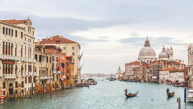
The web of pedestrian streets, narrow alleys, and picturesque canals in Venice have lured tourists to the Italian port city for hundreds of years. There's a near constant hum of activity as people gather in public squares, sit in outdoor cafes, marvel at the ornate architecture, and meander through the labyrinthine city. To Jan Gehl—a Danish architect, writer, and the most respected urbanist alive for his research on how urban design can improve quality of life and curb environmental problems—Venice epitomizes a city that engages all of our senses, and, in effect, becomes an environment tailored for a thriving public life scaled to the individual. It's the ultimate people-friendly city.
Today, as urban populations swell—by 2050, 66% of the world's population will live in cities—that notion of "people-friendly" design matters more than ever, Gehl argues. To accommodate growth that is efficient, economically robust, and environmentally sound, planners, politicians, and designers must put people at the center of the city—a point that seems obvious, except when you consider that for the past six decades, most cities have risen up around cars. Consider Brasilia, a sprawling city built for cars in the 1950s as a reflection of modernity and progress—the pinnacle of technological innovation at the time. Devoid of public life in most areas, Brasilia was deemed a "concrete carbuncle" by the BBC.
"What we have to address now is making livable, healthy, safe, and sustainable cities," Gehl says. It's a topic he's written about in his books Cities for People and Life Between Buildings, and spoken about in The Human Scale, a documentary about his life's work. His research and theories have inspired a generation of planners and urbanists who are intent on reclaiming cities for people. On the heels of a recent lecture he gave at the Van Alen Institute in New York, we asked him about the most pressing urbanism problems of today and what he thinks the path forward should be.
To Gehl, two of the most pertinent macro issues that city planners can address today are climate change and public health. "For 50 years, we made cities in such a way that people are almost forced to sit down all day in their cars, their offices, or their homes," he says. "This has led to serious situations health-wise."
He attributes the problem to cars and the availability of cheap gasoline, which have dictated city planning for the past six decades. "Those factors enabled developed countries to build the enormous suburbs and nobody thought that would be a problem—they thought that [suburbs offered] a good life, this is how it should be done," Gehl says. "I call it architecture for cheap gasoline. The moment there's not enough gasoline or it's not cheap enough, it's no longer a smart idea. If people get sick of suburban living, it's not a good idea. I recently read a study in the Lancet, a medical journal, which found that people in suburbs were having shorter lifespans than people who live centrally [in cities] because those who live centrally walk more during their lives than ones who live in the suburbs. There's a direct effect on the number of good years you have based on where you live. Nobody knew about that, or thought about that, when cheap gasoline and affordable cars were streaming into society."
In 2009, Copenhagen (where Gehl is based) enacted a plan called "A Metropolis for People," which was based on Gehl's work. It envisioned what the city should look like in the future.
"The city council decided upon a strategy to make Copenhagen the best city for people in the world, and it is interesting to read what their arguments are: We have to walk more, we have to spend more time in public spaces, and we have to get out of our private cocoons more," Gehl says. "This becomes good for society, good for the climate, and good for health. They said that if people spend more time in the public spaces, the city becomes safer. It becomes more exciting and more interesting. And it furthers social inclusion. This is an important part of having a democratic society: having citizens who can meet each other in the course of their daily doings, and not only seeing different people on television or on screens."
"We were created as a walking animal, and our senses have developed for slow movement at about three miles an hour," Gehl says speaking to our range of vision and hearing. "A good city is something built around the human body and the human senses so you can have maximum use of your ability to move and your ability to experience. That is a very important issue. For many years, we have broken all the rules to make automobiles happy. If you want to point to a place where there are people walking, and it's a great sensation, where the senses can be used extremely well, look at Venice. And if you want the other experience, go to Brasilia."
Social equity is a great challenge in cities today, which is a by-product of rising demand for real estate and higher land values. This often pushes lower income people farther away from urban centers, where many jobs are located. Gehl argues that access to efficient, affordable, alternative transportation (i.e., not in car form) is essential to promoting equality in cities.
"As it is now, you'll find that the further out in the suburbs you go, the lower the incomes generally are and a higher proportion of the income is spent to transport a family and keep their fleet of cars running," Gehl says. "Further into the city where [housing] prices are higher, you'll find higher-income people who actually spend much less of their income on transportation. So that in and of itself is something that creates inequality."
"It's no secret that the good days of the automobile are over," Gehl says. "In 2009, we saw the peak of driving in the world, and it's on the way down. The automobile was a good thing in the 'Wild West' of Detroit in 1905. It's not at all the smart mode of transportation for the general population in a city of 10 or 20 million people, like South America, Africa, and Asia. The days of the automobile as something for everyone in the world are definitely over."
To highlight how car-centric design is not an option for megacities approaching total gridlock, Gehl points to Singapore. "There's no more space for roads on that tiny island. In a denser city, with walking and bicycling you can get anywhere quickly," he says. "As far as I'm concerned, that is a much smarter solution in all the growing cities and the big cities than using old technology from 1905 Detroit. Cars are leftover from another time. And all these ideas of self-driving cars will not solve the problem of finding space and having friendly streets. They will just enable more cars to be on each street and that will not be a situation that's good for mankind. It would be good for the auto industry."
Space is a luxury, and apartments aren't getting bigger any time soon (sigh). But a new company called Ori thinks that we don't necessarily need to think larger; we just need to think smarter about using what we've got. Its proposition? Robotic furniture that morphs into a bedroom, office, and living room all at the press of a button.
"We started to think about what you could do with technology to make 200 square feet feel luxurious," says Hasier Larrea, Ori's CEO. "Space should adapt to activities instead of the other way around. We saw robotics in other industries and saw that real estate was so far behind. It's still building things like the Romans."
The original CityHome concept was like a gesture-controlled, souped-up Murphy bed. Waving your arms like a conductor or pressing a button instructed the product to roll out a bed, push out a table, or even move over a few feet. It responded to three problems found in studio apartments, the target location for Ori: dividing space to allow people to do different activities (like someone sleeping and someone working), tackling the "hotel" feel of having a bed out in the open, and storage.
To finesse the prototype into a product, Larrea and his colleagues first deployed a few test units into apartments in Boston and rented them out on Airbnb. With the full consent of users—about 30 people in total were part of the study—they tracked how people actually used the piece, like how often they switched up the configuration and how long they used it in a particular state. They also interviewed users about what they liked and didn't like and enlisted fuseproject, Yves Béhar's San Francisco-based design consultancy, to incorporate that feedback into a marketable design.
"One of the things we learned initially when we were testing was that the unit looked like a futuristic robot," Larrea says. "When bringing new functionality to a home, it can't look robotic. That's why we partnered with fuseproject—they're great at creating things that people love."
Ori is now made from wood to match the finishes more commonly found in homes, but the core proposition remains the same. Within the unit—which is about the size of a large closet—there's a bed, closet, drawers, workstation, and ample storage. The underlying robotics are similar but Larrea and his team decided to forgo gesture and voice controls initially and make everything operable by push button to make it easier for the mass market to use; however the software can be upgraded to support gesture controls in the future. He uses an iPhone as a metaphor: while two people might have the same device, the apps each person uses gives the hardware different capabilities.
"It's not that we got rid of those functionalities," Larrea says. "But at the end of the day, the Media Lab project was about ambition. It was real, but it was a one off and not ready for mass market. We started thinking about constraints as a company. Reliability and safety are things that don't matter as much with a concept. We decided to go to the basics. With the touch-control system, if you press harder it will move faster; if you press softer, it moves slower. It makes you feel like you have a super power."
The units are designed in such a way that they can be manually operated if the power goes out or if a mechanism breaks. (To repair the product, you replace the mechanical module that moves the wall, which makes it easier for users, but is potentially wasteful.) There are sensors embedded throughout to make sure that the bed doesn't slide in when someone's sleeping or that it moves in the path of someone standing. "It's a similar safety mechanism to garage-door openers," Larrea says. "We said, let's not reinvent the wheel, but get inspiration from systems that have been here for decades and have improved to a point where they are reliable."
Larrea is targeting real estate developers as his customer base since they're the ones commissioning micro apartments and already has partnerships in the works with companies in Boston, Washington D.C., and Seattle. However, he sees a future for the product to be sold direct to consumers and also to the hotel industry.
"The idea is to create a new renaissance of robotics for interior design," Larrea says.
Correction: An earlier version incorrectly stated that if the unit breaks, the entire module is replaced when in fact only the mechanical element is swapped out.
While most restaurants are eager to adopt the latest design fad, a Denny's in Southern California spent a cool six figures resurrecting a beloved piece of its 1960s design: a spinning windmill.
Designed in 1967 by the architect Harold Bissner—who is now 92 years old—and his business partner Harold Zook, the restaurant was originally built for Van de Kamps—a chain of Dutch bakeries known for its windmills. While they were iconic during the midcentury, those landmarks waned in popularity and were slowly demolished over time.
"I did 13 of them and there's only one standing now," Bissner tells Co.Design. "I had to slowly see them go downhill. As far as tearing them down, they were often in parking lots of shopping centers, and space came at a high cost."
Midcentury diners and coffee shops, often done up with exaggerated geometric silhouettes, punchy colors, and had eye-catching signage, are a particularly rich part of Los Angeles's history. Called "Googie" style, these structures were designed to entice drivers to stop in. Bissner's enormous windmills, for example, would be visible to passersby on the highways.
"Southern California is strange; they like that kind of stuff," Bissner says of the whimsical architecture.
Bissner's last windmill, located east of Pasadena in Arcadia, California, nearly met the fate of its long-demolished brethren. When Denny's took over the building in the '90s, it wanted to tear down the structure. But after locals protested the removal, the company decided to keep it.
The impetus to restore the windmill came about when business was slow at the restaurant. But instead of trying to completely overhaul the building (which locals railed against in the past) Denny's looked to the history that appealed to customers in the first place.
For example, while Bissner wasn't directly involved with the restoration, he was consulted during the process. George Fasching, Arcadia's former mayor who remains active in local politics, advocated reactivating the windmill for years and tracked Bissner down to see what could be done to the building to spice things up while staying historically faithful.
"I told him all the action is already going on there right now," Bissner says, referring to the windmill. "All you have to do is light it up."
The windmill had ceased moving in 1989, so to get it up and running for the first time in nearly 30 years Denny's replaced the motor, added LED lights, and reinforced the blades (and added some spikes to keep birds and pigeons from perching on them). Now, the 49-year-old structure is back, attracting diners just as it did when it opened in 1967. "It's lightened up Arcadia and the restaurant is packed every night," Bissner's wife says.
Historic designs are often viewed as disposable (RIP, Four Seasons) but retaining these places enlivens the urban fabric and ensures that we're not all eating in the same sterile spaces that restaurateurs feel compelled to design using "Millennial Strategies"—looking at you, KFC and Taco Bell—in order to attract more money and foot traffic.
Who would've imagined that Denny's would be an ally to historic preservation?
Along the main drag in Pasadena's historic downtown core, Jamba Juice has opened its newest store. When you step inside, the expansive space—with its terrazzo floor, sinuous oak bar, minimalist European furniture, and seafoam-green walls adorned with relief sculptures of fruit—looks more like a chic restaurant than its sterile brethren populating strip malls and food courts across the country. Designed by the prominent L.A. firm Bestor Architecture, the Innovation Bar, as it's known, represents Jamba Juice's first-ever concept store and a foray into design experimentation as a way to lure customers.
"All retail companies, especially brands that are 20 to 25 years old, have to find ways to stay relevant and keep from getting tired," says David Pace, Jamba Juice's CEO. "It's how do we go out there, try some things, experiment, and look at the business, design, and products differently. This was put into place to test current assumptions."
The past few years have been rocky for the smoothie brand, which has been shedding unprofitable stores and has switched to a franchise model to cut costs to stay financially healthy. Amid those changes has been an interest to stoke more consumer interest in the brand. After consulting with 2x4, a New York–based design studio, Jamba decided to build out a concept store.
"They wanted it to feel more like a part of the community rather than a mass experience that gets rolled out," says Georgianna Stout, a partner and creative director at 2x4. "What we've been seeing in all retail experiences—not just in food—is that it's such a competitive market now. If you think of Amazon, you can get anything in a day, from hardware to diapers to food. In general, people who are competitively part of those same markets are needing to rethink their retail spaces to differentiate them. How do you appeal to someone who's used to a mass experience? How do you get customers to come in and stay? We worked to think about the social experience in a store and to make the environment more appealing and comfortable."
Stout and Jamba Juice admired Barbara Bestor's ability to create environments that feel vibrant and fresh, but not in an artificial way—her most recognized work includes Intelligensia Coffee and the splashy headquarters of Beats by Dre. So they didn't give her a specific rubric for the space so much as a general sensibility. "If you walk in the door and say, 'Wow, I can't believe it's a Jamba Juice,' that was almost the brief," Stout says.
To Bestor, the challenge lay mixing local influences and the brand's core identity to create something that spoke to the notion of freshness, an important attribute considering that the store's main products are cold-pressed juice (not the sugar-laden smoothies for which Jamba has become known) and healthy meals.
"In the coffee world, there's a focus on using design as an expression of authenticity, caring for the customer, and adding some delight for them," Bestor says, noting that while ultra-fancy third-wave coffee shops have become the norm in many cities, juice is following suit. "As architects, it's exciting to look at an established brand and be able to try out ideas to explore 'connoisseurship' of its product."
When Bestor began looking at the brand's current identity, she saw some similarities to the super-saturated oranges, magentas, and teals that L.A. designer Deborah Sussman used in the 1980s. "If you look at how Jamba shows themselves with color—which is embracing it—what would be a way to tune color to a newer palette? What says 'natural, fresh fruit' today?" To that end, she kept the palette vivid, but more organic: light greens, natural woods for the bar and furniture, and a floor made from river pebbles embedded in concrete.
The space is located on a historic street with a landmarked facade, and while there were no laws dictating what Bestor had to do inside—the exterior had to stay the same—she tried to pull some of the exterior influences indoors. The building was originally built as a drugstore in the 1940s, so she decided to incorporate a traditional tin ceiling and used deep moldings to adorn the walls.
The real showstoppers in the space are supergraphics of fresh fruit—which were designed by Bestor Architecture—that cover some of the walls and also cycle through digital screens. "It was about scale and making really big, visceral impressions," Bestor says. "It gets across the idea of naturalness and freshness but in a contemporary way."
When customers come in, they can order food from iPads in the front of the store, pick things from a grab-and-go shelf, or order from the cashier. One of the biggest differences in the customer experience is being able to sit in the store. To get people to linger, Bestor looked to the design of Viennese cafes from the 19th century. There are a handful of tables, bar stools, and a banquette upholstered in leather that offer places to sit. There's also Wi-Fi in the space.
"I call it 'slow casual,'" Bestor says.
On the menu, Jamba Juice is experimenting with different types of cold-pressed juice at a higher price than it typically sells its products (about $8 a bottle) and healthy complements, like quinoa salads. While the store is a one-off and Jamba doesn't have any plans to create more like it at the moment, it's using the space to test the idea of opening regionally inspired retail spaces, much like Starbucks did with its Reserve line. And some elements that do well in the Pasadena location, like menu items, could be rolled out nationally.
"When your designed space reinforces that you're about customization and not 'one size fits all,' customers can say it's kind of my local shop, it's different," Pace says. "But if you stamp out a New York City shop just like one in Albuquerque and there's no customization, there's where people start to feel worried. Customers want to see convenience, personalization, and new taste profiles. . . . In this business, you always have to reinvent yourself."
Correction: The fruit supergraphic murals were designed by Bestor Architecture, not 2x4 as a previous edition stated. 2x4 designed the digital signage for the store.
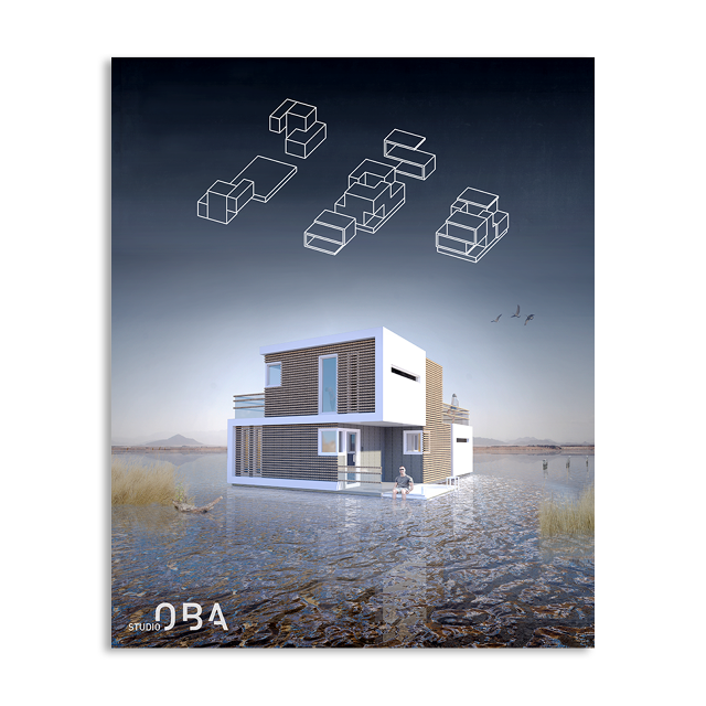
It's a fact of life that people fall in and out of love. Around 40% to 50% of marriages in the United States end in divorce, and it's rarely a clean break. Studio OBA, an architecture firm based in Amsterdam, wants to make one part of that process a little less painful: splitting up property. The firm's prefab Prenuptual Housing concept, developed in tandem with Omar Kbiri, an entrepreneur and marketing specialist, is a single house that splits in two.
Recognizing that many people live on floating homes along Amsterdam's canals, Studio OBA took advantage of the maritime setting and created a lightweight timber and carbon-fiber structure that's composed of two sections that can drift apart and function as two separate houses when necessary. While the house is still in its conceptual phases, the architects plan to build a prototype, and Kbiri aims to begin taking orders for the prefabs in 2017.
"We can stabilize the home front during an otherwise very hectic time," Kbiri told Dezeen. "With this concept you namely don't need to relocate after a breakup."
In the past, architects have experimented with the notion of living spaces designed for after a relationship sours. Considering the volatility of housing markets—both rentals and sales—it just makes sense to create a design that can accommodate the complex realities of human partnerships. Additionally, the design would work for families: Parents of the boomerang generation could finally get their kids out of the nest by splintering off their half of the house.
While making a clean break is sure to entice some people to the design, those intent on a "happily ever after" ending take note: The two halves can rejoin into a single structure whenever the couple wants.
Between Facebook, Pokémon Go, Snapchat, and the myriad apps we have on our phones, it's easy to keep our eyes glued to a screen at the expense of paying attention to what's around us. Designer Ekene Ijeoma found this to be troublesome, and created the app Look Up to remind people to be more present as they meander through NYC's streets.
His goal is to "tear down digital walls" that isolate individuals in the public realm. "I wanted to use phones to prompt people to see, acknowledge and value each other more," Ijeoma says. "I think looking up from our phones to acknowledge others could bring a lot more empathy between people which is something we could use a lot of right now."
The app, which is only available on Android, uses data culled from the New York Department of Transportation's Vision Zero program—an initiative to bring the number of traffic-related deaths to zero—on the fatalities and crashes that occur at a particular intersection. If an intersection has had more crashes or fatalities, it has more "energy" within the app—a reminder of the energy lost from a crash and that you should be dedicating more human energy (ie. attention) to the intersection. Using your phone's GPS, the app notifies you of the intersection's energy level, showing you an animated eyeball if you're on your phone's home screen as a live wallpaper (the app has to be continually running in the background to work), and sending a notification if you're using another app. You can program the app to notify you of the energy level at every intersection, every third intersection you cross, or at random.
The higher the energy score at a given intersection, the more vibrations you receive and the more intense the motion graphics are, meaning that there are more iris lines in the eyeball animation. Receiving a notification or seeing the animation lets users know they should look up and around, take notice of their surroundings, and perhaps even make eye contact with another person.
While the project's social element is Ijeoma's focus, it could also be a potent safety intervention for people who might not be as aware of their surroundings while moving through the city. "Phone distraction and street awareness have become global cultural issues," Ijeoma says. "It's starting to feel like a smartphone zombie apocalypse." Other designers, like Pentagram with its Look! campaign, have tried to tackle the problem through graphics.
In the last decade, the number of pedestrians injured while using a cell phone has been on the rise, according tomultiplestudies. Walkers distracted by cell phones have even prompted some cities to paint "phone" lanes on sidewalks: while Philadelphia did it as part of an April Fool's awareness campaign, it was a very real intervention in Chongqing, China. A New Jersey congresswoman recently proposed a bill to ticket pedestrians who text while crossing a street.
"Pedestrian safety can't happen without empathy," Ijeoma says. While this app won't do anything to stop careless people who text while they drive—the real cause of many traffic collisions—being more mindful as a pedestrian is essential for safety.
"Drivers, cyclists, and pedestrians need to have empathy for each other to share our streets. Same for people from different sociocultural and economic backgrounds. Between all the racial and political polarizations, there needs to be empathy. Look Up prompts participants to acknowledge one another and share their energy. When people start channeling less of their energy into their devices and more into the streets pedestrian safety becomes inherent."
For safety reasons, it might be worth running Look Up in the background if you're one of the thousands of Pokémon Go fans combing the streets, lest you inadvertently run into traffic to catch 'em all.
Today, Nest announced the newest addition to its product line: a security camera called Nest Cam Outdoor.
The camera's weatherproof industrial design is slick, but it's the software that has the potential to win over new customers—in particular, how the system manages footage. Using artificial intelligence, the camera sniffs out potential security threats rather than blindly sending notifications anytime something insignificant (or not) passes in front of it. In short, the camera aims to be a human sentry in gadget form.
"It watches and hears everything, but it only tells you the salient information," Mehul Nariyawala, product manager of cameras at Nest, says.
Nest has had a tumultuous two years, including acquisition by Google, reports of a toxic work culture, high-profile tech glitches, and the departure of its founder and CEO, Tony Fadell. Nest Cam Outdoor seems like a relatively safe bet—30% of current Nest Cam users point the product outside, and the number one request from consumers was an outdoor version. The new camera also hints at how Nest imagines our varied connected devices will fit in with our lives, which has been a struggle for the IoT industry as a whole.
Most connected security cameras are triggered by motion and send notifications based on detecting something—anything—moving nearby. "Motion and sound were interesting three years ago, but we settled for dumb alerts because motion is everywhere," Nariyawala says. "If a tree branch moves, that's a motion [so it sends an alert]. That's not an algorithm error, that's a relevance error. That noise is real."
To Nariyawala, motion isn't the only criteria for a security camera. "What we're looking for is activity, and activity that's relevant to you," he says. In order to combat relevance error, Nest is using a machine learning model to let you know if a person (versus a "thing" like a dog) approaches the camera. It does so by analyzing silhouette and motion, but it can't get any more specific than noting that it's a human; that means there's no facial-recognition—or casual racism, a serious problem with AI, as Kate Crawford recently wrote in a New York Times op-ed—yet.
Yet recognition is the next step for the AI as it relates to the camera, according to Nariyawala, and this is functionality that Nest could add in the future if the technology becomes sophisticated enough. For example, teaching the camera that it doesn't need to send a notification if a specific person comes into view, or notifying you that it's the package delivery guy who's coming to the door.
Because the system is not exactly like a human set of eyes, it has varying degrees of certainty on whether or not it sees a person. Instead of sending notifications for false positives, the camera will alert users if it "thinks" it sees a person when it's not 100% certain. Nest hopes that these Person Alerts—which will be available on the indoor and outdoor cameras—are a more useful way to handle notifications.
"There are a lot of nuances where it's easy for a human to say, 'I see a person'—like when someone is sitting on a couch or behind a car—because the mind has an abstract capacity to think through that," Nariyawala says. "Machine learning hasn't gotten there yet. It will get there, but it hasn't . . . It's this idea that certainty drives a quick reaction and when we know for certain, we want to drive that reaction. When we don't know for sure, we want to give you just enough information for you to act. 'We think we saw something' is to augment human intelligence."
In terms of physical bona fides, the camera is weatherproof (with a rugged IP65 rating) and plugs into an outlet to ensure that users don't have to worry about swapping out batteries; instead, it comes with a weatherproof adapter and about 25 feet of cable (Nest estimates that about 75% of U.S. households have an outdoor outlet within 25 to 30 feet from where they'd place the camera, or users can drill a hole into their wall to feed the cable inside). Screw-in clips corral the cables and are an anti-theft measure, too.
The camera's reinvented industrial design features a rounded body that sits on its base—which is mounted to a house's exterior via a screw-in bracket—via a magnet, a clever detail that lets users pivot and rotate the camera into optimal position without needing a hinge. Meanwhile, a microphone lets you remotely speak through the camera, and the camera offers a 130-degree field of view day and night. Like the current Nest Cam, it continually records footage and stores it to the cloud, which users can review via the Nest app. It can also sync up with third-party "Works with Nest" products so users can program actions—like turning on indoor lights if the camera detects a person at a specific hour. (Nest also updated the fifth generation of its app so that the UI is organized around rooms rather than devices—a hint at the company's ambitions for users to have a Nest product in every room.)
While the camera promises to do a lot, the technology hinges on the ability of its AI model to function properly. We already know that machines pick up the biases of humans. For example, software that mistakenly flags black people more often than white people for recidivism, or Tay, the Microsoft chatbot that went full-on racist in less than a day and was shut down. Let's hope that Nest's model is more nuanced.
Nest Cam Outdoor, $199, is available for preorder today, and shipping is expected in the fall this year.
Imagine sleeping under the stars, the gentle hum of crickets lulling you to sleep. Sounds nice, right? The W Hotel in Manhattan is attempting to channel the charm of camping with what it calls the "Extreme Wow Outdoor Glamping Suite," which offers guests the chance to doze off under the glow of skyscrapers and to the tune of Midtown's symphony of horns, sirens, and droning traffic—all for a $2,000-per-night sticker price.
Glamping—a portmanteau of glamorous and camping—is a tony way to enjoy the outdoors. Think beds in lieu of sleeping bags; cabins instead of tents; fashionable furniture in lieu of rickety folding chairs; artisanal charcuterie, not hot dogs. The W suite, which opened July 13 and is available for reservations through November, embodies this ethos.
The suite is kitted out with all the luxurious amenities you'd come to expect from a swanky hotel; it's about as far from roughing it as you can get. Laurel & Wolf, an online interior design service, decorated the suite, which has a couple of hanging lounge chairs, a sizable sofa, fire pit, and a 12-foot-wide yurt on the turf-lined rooftop terrace adjacent to the penthouse suite (which guests can retreat to if the cacophony of Midtown moves from endearing to ear-splitting). Naturally, room service is available and the price tag includes a bottle of Veuve (unfortunately, no caviar to go with the champagne, though).
Companies like Airbnb, El Cosmico, and Getaway—not to mention independent designers—have all capitalized on this trend. It was only a matter of time before a hotel chain for city slickers got into the game.
Today, MasterCard revealed a redesign of its consumer-facing logo, the first in 20 years. The way we buy and pay for things has changed dramatically in the past two decades ago—think about the proliferation of payment platforms like PayPal, Venmo, and Apple Pay. While MasterCard has evolved with the times by introducing digital products and creating new technology for credit card payment systems, its logo—two intersecting circles with a wordmark superimposed—was stuck in the 1990s. To create an identity system that could simplify and clarify the brand to the millions of people around the world who use its services, MasterCard brought on the esteemed design firm Pentagram.
"Everything has changed in the past 20 years,"Michael Bierut, the Pentagram partner who oversaw the project, says. "There was a lot of screw tightening and design tinkering happening [with the logo] in the first 30 years of the company. Then they almost got frozen in 1996. If you have a MasterCard in your wallet, that's the logo you see. . . . The trick then is, how do we leverage 50 years of equity with enough TLC to provide a new system?"
When Bierut took stock of the existing logo and its evolution, what he saw were slight tweaks to accommodate various technical challenges around where it was used most in the last 50 years: as a decal in store windows and on credit cards. MasterCard has issued over 2.3 billion credit cards, which means that this logo is one of the most widely distributed and recognizable symbols in modern times.
"They've never changed the overlapping circles, but they've made it aggressively complicated due to technical requirements," he says. For example, adding a drop shadow behind the white lettering if the yellow fades in the sun. Since it's often challenging for printers to reproduce the overlap of red and yellow, why not turn the center of the venn diagram into interlocking colors, like teeth on a zipper. To make the letters easier to read, make the font taller, condense it, and attenuate certain letters. Aside from those tweaks, the logo has remained more or less the same, which has strengthened customer recognition.
"Every day clients want to know what will it take to be the Nike swoosh," Bierut says. "They think that these logos are born like this on day one and of course they're not. For any company that achieves that, it's because they've made a long investment in the use of primary elements. The reason those things are rare is that it's so easy and tempting to get bored and say, 'We've had it for five years it's boring; let's change it.'"
To Bierut, it wasn't about a jarring overhaul; rather it was giving the core elements—the overlapping circles—room to sing.
"The question for us was, evolution usually means a further and more complex articulation," Bierut says. "In this case, what struck us is that underneath this stuff are two of the three primary colors on the wheel and the most simple shape, which is circle. And they own this . . .That's a gift we were given. We were smart enough not to—or failed to be dumb enough to—throw it all away."
The team at Pentagram knew that they wanted to keep the interlocking red and yellow circles, but they looked at ways to tweak the logo so it could inform a larger identity system that can be rolled out across everything in MasterCard's orbit: credit cards, window decals, websites, apps, digital products, printed materials, and partner content, like sponsorships.
The red and yellow circles overlap, but gone is the comb effect; now you just see a slice of orange where they meet. Pentagram decided to place the MasterCard wordmark outside of the symbol and rendered it in lowercase font so that all 10 letters in the name could have circular curves in them. The placement of text in relation to the symbol is flexible, too. This strategy allows the symbol to work for everything, like its MasterPass digital payments product and Priceless rewards program, and relies on the circles to say MasterCard without needing additional text, which simplifies the graphics needed to brand all the arms of the company. This way, the logo can be used consistently in all the places that it appears. Because MasterCard issues cards through partner banks, the look of most cards is out of their control. By simplifying the logo, the company is eliminating some visual dissonance that occurs.
The circle motif is a through line in MasterCard's visual identity and it manifests in the way the photographs are cropped, as a graphic flourish on campaign leaflets, and as a pattern on physical credit cards.
"I would not even take credit for designing this mark," Bierut says. "We took their DNA and went through this process of distillation. With each wave of simplification it felt sharper cleaner and more flexible."
Along with the new logo and identity system, MasterCard is also announcing an expansion of MasterPass, its digital payments system and new capabilities, like smartphone compatibility with contactless payment readers regardless of what operating system the user has. With the tech giants like Apple, Google, and Samsung getting into the banking game, traditional financial companies are under more pressure to stay competitive with changes in digital transactions.
"Create the actual digital products is a big thing for us and a cultural transformation," says Cindy Chastain, senior vice president of customer experience and design at MasterCard. "As we're evolving as a company, this is the right time to evolve our brand identity."
In the past, the logo was mainly seen by consumers on their physical cards and in the windows of merchants that accepted the credit cards; now it's in those places plus on our smartphones, smartwatches, and computer screens. And as MasterCard builds out its products—like MasterPass—it needed a brandmark that could balance legibility and flexibility. The new system does just that.
"This is not about being clever," Bierut says. "To me, MasterCard doesn't want to be known as the company with the ingenious logo; they just want to make sure they've got a set of visual assets for them to navigate the world as it is now."
When the Serif TV by Samsung launched last year, it turned the heads of nearly everyone in the design world, an instant and unexpected design masterpiece. But while it was available in Europe, the United States has been sans Serif. Until now.
Conceived by Ronan and Erwan Bouroullec, the Serif has an elegant I-shaped silhouette, fabric cover on the back side, and can be displayed on a shelf or a free-standing wire base. While the collaboration initially seemed somewhat unexpected—haute French designers working with a mass-market electronics brand—it makes perfect sense considering that the most televisions on the market are boring black boxes more intent on wowing viewers with screen resolution than fitting in with our domestic domains. (That and Ronan Bouroullec's personal mission to rid the world of ugly things.)
Where you can actually buy the Serif speaks volumes about its design cred. As of now, it's available for pre-sale from a museum, not a mega retailer. The television is available for pre-order on Samsung.com and the MoMA Design Store, now with a ship date of August 2016. Other retailers from August onward will include the luxury furniture showrooms Vitra, Bo Concept, and Ligne Roset. At $1,499, the set doesn't come cheap—though it's a steal when you consider an Eames Lounge chair and ottoman runs close to $6,000.
It's a puny problem that design nerds didn't have something beautiful to behold as they tune into Game of Thrones, but problem solved. Now, onto the real issues.
Cities are complex organisms shaped by myriad forces, but their organization bears the fingerprints of planners and policy makers who have shaped them for decades. At the root of many of these practices is racism, and modern cities bear the legacy of that discrimination.
In an era of social protest, when movements like Black Lives Matter are bringing inequality back into the national conversation, it's time to reassess the practices that have perpetuated these problems—and how we fix them.
But the first step is understanding the urban policies that got us here. For decades, planners slashed through neighborhoods in the name of urban renewal and slum clearance, underwritten by federal funding from the Housing Act of 1949 and the Federal Aid Highway Act of 1956, displacing residents using tactics like eminent domain and condemnation laws.
As a result, much of our highway system courses through black neighborhoods (which helps explain why they've often become spaces of civil protest). "This method fails," wrote grassroots urbanist Jane Jacobs in the Death and Life of Great American Cities, one of the most influential planning books ever written. "At best it merely shifts slums from here to there, adding its own tincture of extra hardship and disruption. At worst, it destroys neighborhoods where constructive and improving communities exist and where the situation calls for encouragement rather than destruction."
Realtors have also contributed to racial segregation through practices like blockbusting—using scare tactics to convince white homeowners to sell cheaply—and racial steering—guiding prospective homebuyers to certain neighborhoods based on race. This process has led to increased racial tensions, as is what happened in East New York, a low-income neighborhood in Brooklyn which has recently been rezoned in an effort that some say will lead to more racial displacement. Others view the rezoning as necessary to boost affordable housing stock in the city.
These examples are by no means an exhaustive list of how racism has influenced modern cities, but representations of how complex and deep the problem is. Recognizing that design can't solve all of our social problems, we asked architects, scholars, urbanists, and planners to share their recommendations for ways design can be a starting point for more equitable cities.
Justin Moore, an architecture professor at Columbia University, believes that while designers focus on creative solutions for urban problems, issues that are rarely broached are shortfalls within the profession, like diversity, a deep understanding of the communities in which they're building, and the methodology of design education.
"There is a need to redesign the designers, and to give them the tools and competencies to work within social constructs and spatial contexts that they are meant to serve. Designers spend much of their academic and professional training to build the spatial, technical, communication, and critical-thinking skills that are needed to do the difficult work of transforming spaces and places. They use their skills, often with good intentions and 'best practices,' toward results that may not align with what is needed or wanted in a given context.
"There are major blind spots, and the design professions and design education systems need to develop other sensibilities, frameworks, skills, and technologies for designers and design practice that includes not only social or community engagement but also better understanding and relations.
"The demographics of the design fields are improved from a few generations ago, but there are still very few people of color or from lower-income backgrounds in these fields or in the schools—and certainly there are few in the leadership, resource-allocating, and decision-making positions. This results in a missed opportunity to have the diversity of understanding, ideas, talent, and perspectives for the very important role that designers have in influencing the constant change of urban and built environments.
"Imagine if there were only a small number of musicians, artists, athletes, or leaders of color in shaping America and its identity. How much would be lost? In 2016, it remains the case that the majority of the people who plan, design, and build our communities and cities lack the diversity of those same communities and cities. It is a big problem that is not being addressed or taken seriously at the broad scale and scope necessary to make a meaningful impact.
"It is difficult to pinpoint or articulate the direct impacts that design has on the complex social and racial inequities that have been present in our cities for generations," Moore adds. "Advocates and people in leadership rightly focus on more legible policies and actions like police training and judicial reform, or better access to education and jobs. But design does have an impact across the multiple issues and grievances that people have about the inequities that exist in American society and its spatialized contexts: quality housing, transportation, public spaces and facilities, environmental conditions, and the other tangible ways that designers help shape built environments."
Isis Ferguson is the associate director of city and community strategy at Place Lab, an initiative at the University of Chicago led by artist and activist Theaster Gates. She sees ample room for more cities to become more equitable for their citizens by becoming more physically inviting.
"Cities can function as magnificent places of excellence and can also be governed and experienced as repressive places enforcing flawed or even bad policies," Ferguson says. "Public spaces alone will not create the vitality and empathy we seek in and from our cities. Universally designing for everyone can create homogenized, soulless places that have all people in mind but have meaning or use for no one."
"In cities in the United States, we cannot pretend that all bodies have the freedom to move through, occupy, and enjoy public space. The perception of black and brown bodies gathering in public space routinely reads as suspect, criminal, or illegitimate. Peoples' rights to convene or congregate becomes interrupted, sometimes—ever more frequently—through limitation, denied access, and force. If your very existence is read as a violation, is public space really for you? What looks and feels safe to some in public space—like security cameras and police as traditional forms of surveillance—can be experienced by others as another dimension of the state violence.
"Projects in the public realm need to be informed not only from more disciplines but from more kinds of people. Artists, misfits, outsiders, elders, immigrants, people of color, and women have been leading community development efforts in unconventional ways, partly because they have not been invited to the table and also because their varied lived experiences offers something more or counter to the standard advanced for our civic commons, parks, plazas, and other urban public assets.
"The space between who is considered an expert and who is typically on the margins of conversations about public space needs to be collapsed. If that happens I think cities will feel, function, and be designed with multiple points of view, engendering spaces that promote social mixing and most importantly social equity.
"Public space is contested ground in our country. Are there design solutions that promote social integration but also uphold the dignity of the people once they enter that space? Asking the typically untapped people–artists, misfits, outsiders, elders, immigrants, people of color, and women what the most joyous, liberatory, and authentic spaces are for them is a good start at imagining more for public life and for creating places of greater possibility for all in the public realm."
Allison Arieff—a contributing writer for the New York Times and the editorial director of SPUR, a nonprofit planning think tank—argues that building more equitable cities starts with mending the way governments make decisions.
"A constant of so many seemingly intractable urban design challenges is broken public process," she says. "It's not the people aren't being given the opportunity to weigh in on projects, from condo towers to high-speed rail. They are—but it seems that for all the talk of stakeholder engagement, few are satisfied with the processes or outcomes. Even well-designed, well-intentioned projects become the subject of lawsuits, protests, even reversal of project approvals.
"Opposing sides now often engage consultants from the get-go to develop talking points and strategies for getting projects approved as well as making sure projects don't get approved. This is not an easy quandary to solve but it seems the most pressing and is symptomatic of the broader culture's current difficulty in communicating across, and even within, cultural, economic, and racial lines. If compromise is viewed as weakness, little progress can be made. I have no easy solution; I want to keep thinking about how the process might work better for more people and more projects."
Benjamin Grant, urban design policy director at SPUR, thinks that there needs to be a redistribution of resources in cities—starting with the rich.
"This has been said before, but for me good cities are machines for managing mixture," Grant says. "By substituting public goods—particularly public transit and public space—for private ones, cities offer a (complex, imperfect) bulwark against social and economic stratification. Elites in great cities depend on public goods and have a strong interest in applying their disproportionate resources to maintaining them. Think of Central Park or the New York City subway—rescued by wealthy and politically connected boosters. Low-income people are enfranchised by public goods, and are enabled to partake of city life alongside the powerful.
"Of course this in no way means that cities are egalitarian. The corporate baron and the immigrant laborer live profoundly and unjustly divergent lives, but in a city where public goods are abundant, they encounter one another as ordinary people, drawing on the same resources in the same space. Where large numbers of elites can opt out—into private schools or private cars for example—the investment of the powerful in public goods becomes an abstraction, something to do on progressive principles, not practical need."
The Gehl Institute—a policy consultancy that spun off of urbanist Jan Gehl's architecture firm, and which just opened an office in the United States—believes that designing cities for stronger public life could address equity issues.
"The public realm works when you have this notion of trust and this notion of 'ours'—we have to learn how to co-exist," says Jeff Risom, chair of the Gehl Institute and managing director of Gehl Architects in the United States. "Our cities are clearly segregated. We want more mixing racially and economically in public space. We want neighborhoods to be healthier, we want to increase the amount of physical activity we get. Public life could be a tool to address major urban challenges to equity, access to opportunity, health, and sustainability. A thriving public life has to do with a very active, diverse form of participation in public life ranging from civic engagement—things like voting and organizing—to everyday routines like feeling like you can cross a street safely."
In order for cities to facilitate a stronger sense of public life, the Institute argues that governments need to take stock of their civic spaces.
"It's not just miles of road or square feet of park space; we want to equip some decision-makers with people-centered metrics to make sure it's inviting to different social income groups and that's hard," Risom says. "How much time are people spending in the public realm, not just outside, but in civic institutions like libraries or community centers and who is spending time there? We need to know about their income, how far they travel. Here data and technology can help us get that information. We also need to know tough stuff that's messy to find, like how people feel there. So do you feel welcome? Are you participating in community activities? Are you civically active? How can we help you become civically active?
"A big part is how the public realm can provide folks with access to opportunity. So far, I don't think a lot of it has been thought of that way. We have streets and spaces, which are these incredibly valuable public assets, and we don't utilize them enough for things like civic services. We don't use them enough to ensure that citizens are informed and engaged."
To Shin-Pei Tsay, the Institute's executive director, having space that feels inclusive is essential for cultivating a strong public life. "There's an erosion of public space," she says. "For example, there are so many more private pools than there are public pools. There's also the inability for us to maintain branch libraries, which are really community centers for a lot of neighborhoods. We need places that people come together to have open conversation about current issues. Immigrant communities are interesting to look at because this welcome-unwelcome feeling is very inherent to their experience in their city. It has nothing to do with design, necessarily, but design can reinforce that invitation."
"In addition to the legacy of slavery and Jim Crow, the more recent U.S. history of urban renewal continues to have an outsized impact on our racial geography. Throughout the postwar era, vibrant black neighborhoods had highways torn through them, noxious facilities sited within them, and economic investment and mortgage lending directed away from them," Chakrabarti says. "As a consequence these districts experienced a disproportionate loss of good jobs, schools, transit, parks, and air quality. These inner-ring neighborhoods—which proved remarkable in their cultural resilience despite decades of aggression directed against them—have ironically now been rediscovered as the nation urbanizes, creating issues of gentrification and urban inequity and fomenting the racial tensions we are tragically experiencing today."
"The definition of design must be expanded to address the size of this challenge, because traditional ideas of designing buildings and landscapes will only exacerbate the problem. Instead we must pursue an expanded definition of design in which we re-envision the legal and economic systems that distribute the benefits of growth and investment. Communities should share in the benefits of new development in a way that stabilizes and strengthens them through the design of mechanisms such as community land trusts and cooperatives.
"Sorely needed new investments in schools, transit, and parks must be designed to meet the generational aspirations of existing residents—the hope each of us have for our kids to live a better life than we do—rather than a means to displace those residents. Designers have a major role to play, through what commissions they take, the voice they have, and the skills they bring as democratic visionaries and utopian pragmatists. The challenges are enormous, they are spatial, and they can be addressed, at least in part, through a redefinition of what great design truly means."
Richard Florida—an urban design professor at the University of Toronto, the founding editor of CityLab, and Co.Design contributor—argues that the modern complexities of racial inequality in cities lies, in part, with accessible and affordable housing.
"The inequality, segregation, and sorting of our major cities and metros is a huge problem and is reinforced through a whole gamut of urban structures and policies—from the loss of the middle class and the splitting of our labor force into a small tier of good knowledge jobs and a much broader class of low-paid service jobs, the massive decline of once sturdy middle-class neighborhoods, and the splitting of our cities and metros into areas of concentrated advantaged and concentrated disadvantage, to enormous subsidies to affluent homeowners, exclusionary zoning in the suburbs, and land use restrictions in the urban center that limit denser housing development there, and terribly fraying social compact," he says.
"Overcoming this trifecta of urban and society-wide ills is a tall order. This is a not a problem the magic of the market can solve or that cities and mayors can solve for themselves: It will take a full-on national effort. And that effort has to work on both sides of the problem—creating jobs, rebuilding the safety net, bolstering incomes, and providing more accessible and affordable housing.
"On the demand side, this means a new, higher minimum wage policy hinged to local costs of living, a guaranteed minimum income to give people a basic means to live, a massive effort to transform low-wage service jobs into higher paying middle-class ones, and on the supply side, transferring the massive subsidies for home ownership to affordable rental housing and renters that need it and shifting from subsidies to cars, roads, and highways to transit and denser transit-oriented development, as well as ensuring that our land use and zoning policies are reformed to allow the kind of dense, clustered development that promotes innovation and economic growth, while generating jobs and raising living standards."
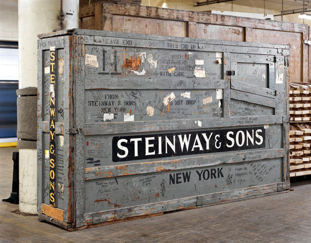
Grand pianos are works of art and feats of engineering composed of over 12,000 individual parts. It takes hundreds of hours to carve, forge, assemble, and finish one—a process that relies on skills passed down through the generations. Steinway, the most famous piano manufacturer, began crafting pianos in Germany in 1853 and in 1872, the company opened a second factory in Astoria, Queens, and has been fabricating them there ever since. For a new book, Making Steinway, photographer Christopher Payne visited the legendary factory to document its process.
Payne originally visited the factory in 2002 on a public tour when he was a practicing architect, and he marveled at the process behind the instruments. After his grandparents—who were both pianists—passed away, the experience took on new meaning. "My memories of the factory took on a more profound, spiritual importance and I felt an obligation to return to take pictures of the instrument so deeply connected to my family," he says.
About five years ago, Payne began planning his photo essay, which follows the journey of a piano—as its plates are cast in an Ohio foundry, as its wood rim is bent into place using a process Steinway invented in 1878, as woodworkers carve ornate legs, and as technicians calibrate the actions of each key.
"In this era of service jobs and office work, most of us have never been inside a factory. The kind of manufacturing and craftsmanship that happens at One Steinway Place in Astoria, New York, where people transform raw, often messy materials into some of the finest musical instruments in the world, has nearly vanished from the American workplace," Payne says.
Today, Steinway employs around 300 people, most of whom live in the area. When the factory opened, William Steinway, founder Henry E. Steinway's son, decided that he needed to develop the area to attract the finest workers. Astoria, which was mostly open space at the time, gradually transformed into a company town, known as Steinway Village, complete with housing advertised as "country homes with city comforts," a library, trolley system, and free kindergarten.
"The people who work at Steinway come from all over the world, and the factory is a microcosm of the diversity that makes New York City—and America—great," Payne says. "Some workers are new to the factory, having recently immigrated to the U.S., while others have been there for decades. Together, they share a quiet pride and dignity, and are proof that manual labor and craftsmanship still have value in today's economy."
See how the pianos are made in the slide show above.
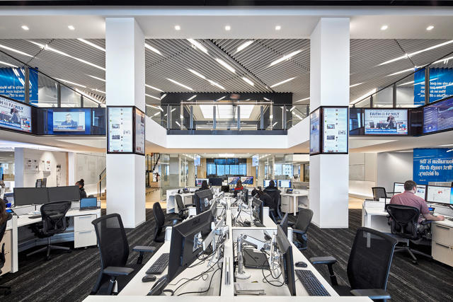
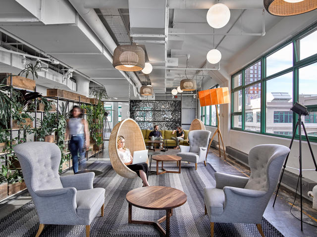
Is your office stifling your creativity? A recent survey, conducted by the global architecture firm Gensler, suggests as much. The good news: You can do something about it.
The online survey, called the 2016 Workplace Survey, sought to uncover whether a workplace can make employees more creative and entire organizations more innovative. It drew more than 4,000 people from 11 different industries including tech, government, finance, media, and biological sciences. The respondents had to work in offices some of the time and for companies of more than 100 employees. About two-thirds of those surveyed believed that they work in spaces that crush creativity and innovation.
Diane Hoskins
The definition of a "creative" or "innovative" business was based on employees' perspectives of how much their companies embodied those traits. For example, how much a respondent agreed or disagreed with statements that are performance indicators, like "my company has a clear strategy for innovation,""my company employs creative thinkers,""my company has a leadership team that encourages innovation," or "my company creates a climate that continually fosters innovation." The variables Gensler found as key to creating an innovative business are workplace design, meaning, purpose (like if the organization positively impacts society), and managerial relationships.
"We found a total correlation between certain core design factors and the level of innovation in a workplace," Diane Hoskins, co-CEO of Gensler, says. "Was it a surprise? No. But we were able to unpack the why, the what, and how." Here are four key ways workplaces hinder creativity—and how design can help.
A sense of purpose is crucial to creating an innovative company, the survey found. For example, it's important to reinforce why people work at the business. This helps employees feel engaged, which impacts the quality of work that they produce.
Related Video: Is Being Too Connected Ruining Your Productivity?
"Design can connect people to the purpose of the organization," Hoskins says. "What resonated across all industries and all of our respondents that were on the innovative side of the spectrum is that the [office] space itself aligned with the organization and really helped every single person understand why they're there, how important it [was for them to be there], their mission, and what they're trying to achieve."
That could mean finding architectural and decorative ways to communicate what a company is about to employees. For example, if a company sells handmade wares, it could fill the office with locally made furniture. If it has a deep history, it could use environmental graphics to tie together the company's past and present.
The survey found that the more innovative companies—as ranked by employees—emphasized individual and group work and were five times more likely than less innovative companies to have spaces that accommodate collaboration. "Collaboration is really critical for innovation," Hoskins says. "How a space can expose you to people who aren't in your direct team? It's not just sitting at your desk [to work]. Diversity of space is a critical factor."
Architecturally, this means creating areas that promote chance encounters, like communal areas for working or socializing. Infrastructurally, it means having ample Wi-Fi and electrical outlets throughout an office to let people go wherever they want.
Collaborative work may be key to nurturing a creative, innovative company, but people still need to get things done on their own. On average, Gensler found that 30% to 40% of a person's day involves solo work.
"There has to be a space where that individual can sit down, really crank things out, really focus, and not have a million distractions," Hoskins says. "They have to have enough space to do what they need and the resources to do it."
Workplace real estate is expensive, so private offices aren't a realistic offering at many companies. The trick, then, is to keep noise to a minimum. (The perk employees want more than anything, as a recent Oxford study found, is quiet.) To that end, design strategies could include creating quiet zones and placing individual workstations in an open space far away from noisy communal areas.
The final key finding from the study centers around management giving employees the agency to work from wherever they feel like they can do the best job.
"The fourth leg of the table is really this idea of choice," Hoskins says. "It's the fact that people do different things during the day and they need to be empowered to choose the places where they're going to accomplish what they need to accomplish." She found that around one-half to two-thirds of employees surveyed didn't have that flexibility. But in companies that were on the higher end of the innovation spectrum, everyone had that flexibility.
The solution? Letting people work in different spaces within the office—or outside of it.
"We talk about myths and realities in this world of what's going on with space, and one of the things that was talked about when technology started to make us all mobile was, 'We're all going to work from home in our slippers,'" Hoskins says. "People want to be in the office, ideally for 71% of the time they're working." Though your employer isn't likely to kit out your home office anytime soon, the next best thing is giving you the option to work from there.
While some of the survey's findings read as common knowledge (of course you need distraction-free spaces to focus and don't want to be confined in a dictatorial environment), Gensler hopes that it reinforces how spatial design can help build a stronger business. It's not just about dropping in a staff cafe and foosball table, calling it "corporate culture," and saying job well done.
"Productivity was so much part of the workplace, then it was all about the knowledge economy, and now we're seeing innovation as a key driver of business and competitiveness," Hoskins says. "Being able to clearly identify that the workplace is an important part of the mix. If you are an organization and you are competing in business today, you need to look at the workplace as part of your strategy to get there."
Making a vinyl record out of coffee grounds was an ambitious—and weird—request, but Gotta Groove Records entertained the idea. A client of the Cleveland-based record press wanted something that smelled like coffee and looked like grounds suspended in a clear substrate and it seemed feasible so they gave it a go. What they got was a greasy, brownish mess."We were cleaning coffee out of our factory for two weeks after," says Matt Earley, the company's vice president of sales and marketing.
Since opening in 2009, the Gotta Groove Records has earned a reputation for being the mad scientists of vinyl manufacturing for its technicolor records and willingness to push the envelope when it comes to fabrication. Other strange requests include embedding records with glitter, leaves, pages from a 200-year-old book, and shredded cash, as Pitchfork reported a few years ago. ("We had to draw the line somewhere; we don't do blood," Earley says.)
While Gotta Groove still produces traditional records, the company has also attracted musicians who want to push the envelope when it comes to vinyl, an industry which has seen an unlikely resurgence fueled by consumers who still lust for physicality to their music. In new short documentary, Gotta Groove shares a behind-the-scenes look at how they make records:
Both the traditional and experimental work starts out roughly the same way. The company makes a lacquer "master" record of the audio file, which is then sprayed with silver and electroplated to create a mirror image, called a stamper. The stamper has raised ridges and—like a waffle iron presses into batter to cook a waffle—it will eventually make the impressions in vinyl. Here's where things diverge. In a traditional black record—or a single-color record—vinyl is heated up to about 250 degrees and is extruded into a mass about the size of a hockey puck, which is called a biscuit. The stamper then presses the biscuit to produce the record, which is then trimmed and inspected. This is pretty much all done by machine and can be repeated ad infinitum and all records will be identical, if done right.
Each of the experimental processes is much more labor intensive and every single record is produced by hand; there's no economy of scale with these. To create a "splatter" record, which kind of looks like a cross section of a lava lamp, the press operator uses a hot plate to melt one color of vinyl pellets then sprinkles them over the biscuit before it's pressed. The company has developed a handful of other proprietary techniques—and declined to comment on the specific processes—to create Nebula effects, Color stripes (which essentially involve Frankensteining multiple records together and re-pressing them), and Label Blowouts.
To Earley, part of the company's experimental culture is just part of the personality of the people who work there: they're interested in music and want to try something different. Sarah Barker and Heather Gmucs, two of the plant's press operators, lead Gotta Groove's "special edition" offerings also opened their own label on the side called Wax Mage Records to try make even more designs—an example of just how die-hard vinyl the company's employees are. Some of their recent inventions include making fishnet vinyl and achieving a pig imprint in another.
"Nobody in our company worked in vinyl manufacturing prior to this—everyone has learned it here," Earley says. "We actually employ a lot of musicians, which makes us unique compared to our competitors. Because they're musicians themselves, they want to put something out that would make them as proud as if it was their own record."
While alchemists never succeeded in their quest to turn lead into gold, crafty builders since the Roman age have been transforming inexpensive plaster into far more luxurious materials, like faux-marble and lapis lazuli, using a process called scagliola. While the technique is typically used for architectural flourishes like moldings and columns when more expensive stone isn't feasible.
Artist Deborah Moss, of the Toronto-based studio Moss & Lam, uses scagliola to create furniture that's handsome in its own right. Used the same process that's been around for centuries, Moss mixed together plaster, pigments, water, and glue to produce the marbleized material. She then molded it to make the statuesque side tables.
Moss is one of a handful of contemporary artists who are experimenting with ways to spin humble materials into marble-like finishes. Danish designer Pernille Snedker Hansen adapted Suminagashi—a traditional Japanese technique in which artists dip paper into an solution of oil, ink, and water to produce a marbleized effect—for her technicolor floor tiles. The Edmonton, Alberta–based studio Concrete Cat mixes prismatic concrete together to create pieces that look like exotic stones. Thanks to these artists' ingenuity, copycat materials are even more covetable than what they're imitating.
Its new headquarters in the DUMBO neighborhood of Brooklyn serves as a physical embodiment of this "responsible citizen" philosophy—from the solar panels covering its roof down to the salvaged furniture outfitting its conference rooms to the public gallery of maker goods in its lobby. The hope? That it'll push others to adopt its conscientious ways.
LEED is about leaving as light a footprint on the environment as possible. The Living Building Challenge—the certificate of which you can only receive a full year after construction is complete—awards buildings that have a net positive impact on the environment. Buildings that adhere to the LBC standard have to meet sustainability requirements around water and energy usage, materials, and more.
For Etsy's new office—which takes up an old industrial building that once housed the Jehovah's Witnesses' printing press—Gensler focused on LBC areas such as materials, health, and beauty.
Through sourcing locally made furniture and fixtures—the LBC states that 20% of a materials budget, which includes furniture, should come from within 300 miles of the building's location—Gensler hit one of the LBC's requirements and simultaneously tapped Etsy's community of makers. The architects estimate that 100,000 square feet of the 200,000-square-foot office is furnished with handmade goods from about 20 different local designers and manufacturers, which Etsy handpicked.
"We had furniture meetings every single week, which is not normal," says Amanda Carroll, Gensler's principal-in-charge of the project. "The emphasis on furniture was three times that of a regular project."
Etsy and Gensler worked closely with the makers to see if they could produce the quantity and scale of furniture needed (for example, workstations for 600 employees), and if they would be interested in and able to get "Declare Label" certification, which is kind of like a nutrition facts list letting you know a product doesn't contain toxic chemicals. To do that, the designers had to submit detailed documentation about what was in their pieces—a more formal process than many of them were used to.
"We received sketches that were done in crayon that showed what a chair is going to be," Justine Chibuk, a project manager at Etsy, says. "It's melding that with a much more stringent process."
The process of finding materials—like Forest Stewardship Council-certified wood—for Declare Label certification sparked camaraderie among the makers. Often, suppliers or materials are held as trade secrets but in this case, since many of the designers were experimenting with new materials or techniques, they shared information to make the process easier for the group. In the end, it benefited the small businesses since their work could become part of a very short list of Declare Label products—a potentially lucrative designation.
Gensler submitted about 30 products commissioned as a result of this project to the LBC for Declare Label certification and specified 30 more from mass manufacturers that were already on the approved list, ranging from acoustic tiles to wall coverings and insulation.
"We approached over 1,500 manufacturers about being transparent," says David Briefel, a sustainable design specialist at Gensler. "It's a small percentage that went for the Declare Label, but maybe for some it's the first time they're hearing about this being important to anyone." While it seems like a loss, Briefel sees the "ask" as a way architects can become advocates for greener products.
Gensler also tried to get large manufacturers to develop products that would meet the standards, but found that some weren't able to reformulate fast enough. For example, Gensler approached Herman Miller to produce a version of the classic Eames Aluminum Group chair that would be LBC compliant, but they weren't able to. (The architects ended up buying secondhand versions of the chair—they are LBC-approved.)
"I think that's an important signal that the broader commercial furniture community is waking up to this idea that there's going to be some pivoting happening," Carroll says of the sourcing process. "It's a contribution to a larger community of people who are trying to find materials that are better for the built environment, the people experiencing them, and also the planet."
In Etsy's previous location, which was just a few blocks away in the same neighborhood, space was scarce. The new headquarters has a mix of personal workstations, communal lounges, conference rooms, and craft studios to give the 600 employees who are currently in the office the freedom to move where they'll produce the best work.
The workstations are in an open-plan space but to help eliminate visual distractions, the architects organized the tables perpendicular to one another to shorten the field of vision. Additionally, they placed plants throughout the office so you can see some greenery regardless of where you are in the office.
While there are private offices in the building, the best views and the tallest rooms in the building are reserved for communal space, like the Lab, a maker space that's filled with craft supplies, a digital design studio, a 3-D printer, a screen-printing studio, and letterpress tools that are used by Etsy's employees as well as during events that are open to the public. There's also an area with board games, a grand piano, and a ping-pong table for when people need a break. A wellness studio offers space for yoga and a few bean-bag chairs for naps. The office also has a handful of outdoor spaces, including a roof deck—outfitted with a solar array that provides about 1% of the office's energy—and two terraces that are off lower floors for when people want some fresh air.
Artwork abounds in the space to reconnect everyone to Etsy's base and also to pay homage to its last office. For example, they turned old desks into wall hangings and used a felt wall divider as an acoustic dampener. On the stairwell between security and reception on the second floor, Gensler designed a space where Etsy can easily rotate artwork.
"When you have a monumental moment in architecture, it's typically fixed," Carroll says. "Instead, we created a platform for Etsy to create their own installation or whatever it is they want their first welcome to be."
One of the biggest differences between this office and Etsy's previous office is that it is the sole tenant in the building, which gave the company an opportunity to have a presence at the street level. The ground floor is open to the public and a gallery of products and furniture made by people in Etsy's community is visible through the floor-to-ceiling glass walls.
"We were looking for spaces where we could directly engage with the community in some form," says Josh Wise, Etsy's global director of workplace ecology and design. "It further expresses an ongoing commitment to the neighborhood as well."
That extends to how the company planned its food program. Rather than hiring an in-house chef for "Eatsy," their cafeteria, Etsy enlists local caterers to come in twice weekly to provide meals. "We're not creating a closed experience, having people go out into the community was a deliberate thing," Wise says. "It distinguishes us from the typical campus where you walk in and you never have to leave."
What excites Gensler and Etsy now that the office is complete is what can happen beyond its walls.
"We can have greater impact in a ripple effect," Carroll says. Recently, the firm held an event at the new headquarters, which was attended by over 100 clients and dozens of architects who may apply some of the strategies implemented at Etsy in their future projects. "Within Gensler we've already had so many people ask us, who made that chair, who made that table, and that was intentional on Etsy's behalf. For some of our Fortune 500 clients, it was the first time they were in Brooklyn and the first time they were completely surrounded by handmade goods. It is an eye-opening moment for many of them, and there was an acknowledgment that it creates a joyful space. That was part of the strategy: We can open people's eyes to more inventive ways of design."
As science has shown, nature offers restorative effects on our brains and can be a visual break from our often harried and frenetic lives. The research behind houseplants and their health benefits is less robust, but studies have shown that some people are less anxious, more productive, and happier when they're around indoor greenery.
And who can ignore how inherently beautiful these plants are? It's only fitting that you display them appropriately.
MoMA Design Store has a handful of stylish options, ranging from an ash-wood freestanding greenhouse by Design House Stockholm to a minimal vase for a single bloom by Peter Hewitt. Designer Daniel Pouzet's Ambienta lamp is actually a hydroponic planter, and for those who still can't manage to keep even the hardiest botanicals alive, Hay's got a trio of immortal ceramic cacti. Spy the selection in the slideshow above and find the products on MoMA Store's shelves and at store.moma.org in September.
As subway offenses go, there's plenty to scoff about: overcrowding, frequent delays, odious smells, and crumbling infrastructure, to name a few. Another annoyance that can have serious safety consequences? Too few handles for passengers to grip—and the awkward moment when you come palm to palm with with a stranger.
During rush hour, subway-handle real estate is scarce as an affordable apartment. Riders cling to poles, contort themselves in order to reach a handle, and are often not tall enough to comfortably hold on. Should the train lurch—which is very common—there's potential for falls.
In the past, designers have approached grab handles a few different ways. The old MTA subway cars had pivoting, fixed-in-place handles that a person could hang onto. The London Underground has moveable plastic straps that riders can slide as needed. One independent practitioner even invented portable handles for shorter people. The problem with all of these is that they're designed for use by just one person.
Keita Suzuki of the Tokyo-based firm Product Design Center has a solution: a handle that looks a lot like a gymnastics ring, but with a few key user-friendly adaptations that allow for more capacity on a single unit. He and his assistant, Sayaka Hiromura, developed the concept for Sagami Railway, the 15th-largest train operator in Japan.
First off, the ring has an elliptical shape that's easier for hands to grip than a perfect circle. Second, it has a wide enough diameter so two people can hold it at the same time. Third, the vertical metal fitting that secures the strap to the ring is elongated and has rounded corners to let riders know that they can hold on there, too. Three simple details that allow three straphangers to grab a single strap. Genius.
Considering that many handles on public transportation are designed for solo use—like this clunky gem formerly on MTA trains—it's a marked improvement.