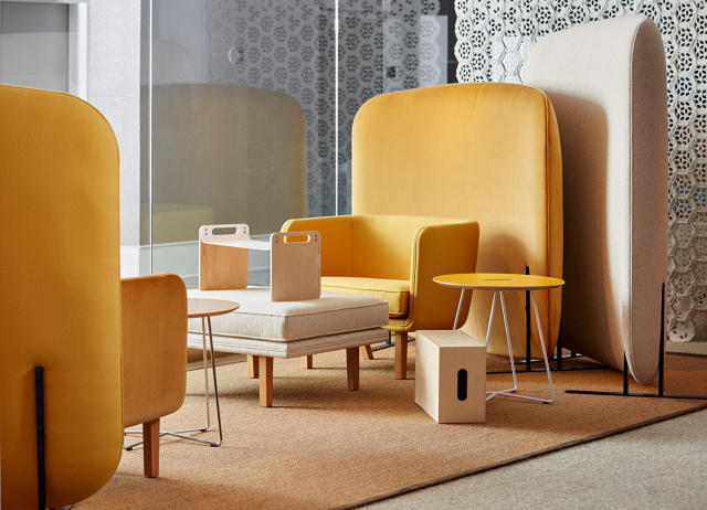
Every few years, Ikea releases its limited-edition PS Collection—a series of experimental products that aren't intended to supplant its perennial offerings, but rather to add a jolt of energy into its stores.
For its 2017 PS Collection, Ikea's designers chose a theme they call "Young Urban Life," delving into new material research, fabrication techniques, and product types.
Again, the PS Collections are never Ikea's bread and butter—the goal isn't to turn a profit. Rather, they represent forays and experiments that keep the furniture giant's product line from feeling stodgy. For example, a PS 17 side chair uses 3-D knitting—a technique developed by the footwear industry that's since been co-opted by the high-end furniture industry.
Looking for ways to use materials more efficiently—Ikea is notorious for its bad logging practices to quench its thirst for wood—the company also worked with one of its glass factories to remelt reject products that would ordinarily be thrown away, reusing the material for a handsome vase. Some of the more idiosyncratic products include a seating piece that looks like the love child of a Papasan chair and a rocker, a sofa that looks like it's composed of pillows, and a throw blanket that can be worn like a jacket.
For the practicality-minded set, there are still a few space-efficient pieces, like stackable storage bins, collapsible side tables that fold away when not in use, and arm chairs that join to become a love seat.
"Ikea is for the many, but the many are different," says Henrik Most Nielsen, a creative lead at the company who directed the 2014 PS Collection. (The creative lead behind the 2017 collection is James Futcher.) "We're trying to attract customers who think Ikea isn't at the front of design. We're moving from basics to embodying a strong personality and style."
So if the Swedish retailer has its way, you might walk into Ikea for a basic bookshelf and exit with a vibrantly festooned rug/jacket as well. Spy some of the prototypes in the slide show above in advance of the collection's full launch in February 2017.
A few years ago, you might have caught Ari Heckman and Jonathan Minkoff—cofounders of the New York–based design company ASH—loading up a station wagon with flea market finds to "stage" properties on the real estate market, a fairly common practice to furnish empty spaces to make them more enticing to potential buyers. Since then, the company has grown into a thriving company that specializes in both design and development, all while still sticking to its roots in the staging business.
Heckman and Minkoff founded ASH in 2008 on the heels of the financial crash, a risky time to start a business and an especially volatile time for the design and construction industry. However, through a few strategic decisions, big-name partnerships, and the core belief that it's better to keep it unexpected and interesting than stable and even-keeled, they've been able to parlay their brand of warm, minimal, organic design into hotels, private residences, rental properties, luxury condos, and even a vintage furniture boutique.
The total value of all ASH's development projects on the boards is more than $100 million—and that sum doesn't even include business generated from the design and staging side of the company. "If it's just 'let's focus on what we're good at'—that's so boring," Heckman says of the company's ethos. Here's how ASH evolved from its unlikely start into one of the most thoughtful and ambitious design businesses operating today.
Transitioning from a staging company to a multifaceted design brand didn't happen overnight. But the lessons from its early success continue to inform how ASH conceives of its brand. It's about maintaining a clear point of view—which is more of an outlook than a checklist of attributes.
Heckman and Minkoff met while working at Cayuga Capital Management, a Brooklyn-based developer. The two pondered how to break into the development business themselves, and simultaneously noticed that a lot of properties they were working on entered the market without their best foot forward. "They needed to be positioned somehow," Heckman says. "At the time, all of the staging companies were just going to Ikea or putting crap into an apartment. I thought, 'Why don't we just make this a little more point-of-view centric to the neighborhood and development?'"
Instead of shopping at box stores, they trekked to antique stores and flea markets and called upon their contacts in the art world to lend original pieces. Impressed with their work, the company asked them to stage another development. Word got around of their strategy, and Heckman and Minkoff decided to cast out on their own and began to get more clients. They worked their Rolodex and networked to get business and start partnerships. "It was a snowball gently rolling down a hill," Heckman says. "It gained traction. In so many ways, the staging and furniture-rental business started to finance the greater aspirations of the business at the beginning."
The mindset that Heckman established—which was to do something very specific to a project based on its location and context—informs everything that ASH does today. For example, the branding and concepting for its hotels are based on their respective city. The Dean, its first hotel in Providence, Rhode Island, wouldn't exist elsewhere. Honing a "signature style" isn't as important to ASH as creating a space that seems like it sits naturally within the urban fabric.
"With real estate, when someone sees one project that's done really well, then they're willing to give you work," says Will Cooper, ASH's creative director. "They say, 'We love what you did for them, can you do it for me?' We say, yes, but we're not going to recreate the same thing."
"We view design and development as the same thing in many ways," Heckman says. "It's not even opposite sides of the same coin; it's the same side of the same coin. We try to view design and commerce in a symbiotic relationship to one another rather than oppositional, which is too often how the world sees design and commerce or finance."
ASH is currently divided into five different divisions: design, development, hotels, staging, and products. Since ASH operates as both a designer and developer, the negotiations and compromises stay internal. It can better understand where the costs lie and allocate budget accordingly. For example, finishes and detailing are very important to ASH's design vision, and thanks to their business model, they can make all those decisions internally without having to justify the expense for custom fixtures or a specific design element to the client.
Cooper argues that this strategy allows the brand to exert more control over its identity and to ensure that the projects it executes are done so to their standards. "Design and development also go hand in hand in controlling the message and not diluting it," he says. "When you start looking outside for consulting—like if you hire an architect who hires a designer who hires someone else—you may not have that original vision come to fruition."
Additionally, this makes the company more financially sustainable. "When I began at ASH, there was a moment where one side of the business was supporting the other and it's flip flopped so many times since then," Cooper says. "That's the ethos of a big brand. When I worked at Ralph Lauren, the biggest secret to their business was the stores that everyone sees and the clothes that everyone sees don't make the money. The wholesale accounts and their outlets make so much money that it allows them to position themselves as this brand."
At ASH's inception during the financial crisis, Heckman and Minkoff saw many un-diversified businesses lose their financing sources and fail. Moreover, the timeline of architectural projects is typically long (two to three years is the average for ASH), so seeing any return on those projects takes time. Having shorter-term work in the pipeline ensures a constant revenue stream. "Because we do so many things—from staging to production to hotels to low-end apartments and high-end apartments—it's not recession proof, but it tries to accommodate the fact that markets change often and rapidly," Heckman says.
The way ASH is structured, one division feeds into another. For example, it produces furniture that it uses in its staging projects, which can then also go into its hotels. "It's a symbiotic relationship," Cooper says. "We don't design for the sake of designing; it's for a specific moment or project and that allows it to be more appropriate and have more gravitas instead of just making something out of thin air."
The Dean in Providence—a former strip club that ASH renovated into a boutique hotel—opened in 2014 and brought a lot of publicity for the company and has since become a calling card of sorts. "Part of the crazy reason why we got involved with hotels is they're sort of an ideal position for us, given our interest in development, design, and operations," Heckman says. "A hotel flexes all of those muscles more than anything else."
For the Dean, ASH mined Providence's history as an academic and design-minded town (RISD and Brown are near the hotel) and worked to revamp a derelict property into a type of destination hotel that the city didn't have before. In addition to 52 guest rooms, there's also a cafe, beer hall, and cocktail bar within the building. Rather than stripping the building down and making it feel entirely new, ASH retained historic design elements and inserted modern features where appropriate. It worked with a local fabricator to make the beds in each room, and handpicked antiques to adorn the spaces.
"We try to go to places where we can serve the market with something interesting that doesn't already exist," Heckman says of opening in Providence, which is also his hometown. "That's one of the reasons we've been hesitant to do a hotel project in New York. The city already has a plethora of options. You have your moment that fades as soon as the next one opens up, but when we open a hotel in Providence, Detroit, or New Orleans, we have real community impact and staying power."
Right now, ASH is working on redeveloping a church and rectory in New Orleans into a hotel, and it's also overhauling the Wurlitzer Building in Detroit. "We're cognizant of not being the big, bad New Yorkers coming into New Orleans to build our dream," Cooper says. "We're refurbishing these beautiful spots and making sure our food and beverage partners are of the community and have grown up there and are contributing to the rebirth of the city."
Heckman adds: "We try to elevate as many talented local makers, doers, artisans, food businesses, and incorporate them into the hotel. It really is a hotel for those cities, of those cities. It's not something that lands from Manhattan. . . . That's why we like adaptive reuse projects—it's taking something and turning it on its head and reinterpreting it. It's seeing what other people don't see."
As ASH continues to build its business, it's keeping an open mind as to how its brand evolves. It plans to expand the staging part of the company—what Heckman views as having the most predictable, sequential growth of all its divisions—to the West Coast and further build out its presence on the East Coast. Everything else is based on their gut feeling.
"People always ask, so how many hotels do you want to have open in five years?" Heckman says. "I don't know, maybe just the two more we're doing, maybe 50. It will depend on how we gauge the market and if we're still interested in it. We're not going to do projects to force them."
For ASH it's less about metrics and numbers than allowing things to grow organically. "From the beginning, it was about crafting a brand and a story and seeing where it goes," Cooper says. "As opportunities come, we take them or we don't take them and that contributes to what's on our plate. We can't be pinned down, which I like."
"I think it's just keep on keeping on," Heckman says. "People at ASH come to work because they are problem solvers and they enjoy the challenge of what we do. That to me is what's motivating. I'm lucky in that I can pay my bills and not be on the street, but I don't think we're looking to conquer the world. It's just taking it one day at a time."
There are myriad services that make designing a website very easy, like Squarespace, Adobe Portfolio, and Google's Material Design Lite. But Wix, the website builder with 85 million users, wants to go one step further than its competitors—with an artificially intelligent design service based on carefully honed machine learning models.
"How do you make something complex, like building a site, trivial for a user?" asks Nitzan Achsaf, the head of Wix Advanced Design Intelligence, or ADI. "When we talked to our users, we learned that the two main problems they faced are how to write great content and how to actually design a website so it looks beautiful."
The ADI technology works like a virtual graphic designer. Rather than offering cookie-cutter templates, it tailors the design through a series of prompts given to the user, while also pulling in information from the web. Since the user offers feedback as the design progresses, the finished product ends up being unique.
It's not completely automated, but it comes pretty close.
To build ADI, Wix's team of dozens of engineers and developers who specialize in AI developed many machine learning models for the many different layers of a web page, such as color, layout, and more. "It's trying to take the brain of a designer and make it into a machine," Achsaf says. "I'm calling it 'automagically' making a site."
The first step in the process was training the ADI system to understand what made a great site and what type of content—like text and images—and structure makes sense for any given profession. "Think of a lawyer versus a plumber versus an art director," Achsaf says. "Each one has different needs and wants a different look and feel."
To do this, Wix found enough visually stunning websites to train the models what a "good" site looks like. Then it mined the web, analyzing the best-performing sites for attributes like traffic and conversions. It then used those insights to form best practices that the AI system uses to create websites. Starting with visuals first then moving to metrics ensured that "ugly" sites with high traffic didn't skew the models.
Here's how the service works. First, you select your profession from a drop-down menu of more than 5,000 different jobs, everything from photographer to lawyer to beekeeper. Then you type in the name of your business and select its location and on the next screen. The ADI then uses that to gather information about you from the web and uses that to build the site. Though Achsaf declined to state precisely where the system is pulling information—"It's part of our secret sauce," he says—he did say that it comes from local databases and different social networks, and the system ranks the sources of information for quality and reliability.
The live demo I saw used an existing fitness business as fodder. The system mined a Google listing for reviews and basic contact information and input it into its website builder. Users can then augment the information. If you don't have an existing website, you can fill in everything from scratch.
Then, the ADI guides users through a series of prompts to create the site's look and feel. First, users can select from a series of "kits" built around adjectives—targeted to the professions—that describe the design sensibility. In the case of the personal training site, it was terms like "bold" and "agile." In another demo I saw for an architect's website, the terms were along the lines of "clean,""classic," and "minimal."
To create these "kits," the ADI analyzed the colors and fonts used on some of the best performing sites for each particular profession. A team of (human) designers then synthesized that into the kits. In essence, the system is creating a universal average of the best designs as a baseline. If some of these attributes are someone else's intellectual property, Wix purchases the licenses.
After users select the aesthetic that looks the most appealing, the ADI then serves up a checklist of what site functionality make the most sense, like an "about" page, a section to schedule a consultation, testimonials, and so on. "All these goodies are edited automatically for you," Achsaf says. After deciding what you want, the ADI presents the first few mock-ups. "It gives the user the type of information they should think about when they write their own bio," Achsaf says. "If the bio exists somewhere on the web, we're using that. If not, we're providing relevant info for you." (Wix's team actually spent a lot of time writing dummy copy for each of the 5,000 business types on the site.)
Based on the type of information you include, the ADI then tweaks the design. For example, if a section has a lot of text compared to another, it will reorganize the layout so it looks balanced. It will then ask you if you like it (or not). If you don't, it will offer another iteration. These visual standards for the ratio of text-to-images-to-blank space are based on the universal averages of Wix's machine learning model.
"The system knows how to edit options, how to make something that looks beautiful, how to change the layout dynamically, and how to offer you multiple layouts for the same content," Achsaf says. The templates that the ADI suggests are based on popular web design principles, like parallax scrolling and responsive design, to make sure the page looks good on desktop and mobile platforms.
To Achsaf, Wix ADI is about allowing more people to have better websites by making the design process easier to execute. "Better means that more people will be able to complete their websites, more users will love and be proud of what they have as their online presence," he says. "It means that they will be successful businesses. There's a tight correlation between a website that looks professional and beautiful to the ability to sell. If a website doesn't look good, you don't trust it. If you don't trust it, you don't buy the product or service."
Meanwhile, Wix argues that since there are billions of options in any web page design, the chances of two websites looking the same are like winning the lottery.
Automating design is a double-edged sword. It can give people polished websites with different colors, layouts, and copy; however, starting with a baseline of mathematical averages means that the model isn't doing anything truly "new" since it's learning from existing information. Most professional designers would likely say that a machine is no match for the human brain. Moreover, what's popular today in website design could easily feel tired in a few months. Still, for a small business that can't afford a professional graphic designer, Wix ADI could prove appealing.
It's free to create the site, but as with its other website services, Wix charges a monthly fee when you want to link it to a domain. ("It's between two and five Starbucks coffees a month," Achsaf says, so roughly around $15 depending on the features you have.) The service is still rolling out, but will be available to customers later this summer.
This month, Ikea released the annual Life at Home report. Now in its third year, the report helps Ikea develop new products, offering a tantalizing glimpse at designs that could shape the look and feel of our homes in the future.
To create the reports, Ikea conducts intensive research as it has done for years during the product development process. "We've been doing home visits for many, many years," Mikael Ydholm, head of research at Ikea, says. "We've focused very much on, what does it look like? What kinds of functionalities are in the home? How many meters of storage do people have? What do they store? How many pairs of jeans do they have? How do they fold the jeans?"
Such research offers valuable insights, but recently, Ikea began to realize that understanding what people have in their homes is only half the matter. The other part is how people actually use their homes. To achieve this level of understanding, researchers interviewed more than 12,000 people around the world and—because people aren't always forthcoming during interviews—installed (with permission, of course) time-lapse cameras in some homes to see what their day-to-day was really like.
For example, in one study not directly related to the Life at Home report, Ikea wanted to learn how people use their sofa. Most people reported that they use it to sit on and to entertain, but when Ikea reviewed the footage, the company found that people spent most of their time on a sofa lying down. In Asia, many people sat on the floor and used the sofa as a backrest—an insight Ikea wouldn't have learned otherwise.
These regional differences inform how the company develops some market-specific products, but the differences aren't as important as uncovering global trends, Ydholm says. "For us, it's always more interesting to look at the similarities among people," he says. "The reason for that is mainly because we always need to be cost-conscious and to be able to deliver a price that most people can afford. Therefore we need to have effectiveness and efficiency in the range."
For this year's report, Ikea focused on 12 cities: Berlin, London, Moscow, Mumbai, New York, Paris, Shanghai, Stockholm, Sydney, Toronto, Zurich, and Madrid. Here are seven of the many insights that Ikea gleaned from its 2016 study on what home means today.
In Ikea's survey, it found that 48% of respondents defined home as "where I have my most important relationships." Only 20% said it was a physical space.
The report included the following statement from Samuel D. Gosling, a professor living in Texas:
"What I think makes something a home are the psychological functions that it serves. It's a place where we can feel protected, a place where we can feel provided for, a place where we can feel loved, a place where we can feel connected to others. The things that make a house a home are the psychological senses, the emotional senses. That's what makes it a home."
This information could feed into Ikea's product development process and help the company create items and branding around facilitating interpersonal connections.
Part of the study focused on how our senses factor into how we experience our homes, like sight, hearing, touch, and smell. In the study, 18% of people said that they considered their homes to be too bright—a side effect of light pollution in urban environments. In Mumbai, 39% of people said that reducing ambient noise in their homes would improve their well-being. And 40% of people reported that their home had a distinct smell. This information could potentially feed into new products.
"I think we have totally underestimated the importance of senses in the home," Ydholm says. "When you think about it, it's kind of obvious, but I think we maybe haven't taken it so seriously."
One example Ydholm cites as an example of how senses can play into products is how they feel to the touch. For example, a table might appear to have a smooth surface in an image, but in real life it actually has a more textured feel, like that of an orange peel. "We need to look into this much, much more," Ydholm says. "Some materials feel cold, most people want a warm feeling around them. We have to think about the properties of materials not only when it comes to functionality, but also from a sensory viewpoint."
Legendary Braun designer Dieter Rams was famous for saying that good design is "less but better." That adage holds true, Ikea found, as many people in the survey appeared to be minimalists at heart. Eighteen- to 29-year-olds were more sensitive than other age groups to clutter, with 46% of respondents getting frustrated with clutter, and 36% of them getting into weekly arguments about it. People in the same age group, however, felt more sentimental about their things and placed more emotional value on them than older generations. In the report, Ikea says that it will use this information to pay more attention to the emotional meaning of products as opposed to just focusing on functionality.
Science has shown that we're better off spending money on experiences, not things. The same line of thinking applies to the products people choose to keep. Ikea found that 43% of people thought that things that enable them to do what they love are most important. The notion of products as "enablers" could prompt Ikea to produce more items that encourage interaction. This fall, Ikea plans to launch a bike. Last year, it developed a line of toys and costumes that rethought how kids play (though some of the toys were recalled). We may be more likely to see new products along those lines.
Around 32% of people in the survey said that it's more important to have reliable Wi-Fi in a home than a social space. In Shanghai, that figure jumped to 49%. The study points out that the television was once the focal point in a home (and before that the radio was), but now that's changing because of the rise of mobile devices.
Understanding how people use devices at home is an area that needs further exploration, the report says. However, it did note that "the idea of people watching TV with five people on the sofa is dead" due in part to the rise of tablets as a viewing medium. This could factor into the size and form of seating pieces.
In the study, 42% of people reported that they felt more at home outside of their actual residence, and 38% considered their neighborhood to be part of their home.
The rise of the sharing economy and more people are living under the same roof have led to an acute desire for privacy. A larger percentage of people said they'd like to have more privacy than more social space in their residences. If people had an extra hour to spare, 25% said they'd spend it alone.
The company views this as a friction between "me" and "we" spaces. "The "me" is all about recharging yourself—"a sanctuary, a place to rest, a place to engage in activities that are just about you," the report says. "The 'we' concerns activities with others—nurturing and building relationships, and spending time with family and friends." This dichotomy could materialize in multifunctional furniture that can be configured for individual and group use.
Every year, Ikea introduces around 2,500 new products to customers around the world. Working under the umbrella philosophy "Democratic Design," the company evaluates every single piece—from humble tea towels to elaborate kitchen systems—on its form, function, sustainability, quality, and price. One of its most ambitious products to date was announced last week: a sofa bed in collaboration with big-name British furniture designer Tom Dixon.
Inspired by the car and technology industries and made from extruded aluminum, the design is based on the notion that it's a platform that can change and mutate along with its owner. The sturdy frame—referred to as a chassis—is designed to be modular so that users could add components to customize the piece's configuration. One day it could be a bed. By clipping on a back and arm rest, it becomes a chaise longue; hitching on an additional backrest and arm turns it into sofa. Bridging another unit turns it into a sectional.
While the piece is still very much in progress and will evolve before its launch date in August 2017 (it doesn't even have an official name), we sat down with Dixon and Marcus Engman—Ikea's top design brass—at the company's headquarters in Älmhult, Sweden, to learn more about the sofa's development and its implications for the future of product innovation at the company. The thumbnail version: After years of exerting firm control over its designs, Ikea wants to start acting more like a software company.
But for Dixon, who's quipped about plans for global domination, it's a chapter in his ever-evolving career and fascination with all elements of design, from the actual creative process to exploring means of production.
"I'm interested in exploiting Ikea to my own ends," Dixon says. "People always try to put you in a box, like 'They're the people that do the fancy goods.' I'm doing luxury goods now. I never used to. I used to make things with my own hands and then I was the guy who made things out of rusty metal. You want to defy what people think you're supposed to be doing. Why should we be doing the same things?"
More to the point, Ikea offers Dixon the unprecedented chance to design at an unprecedented scale. Ikea has over 300 stores in 28 countries and generated more than $35 billion in sales last year.
"Ikea opens up a completely different opportunity, which is you can reach so many more people, which we're all interested in as designers," Dixon says. "You can be snobby about design and production, and you'll reach very few people. There's a big movement now for one-off pieces or limited editions, which is interesting in itself because it allows you to be more extravagant. But what this affords is an opportunity to get to the whole world. And if you're any good, then you'll have a massive, massive impact on how people live. And that's the extraordinary opportunity."
For Marcus Engman, Ikea's head of design since 2012, working with Dixon is symbolic of the brand's interest in shaking up its status quo of boxy birch furniture. Developing new products is "not about just doing just another thing," he says. "One of the strongest driving forces [at Ikea] is when you find things and you say, 'Is this really right? Do we keep on doing things like this?'"
The collaboration is also about the realities of designers competing in a global market. "The business has got to evolve and change," Dixon says. "It's dangerous for designers out there right now. We're going to be in a position where no one will want to pay for our services, just like in the music business or in journalism where there is no value to that unless you can change your model. In music, you become a performer rather than a recording artist. What does that mean for us as designers of small brands when there's actually a dominant force in furnishings, which is Ikea? Actually being part of that rather than outside is very fascinating for us."
Upholstered goods—like sofas and armchairs—is one product category that Engman believes is particularly due for an overhaul.
Sofas are among the most complex pieces of furniture both in construction and logistics. First there's a frame that supports enough springs and foam to keep you sitting nice and comfortable. This mix of materials makes it impossible to recycle. And because of its size and heft, shipping is expensive and difficult. Moreover, local tastes influence its overall form. In Italy, they tend to sit low to the ground. American sofas are big and plush. In Asia—as Ikea discovered in one of its studies—many people sit on the floor and use the sofa as a backrest.
"Sofas are often made to measure—it's a quite bespoke business actually," Dixon says. "I thought, we can't compete in that game so why don't we look at other possibilities? That was the initial departure point."
Another challenge with sofa beds is how they're approached. Typically, you start with a sofa then add a bed, which is usually flimsy and uncomfortable and feels like an afterthought. Dixon and Ikea wanted to reverse that: Why not start with a bed and turn it into a sofa?
When Ikea develops a new product—with or without a celebrity designer—it follows more or less the same process. A product development team ushers a design through conception, prototyping, and commercialization. Designers and technicians evaluate a piece for its form and robustness and how easily it can be shipped. At the same time, they're in conversation with people on the supply chain about where the product will be sourced and the fabrication capabilities of those factories—information that feeds into the design. Sustainability experts look at the overall impact of the product, and commercialization specialists think about positioning the product and how well it will sell, which informs how many units Ikea produces.
Since the sofa bed is in its nascent stages, much of the work so far has been in devising the initial design and concept. In rethinking how sofa design and manufacturing could be updated for the 21st century, Dixon and Engman looked to two industries that have evolved remarkably well with the times: automotive and tech.
In automotive design, it's common to build different models using the same chassis. Toyota (a budget brand) and Lexus (a luxury outfit) share the same platform, for example. In technology, you develop a program that you constantly upgrade. Dixon and Ikea took those notions and spun them into the basis for the sofa: an open-source platform that individuals could modify at will.
The frame is extruded aluminum, meaning that it has lots of slots and cavities. The extrusion has a lip that goes around the perimeter and allows you to slot things in without needing any tools. Some of the slots have the circumference of a bolt that would allow you to affix something—like a tabletop or lamp—to the frame.
"We can build a lot of properties into the extrusion," Dixon says. "Then we had this idea for the future that it's not just an Ikea product. Maybe it's actually this chassis as an open platform and people can use it for different reasons."
"Open-source thinking is one of the things that I believe will affect a lot the way we do things," Engman says. "When we look at mass production and what's 'good,' the measurements of quality are set by engineers. It's very much that everything should be exactly the same. But what if that's not the goal? Is [an experiment] 'wrong' but in the right way? That's how the software industry works and how they develop."
In the past Ikea resisted hacks to its designs, threatening legal action against a website that shared ideas on how to customize its bland pieces. Now, the company is firmly embracing the notion.
"If we do this platform, you could turn that into a different type of sofa if you wanted to," Engman says. "You buy the platform from Ikea and the upholstery from somewhere else."
For Dixon, having a flexible, easy-to-adapt line makes sense. "What we want is something that will sell in volume, so we want something that's relatively conventional," he says. "But it can mutate into something more space age or hotel-oriented depending on what someone wants to put on top." For example, a user could easily outfit the frame with custom upholstery or design their own seat backs and add-ons. Part of the motivation for customizability isn't just to appeal to a broad set of consumers; it's also extending the product's useful life.
"It's got a solidity to it, it sits comfortably in the Ikea world, but it could happily sit in a hotel, contract, or more military scenario," Dixon says. "There's something interesting about its neutrality."
This way of thinking is emblematic of the type of change Dixon would like to see in the furniture industry. "It's not about my company, it's not about Ikea," he says. "It's about something we can do which engages more people—whether it's students or companies—creating apps for our platform."
Because the sofa is made from aluminum—a material that's available and manufacturable all over the world—the design is well-suited for mass production. Ikea always looks at the entire supply chain when it develops a product to find the least expensive suppliers. As of now, Ikea is investigating a manufacturer in Sweden that fabricates parts for automotive companies like Volvo and Scania. Since the sofa's substructure is a kit of parts—as opposed to a monolithic sofa—it's easier to ship, which makes it cost-effective. "The logistical costs are rising more than material costs," Engman says.
Additionally, the sofa's metal framework plays into Ikea's ambitions to enter into global markets. One of the newest is India, which will receive its first Ikea store in 2017. "It's brilliant for India where it's humid and where we can't use a lot of wood," Engman says. (Wood is temperamental in humid climates and warps from moisture in the air.) Moreover, Ikea researchers learned in its home visits that's its normal to wet clean floors multiple times per day because of dust accumulation that's a byproduct of air pollution. This also means that Ikea needs to use water-resistant materials on pieces that touch the floor, like a sofa. Aluminum—a rust-proof metal—is ideal.
For Engman, the motivation to sink so much research and development into a sofa might also have some roots in his personal history. His father developed the Klippan sofa in the 1970s and it has become one of the brand's perennial best sellers. During a press conference about the Dixon collaboration, he alluded to a desire for this new design to eventually eclipse the classic piece in sales and popularity. And—like father, like son—perhaps some day it will. "The only thing you should hold onto is your ability to change," Engman says.
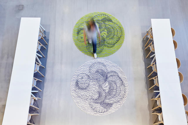
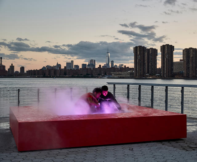
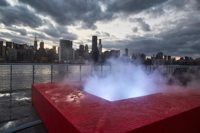
This summer, visitors to Hunter's Point South Park—a relatively new waterfront park in Queens—might spy plumes of pink and blue mist rising from a concrete cube. This piece is called Meridian (Gold), a new installation by artist Mika Tajima. Commissioned by the Sculpture Center, the piece is, in essence, a large-scale vaporizer that visualizes data through its prismatic puffs. Yes, vaping has infiltrated the art world—literally.
In her work, Tajima, who is based in Brooklyn, explores how we perceive and experience the world around us through design and technology. When the Sculpture Center invited her to create the installation, she looked for ways to create a physical space that would encourage contemplation about what's happening in our world today culturally. She envisioned a large-scale sculpture that was also a data visualization tool that could quantify our cultural sentiments. The metric she chose? The value of gold.
There's an undeniable irresistibility to gold and all its flashy, bling-bling glory. It's a symbol of excess and luxury, one of the most coveted metals, and a monetary unit of measure (aka the "gold standard"). But for Tajima, gold, particularly its price fluctuations, is a barometer for our collective confidence and insecurity.
"Gold captures the worldwide sentiment about the state of things," Tajima says. "It's a unique commodity that's untethered from other commodities for which supply and demand dictates price; things like a natural disaster or war affect gold prices. When people feel uncertain, they turn to gold as if it's a steady, safe place [to invest]."
The square-shaped piece measures 12 feet on each side and has a sunken pit in the center. Though it's fabricated from concrete and teak, the material du jour is actually light. Tajima compares the piece to a Jacuzzi—but instead of circulating hot frothy water, it has a complex vaporizing system that creates a plume of mist, which is illuminated by LED lights that fluctuate between pink and blue depending on the price.
To achieve the color shifts—which end up turning the vapor into a prismatic gradient—Tajima worked with a computational linguistics programmer to create an algorithm that translates the changes in gold prices into something tangible. Because the price changes can be very small—sometimes just fractions of a cent—and because they're constantly changing, they experimented with calculations that would accurately reflect the data but would also produce something visible. Every two seconds, the algorithm averages the percentage change in price. When the figure rises, the program communicates over Wi-Fi to the LED bulbs to shine magenta; when the figure drops it tells the bulbs to shine blue. The more dramatic the percentage change, the more saturated and intense the color. Viewers typically see changes every 15 seconds, which could be subtle or extreme depending on what's happening.
"Using light and technology was a natural evolution of exploring how architecture works," Tajima says of the piece. "Light is a basic element and an architectural device that creates an environment. The technology aspect is something we're all experiencing in our daily lives.
The way Tajima sees it, we're constantly negotiating between physical and virtual space, the material and the dematerialized. "It was a joke in the beginning that there's a parallel metaphor, which is the idea of e-cigarettes and vaping, which is another way of inhaling some kind of substance—it's not exactly smoking," she says. "In the initial proposal, was thinking about that. In the age of email and vaping, this is a new kind of sculpture that's doing a similar thing in a weird mediated experience."
Beyond finding clever ways to express what's happening culturally, Tajima also wanted to explore what it means to make a contemporary public sculpture. To her, it was less about a hulking monolith that one looks at than building a communal space for interaction and a stage for introspection and contemplation.
"The piece is sited right across from Midtown," she says. "In my mind, I see this fog mist that's the dissipation of the commodity price of gold, but it also obscures our vision of this financial capital. Maybe people will escape the quantification of our lives and talk to the person in front of them."
Do expensive amenities like great food and game rooms really attract the best employees? That's been the conventional wisdom for the past decade. But more and more offices are rethinking what the most meaningful perks are—doing away with cafeterias for more vacation time, for example.
While some argue that unlocking engagement from millennial workers lies in playground-like offices, CityLab highlights a new survey that says that it's peace and quiet that's the real key. Carried out by Oxford Economics (a spin-off organization of Oxford University), the results revealed that uninterrupted work time was at the top of most of the 1,200 respondents' wish lists. Meanwhile, none said that free food was the most important.
Surprisingly, the study revealed that millennial workers were the most vocal about noise complaints: 74% of people surveyed worked in open offices—a once-popular design strategy that's seeing more and more backlash. Because of the rising cost of real estate, it's unlikely that we'll all receive private offices anytime soon, but there are some design strategies that can mitigate noise and distractions to help people concentrate and get more work done. We share 10 ideas below, ranging from larger interventions to quick fixes.
The Zones furniture collection by Teknion includes a high-backed settee to help eliminate visual distractions.
"The most important thing to remember about sound is that it is relative," Robert Benson, a principal and design leader at the global architecture firm CannonDesign says. "Reducing sound may actually make the 'noise' worse. Imagine sitting in a charming cafe. Twenty people chatting about their day and you are able to read a book because the sound is even. There is a nice din that becomes background allowing you to focus. Now imagine that there is only one other table occupied in the cafe. The conversation at that table is really the only sound being made in the space. You hear every word, and it is as if they are chatting inside your head. The go-to strategy is to match the energy in the workspace. Open meeting areas should be adjacent to circulation or other sound-producing areas. Gather quieter spaces near each other."
"Providing spaces for concentration is easy—just don't expect a workstation to do it," Benson says. "The challenge now and tomorrow is maintaining the right level of energy. Walking into a deadly quiet workspace is not inspiring. More and more people want to be part of a team that is collaborating. They want to see activity. They want to see the mission of the organization happen."
Steelseries
The furniture company Steelcase and writer Susan Cain collaborated on these workspaces (also shown above) that offer communal semi-private space that's still visually connected to the rest of the office. In renovating its HQ in Minnesota, 3M is dedicating communal spaces for either quiet work or conversational, collaborative work to help control activity and noise.
"Allowing users in a workspace to relocate—or flow—to spaces that suit their needs, at that moment, increases productivity and satisfaction in the workplace," Benson says. "Secondly understanding the type of work happening throughout the workforce is critical. Quiet zones, similar to that deployed on commuter rails, are becoming more and more popular."
Knoll
Rockwell Group and Knoll recently collaborated on a collection of more than 30 different office furnishings, which were conceived as stage set-style pieces that offices could pick and choose from to create flexible work areas that make the most sense for their specific needs. For example, a modular wall panel system offers the ability to create semi-private rooms within an open office and movable sound-absorbing privacy screens—like the ones shown above—offer diversity to an office's layout.
Yammering on the horn is a necessity for many jobs, yet there are few things more annoying than hearing one side of the conversation from a loud talker.
Framery Acoustics
"When we first started designing office spaces, we would focus on bare minimum needs: a few break-out spaces, conference rooms, and smaller break-out rooms," says Shelly Lynch-Sparks, head of commercial design at the interior design agency Homepolish. "Now we are installing more phone rooms." She recommends freestanding, acoustically insulated booths from Framery. If those are too bulky for an office, Lynch-Sparks also recommends the wall-mounted Buzzihood to help muffle sound from phone calls.
"Furniture solutions are a great, cost-effective way to provide acoustical and visual privacy in an open-office environment," says Jeannette Peruchini, interior design associate director at Skidmore, Owings & Merrill. "I recently used rotating acoustical blinds by BuzziBlinds as a way to absorb sound and provide visual privacy in an existing office space. Steelcase's Brody Worklounge has also been a client favorite. It provides workers a place to get away while still being in the office."
The Swedish brand Glimarka makes handsome workstations and storage cabinets covered with plush acoustic panels, which help absorb sound.
For both visual and acoustic separation, Layer—an industrial design firm fronted by Benjamin Hubert—designed modular acoustic panels for the textile brand Woven Image that clip together like a honeycomb. The system is freestanding so it doesn't involve intensive installation, and can be moved if needed and easily expanded.
The Italian furniture company Arper recently released the freestanding Parentesit wall system by the design firm Lievore Altherr Molina, which is inspired by Japanese architecture. The wall assemblies are modular, so users can customize their size and configuration.
Marco Covi
"For new build-out projects, I like Arktura's Ceiling Systems," Peruchini says. "They have a variety of standard panel options, or they can be customized to fit a client's needs. The options are endless."
If the barrage of a noisy office is too much, how about a restorative nap? The company MetroNaps makes Space Age pods that allow employees to nab 40 winks comfortably.
While freestanding wall systems might work for offices with room to spare, the reality is that most are crunched for space. A student at Lund University developed a clever solution: a lamp with an enormous shade that's set on a hinge so users can angle it to block their field of vision.
Umbrella by Malin Yngvesson via Lund University School of Industrial Design
If your office isn't going to invest in a renovation or new furniture anytime soon, there are always headphones. A word of advice: spring for noise canceling.
When I was in elementary school, one of my teachers joked that she had eyes in the back of her head—a warning to us that there would be no shenanigans when she wasn't looking. Turns out that the National Highway Traffic Safety Administration (NHTSA) thinks everyone should have eyes in the back of their heads: Its 2014 mandate that all vehicles sold after May 2018 must be equipped with rearview cameras is soon to come into effect.
The mandate will make new cars safer (an estimated 210 people are killed and 15,000 are injured every year by cars moving in reverse). But what about the millions of other cars on the market?
Bryson Gardner, Joseph Fisher, and Brian Sander—three engineers who met while working at Apple in the iPod department—saw a need and opportunity to provide an elegant and easy-to-install backup camera on all of those other cars, so they cofounded the company Pearl. Their first product? A stealthy wireless camera that hitches to your license plate holder for $500.
As Gardner and his cofounders see it, the automotive industry is incredibly slow to bring the latest technology en masse to consumers because its takes a while to deploy new models; the development cycle for cars is years, not months like with tech. Moreover, with the rate of old vehicle retirement and new cars hitting the streets—the U.S. Department of Transportation estimates the average age of vehicles in operation is 11.4 years—only 7% of vehicles on the road at any given moment are new. This means only a small fraction of drivers overall have access to the newest innovations, whether they're for convenience or safety.
"We believe that a car that comes off the production line should be fundamentally different from when it's retired," Gardner says of the way he views after-market additions to vehicles. It's a product to constantly upgrade, not set and forget. "This is a step function to an autonomous car."
Made from painted die-cast aluminum alloy—chosen for its durability and all-weather resistance—Pearl looks like almost like a regular license plate holder, except that it has two small cameras and a strip of solar panels (so you never have to worry about recharging the batteries) integrated with the body. It screws into place with a special tool to prevent theft. The camera uses your phone as a display—meaning you don't have to install an additional screen in your dashboard. The camera communicates with your phone wirelessly via an adapter.
Pearl's cameras have a 180-degree field of vision, more than the NHTSA's mandated 130-degree field. To come up with the UX, the company enlisted an expert who helped develop Apple's CarPlay platform. "It's like having another set of eyes guiding you," Gardner says. "How much we could mimic that drove the product's behavior."
On the app interface, users tap the screen to pan the camera up, down, and side to side. If the system detects something that's about to move behind your car—like a pedestrian, biker, or another car—but isn't quite in the field of vision, it sends an audible ping and a visual alert that looks like sonar ripples across the screen.
Getting people who aren't used to checking a back-up camera accustomed to looking at Pearl's app will be a hurdle. To make it easier, the company designed a phone mount. On Android phones, the app automatically opens when your car turns on; however, due to Apple's restrictions it's via push notification. Video launches as soon as you open the app and once you hit 10 mph, the app returns to the launch screen.
What Pearl shows is that an effective copilot can be had in the smartphones most of us already have in our pockets—no need for a complex platform like Apple CarPlay or Android Auto. In terms of extra features, Pearl doesn't have parallel parking assist, and the company is hoping that the ease of installation and relative affordability compared to dealer-installed backup cameras (Gardner estimates that the average price for the hardware and installation is more than $1,000) is enough to convince customers of Pearl's utility.
Now, for $500, we can all have an extra set of eyes behind us, even if you didn't buy a car with all the bells and whistles out of the gate. Pearl is available for preorder now and shipping is expected in September.
Before sous vide machines migrated from fine dining to domestic domains, before Keurigs and "The Keurig of Xs" began cluttering countertops, and before we started pulverizing food into a textureless slurry, there was one piece of culinary tech that took America by storm: the humble crock pot.
When Irving Naxon introduced the electric slow cooker to the market in the 1950s, it was touted as a liberating device that allowed women to prepare food in the morning, leave for work during the day, and still have a plate of hot food ready in the evening. In the 1970s, it was championed as an an efficient cooking method in the wake of the energy crisis. Today, we often associate it with vast amounts of food that, while tasty, all comes out to have the same mushy, amalgamated consistency.
Companies have tried to update the slow cooker for the IoT era (but who needs to control one from an app? the point is you don't need to manage it once it gets going...) without much consideration to the role the appliance plays or what people want to get out of a modernized, app-fueled version of the kitchen gadget.
Enter Oliver, a new slow cooker engineered by the San Francisco design consultancy Matter. The product is two-fold: a sleek, compact countertop appliance and an app.
The product's inventor, Khalid Aboujassoum, came up with the idea and presented it on Stars of Science (kind of like Qatar's version of Shark Tank). The prototype was rough, but set forth the core proposition: a device with multiple chambers that releases the ingredients into a cooker to ensure meats, veggies, and grains all come out at the optimal texture.
"They had this prototype that looked like a piece of machinery," Adam Leonards, a creative director at Matter, says. "If you talked to another industrial design firm, it would be about making it look prettier. We started to look at what does cooking mean? What are the paradigms people have for cooking?"
Judging from the slew of cooking documentaries coming from Netflix, the rise of celebrity chefs who are outright lifestyle brands, and the popularity of the Food Network, we're all becoming more adventurous in the kitchen, a fact reinforced by our insatiable hunger for exotic hot sauces. Matter looked at the trends and saw that the type of person who would be most interested in an automatic cooker is someone who likely lives in a city and leads a busy life. Moreover, that person wants to eat food that's healthy, that tastes as good as what you'd find at a restaurant, and nearly as easy to use as calling for take-out.
"I think there's a broader general movement, especially in Western cultures, to be more connected to the food we put into our bodies as well as in the cultural part of sharing a meal with friends and family," Max Burton, Matter's founder and chief designer, says. "People want those things, but they don't want to loose the convenience. They also don't want it to be difficult and challenging. It's a fine line this product resolves."
There's also the challenge of recipe discovery. While there's plenty of food porn out there on blogs, finding the right recipe and executing it well can be problematic.
Using Oliver starts and ends with its app. First, you search through its recipe database which features cuisines from all around the world. Once you settle on a dish, the app tells you what ingredients you should buy and how to cut and chop them before placing them into one of the appliance's six canisters. You then place the canisters into their respective loading areas. Keeping ingredients separate until it's time to cook them is important. A potato doesn't have the same cooking time as chicken, for example, so the machine knows when to drop everything into the main cooking unit.
The canister tray fits over the pot just like a lid—a conscious decision to make the experience as close to using a traditional pot as possible. The pot, which has an internal stirring mechanism, then sits over the warming element. There are no controls on the pot, just a backlit LED countdown clock that disappears when it's off—a detail pulled from the Nike Fuelband that helps to keep the product clean and simple and to avoid looking outdated over time.
Inventing a new kitchen gadget with staying power is somewhat challenging, especially in the Marie Kondo era of limiting what we own to the essentials. With a cast iron pan and a chef's knife you can make just about anything. And how many of us regularly pull out blenders and food processors anyway? That said, every chef has his dream gadget.
"A lot of people put off making new meals because they don't have the time or patience to learn how," Burton says. "This opens up the door. Through the app, you can explore the world."
That's a proposition your potato peeler won't be making anytime soon.
Apartments aren't getting any bigger and, as a recent report from Ikea reveals, dwellings filled with space-hogging clutter are turning us into neurotic minimalists. The solution? Furnishings that let us do more with much less.
The Hungarian design brand Hannabi—which has its roots as a bespoke sofa maker—just released a clever fleet of furniture called Urban Nomad that fits the bill. Tables, cushions, trays, and seating elements comprise the collection, and they're designed to have measurements that make them reconfigurable depending on what you desire. Moreover, since the pieces are relatively small, there's no need to resort to acrobatics when moving.
The meatiest piece in the furniture landscape is the Urban Nomad Combination, a sofa that pulls apart to become two beds. Pyramid-shaped movable backrests can turn the sofa into a chaise or you can use them as armrests or on the floor to accommodate guests. Hannabi created a pair of low tables; the smaller of the two has the same depth as the seating cushions so you can stack them if needed. Think of the entire series as a Leatherman or Swiss Army knife—the multi-functional pieces can be adapted to become the right tool for the job. Never melt down at Ikea again.
Find the Urban Nomad collection shop.hannabisofa.hu. Prices range from about $70 for a tray to $2,500 for the sofa.
Today you're likely to see the same sanitized strip malls and generic motels along most of America's interstate system, but decades ago, highways would sport all sorts of local flavors. The structures were often garishly eye-catching (gotta find some way to compel passersby to stop!) or unfortunately heinous: Buildings shaped like chocolate doughnuts, Shell gas stations that were literal shells, drive-ins with a towering statue of King Kong as a backdrop, motels shaped like tipis.
These buildings were campy, whimsical, and mundane—and photographer John Margolies, who passed away on May 26 at the age of 79, relished it all. For decades, Margolies zigzagged across the United States, often in a rented Cadillac, photographing obscure places along the way, as the New York Times reported in his obituary.
"I liked places where everything was screaming for attention: 'Look at me. Look at me,'"he told the Washington Post.
On Twitter, critic and historian Paul Goldberger remembered Margolies as one who "taught a lot of us to take silly architecture seriously."
John Margolies/Library of Congress via the New York Times
Margolies became interested in architecture as a child and eventually studied the subject, along with journalism, at the University of Pennsylvania. After working as an assistant editor at Architectural Record from 1964 to 1968, Margolies then became coordinator of experimental programs at the American Federation of Arts and went on to publish more than 10 books on subjects ranging from gas station architecture to miniature golf courses, movie theaters, and main streets. The focus was on the unsung, everyday structures done up in the regional style—not capital-A architecture.
In doing so, Margolies opened up the stuffy establishment to looking at vernacular structures critically, a notion that postmodern architects such as Robert Venturi and Denise Scott Brown would develop further in their writings.
In the forward to Margolies's book The End of the Road, which chronicled roadside architecture, the influential architect and historian Philip Johnson (who helped fund some of Margolies's scouting trips) wrote: "This is a forgotten portion of the great American architectural heritage, and John Margolies is perhaps the leading historian in this field. . . . It is vital for us . . . to see America through his eyes."
Spy a few of Margolies's photographs in the slide show above.
The stovetop moka pot is a classic method for brewing coffee. A design dating to the 1930s, it's a staple of kitchens all over Italy and, according to Daniel Debiasi and Federico Sandri of Something Design, it makes the best cup of coffee. But it isn't the world's most beautiful coffee maker.
Working with the Danish housewares brand Stelton, Debasi and Sandri created the Collar collection, a gorgeous revamp of the moka pot that includes an espresso maker (which works on gas and electric stoves), a milk jug, sugar bowl, and bean grinder.
In typical Scandinavian fashion, the silhouettes are restrained. Thanks to its matte-black finish and minimal silhouette, it's more Scandinavian cool than the flashy Italian Deco of the original metallic moka pot. However, the three-chamber internal design remains the same. Water is placed in the bottom and coffee in the center. When the water heats up, it flows through the grounds into the top chamber. Oak handles and a brass grinder round out the material detailing. It'll make design-minded coffee snobs swoon—and hopefully will be the nail in the coffin for any unsightly Mr. Coffee machines of Keurigs that might be lurking in your kitchen.
Find the Collar collection on stelton.com in September; prices range from $45 to $85 per piece.
To some, calling a design "cute" might seem like a sly, backhanded compliment. Yes, it's nice to look at, but cuteness isn't typically taken seriously. Hello Kitty is cute. Lisa Frank is cute. They're successful brands, but are they capital-D design? Hyerim Shin, a designer who recently graduated from the Royal College of Art, reckons so.
Shin argues that cuteness—a concept known as "Kawaii" in Japan—hasn't been explored to its full potential so she created a line of small appliances, called "Be My Mother," that demonstrate how it can contribute to the longevity of a product.
"As cuteness is a subclass of other aesthetic categories, there is less public interest and understanding for it in comparison to other visual attributes," she says. "In my work, I discover the value of cuteness and try to awaken an interest in and understanding of cuteness in others. I want to impress designers with the power of cuteness."
To Shin, cuteness is defined by the characteristics of tiny creatures, both behaviorally and in how they look. Her interactive products exhibit some of these traits. First off, the appliances have curved silhouettes—think the chubby cheeks of a baby, not the hard-angled jaws of adulthood—and are painted with glossy pastel hues. A toaster starts to make a sneezing sound when it's time to clean out crumbs and makes the sound again when users pull a lever to expel crumbs. A waste bin inspired by kids' games like hide-and-seek and peek-a-boo moves to the side and turns around when it's full, letting users know when it's time to take out the trash. A robot vacuum cleaner—essentially a Roomba—wiggles its silicone dust canister and "poops" it out when the canister is full.
"The products I designed for Be My Mother need continuous maintenance," Shin says. "Research shows that cuteness appeals to our 'gut instinct of caring.' Enabling consumers to project care onto the product thus compels them to care for them long-term. These products encourage maintenance without feeling like a chore."
While the attributes of babies inspired Shin's designs, other research has shown that while cute babies make us more caring, cute products make us more self indulgent—it's a treat yourself mentality validated through objects. Cute things are more fun to have than boring, functionality-driven items with no panache. That said, Shin believes that the more you take care of something, the more affection you gain for the object which in turn will make it harder to throw away. "That is emotionally durable design for the products," she says.
In the Marie Kondo era of only keeping products that bring us joy, Shin's argument is compelling. Kids bring parents joy. But how many diaper changes does it take before a pooping baby loses his charm? Being forever young has its appeal, but so does growing up and being able to take care of yourself. A vacuum that empties its dust and takes it directly to the trash is a product I would get behind.
For 13 years now, the AIA has reserved a special recognition for projects that do a lot with a little, whether it's cash or space. This year, it's bestowed honors on a reading nook in a public library, a roving dental studio, and a remote cabin, among others. In an era of finite resources, these designs show how efficiency breeds clever design.
The AIA's definition of "small" varies and it gives a lot of leeway to the project type—it can be a structure, an object, or a work of environmental art—but it sets strict budgetary constraints. The first category includes projects that cost no more than $150,000. For example, the AIA lauded Substance Architecture's shade-providing parklet that was made from salvaged materials for $900. Another winner in the category? The crowdfunded floating wa_sauna by goCstudio, which Co.Design covered this spring. To keep costs down—the Kickstarter campaign raised $43,000 for the project—the designers worked in a donated studio and enlisted the help of volunteers to fabricate the design—a move that shows how architecture can be a vehicle to build community.
Though scrappy projects are in the mix in the second category too, it applies to projects with a budget of no more than $1.5 million—a relatively hefty sum, but one that that AIA calls "limited" in comparison to many projects with budgets running into the tens if not hundreds of millions of dollars. (Surely they're talking large-scale commercial or institutional buildings and not an obscene housing bubble, right?) In this category are a modern chapel and prayer garden in New Orleans by Eskew+Dumez+Ripple and Girl Scout cabins located just outside of Kansas City, Missouri, by El Dorado.
Scope the winners below and in the slide show above.
Designed for the "Teen Zone" in the East Liberty Branch of the Carnegie Library of Pittsburgh, the Studio Hive is meant to be a collaborative space for studying, designing, crafting, and reading. After the space's construction, the library saw a 350% increase in teen visitors.
To provide Des Moines denizens with some relief from the blistering sun, Substance Architecture designed these inexpensive parklets to be deployed throughout the city. The total cost for one is just $900, making the structure highly replaceable.
Clad in weather-resistant prismatic corrugated metal, these bunkhouses offer flex space, sleeping quarters, showers, and dining areas for Girl Scouts at a camp that focuses on STEM education and confidence building.
Visit a Seattle lake and you may spy this floating sauna built from a prefab frame system and clad in charred wood. Paid for with crowdfunding, the sauna can be docked like a houseboat and a motor makes it mobile.
To make the most of this cabin's sylvan site, Johnsen Schmaling Architects split the building into three compact boxes that frame the surrounding landscape. Knotty pine clads the cozy interior.
St. Pius Chapel & Prayer Garden; New Orleans, Louisiana
by Eskew+Dumez+Ripple
St. Pius Chapel & Prayer GardenWill Crocker
An addition to a 1960s church, this chapel sports a Spartan look to keep the focus squarely on contemplation. Studio Dental; San Francisco, California
by Montalba Architects, Inc.
Studio Dental
Most people hate going to the dentist, but what if the dentist came to you? This 230-square-foot trailer is a fully equipped dental clinic made possible by clever storage elements.
Built in Burundi—a country in East Africa near Rwanda—this 6,000-square-foot dormitory for medical staff is off the grid. Ample use of porches offer outdoor social space and help to passively cool the rooms.
Designed for pop-up Christmas markets, these stalls require under $300 worth of materials each. Polycarbonate shells protect the interior from the elements while allowing daylight to shine through.
In a statement, Martin Nesbitt, chairman of the Obama Foundation, wrote: "Tod Williams Billie Tsien Architects | Partners stood out in their commitment to exploring, together with the Foundation, the best ways of creating an innovative center for action that inspires communities and individuals to take on our biggest challenges. Interactive Design Architects brings local knowledge and a track record for delivering excellence to large, complex civic projects."
WASHINGTON, DC - JULY 28: U.S. President Barack Obama (R) presents the 2013 National Medal of Arts to Architect Billie Tsien (L) and Tod Williams (2nd L) during an East Room ceremony July 28, 2014 at the White House in Washington, DC. Tsien and Williams were honored for their contributions to architecture and arts education. Alex Wong/Getty Images
The Obama Presidential Center isn't just an homage to his eight years in office; rather it aspires to be a cultural hub that hosts lectures and events, offers green space for the public, provides educational programming, and healthy food. The Obama Presidential Center will be built in Chicago's South Side. The foundation is still deciding between two proposed sites, Jackson Park and Washington Park.
In choosing TWBTA, which the Obama Foundation lauded for its "incredible commitment to scale, craft and materiality," the president is picking a firm whose progressive reputation in the architecture profession matches Obama's forward-thinking administration. TWBTA earned a 2013 National Medal of Arts from Obama and is best known for designing The Barnes Foundation in Philadelphia; the Reva and David Logan Center for the Arts at the University of Chicago; and the Folk Art Museum in New York, which the Museum of Modern Art is tearing down to to make room for its own expansion, designed by TWBTA's competitor for the library, Diller Scofidio + Renfro.
IDEA is a women-owned architectural practice and its president, Dina Griffin, grew up on the South Side of Chicago and was formerly president of the National Organization of Minority Architects. To the project, she brings invaluable local knowledge. Her firm's recent work includes the modern wing of the Art Institute of Chicago and the Eckhardt Research Center.
The President, First Lady, and Foundation were impressed with TWBTA and IDEA's proposal, which "carefully balances the historic Frederick Law Olmsted and Calbert Vaux setting, Chicago's history, and the neighborhood's potential," Nesbitt says.
"TWBTA's architecture could be described as thoughtful, dignified, beautiful, and understated and those are are all qualities that can be said to characterize much of the Obama presidency," architecture critic Paul Goldberger, who served as an advisor to the Obama Foundation, says in a conference call. "Hopefully they'll be translated into a building and expressed some way in architectural form. But the building will have to speak for itself."
The recent process was conceived as more of an ideas stage to select an architect, not a final design for the building, so tangible details are not available. "The real design process begins anew right now," Goldberger says.
Plenty of websites offer design inspiration, like Pinterest, Instagram, Houzz, and the thousands of blogs on the web. But most of them are fire hoses of information, lumping everything together—a nightmare if your tastes run modern. An homage to Liberace in a feed next to a Lautner? Preposterous.
Dwell—full disclosure, I was an editor at the magazine until mid 2015—has released a newly designed website that aims to be a one-stop discovery and collaboration platform for modern design fiends and professionals. Think of it as the lovechild of Pinterest, Medium, and Quora—but for serious design snobs.
"There are a ton of sites out there that provide great inspiration, like Instagram and Pinterest," says Bobby Gaza, Dwell's chief technology officer and an alum of Apple and Beats Music, where he was the senior vice president of engineering. "They're fantastic with that stuff, but for me it hasn't really connected with collaboration well—like what am I going to get out of the inspiration."
The new approach follows a sea change in the publishing industry, as readers look to social networks, not publishers' home pages, for news and information. Rather than try to chase news, a common editorial strategy that requires tremendous resources and has unreliable outcomes, Dwell wants to capitalize on what it's always done well: aspirational modern design.
The new site's public beta launched this weekend and the full rollout and accompanying iOS app are expected in early August. Instead of organizing the site like most editorial publishers around new stories or editor-chosen placements on a single home page, Gaza and his team—about 20 people, many of whom used to work with him at Apple and Beats—repositioned the site as a socially driven database of its more than 300,000 images that have surfaced for individual users based on what they like, whether it's user-generated content collections—think Pinterest pages—or the metadata attached to a specific image or story.
When users—whether people or companies—log on to the home page, they'll see a collection of images and stories under the banner of "Just for You." That content is a combination of items chosen by the site's machine-learning model and things that other people whom the user follows on Dwell.com has liked. ("Having the human touch involved is really important with any kind of social feed or interest feed that you're generating," Gaza says.)
Clicking into a story brings you to a page that's formatted a lot like Medium's editorial content: a big hero image, very legible text set against a white background, and no banner ads or distracting sidebars. Up top, there are options to add the story to one of your Dwell collections, "like" the post, and share—but only to Dwell, not to other social media platforms.
The real baseline of the site is at the image level, where users can annotate individual photos with product names, ask questions about what they see in the photos, and hopefully get an answer from fellow readers, the architects behind the project, or Dwell's editors and community managers. Additionally, users can publish their own content using Dwell's images along with their own uploads in the form of collections and blog posts. The site's search function gives users another layer of discovery to find things such as prefab houses, cabins, and homes that prominently feature a favorite material, such as concrete.
"We've really focused on annotating images and telling a story behind an image," Gaza says. "Anyone can create their own story in Dwell and write their own content." For those who have struggled to find the true context of a photograph on Pinterest or Tumblr, this could be great news, since the Dwell-uploaded images will be accompanied by editor-written captions and tags (which often include material and product callouts). It's also a plus for designers with clients who are hell-bent on getting a specific wallpaper or chair seen on a mood board. Dwell is hoping that its audience is knowledgeable enough to answer any questions readers might have about information not in the caption—though that does make it easier to spread misinformation and spam at a time when many publications are moving away from user comments.
Dwell, which is a privately owned company, began taking on investors in 2013 to beef up its digital presence. One of its more prominent investors is Dave Morin, a founder of Path and an early employee of Facebook who became involved with Dwell in early 2015. That may explain the company's motivations to become a kind of social network for architects, designers, clients, and design fans. Whether or not it can sustain its audience and get meaningful engagement in the era of Facebook dominance is the question.
According to its 2016 media kit, Dwell has a combined audience—mostly people in their late 30s and 40s with household incomes more than $100,000 per year—that's about 3.5 million strong across its print, web, live events, e-commerce, and real estate platforms. The website alone receives about 1.5 million unique visitors monthly.
When I ask about the competition, Gaza says, "There are some obvious ones that people will point to, like Houzz," but he's cautious not to draw parallels to Houzz or other companies. "We're coming at it more focused," he says. "We really want to provide a more focused community based on modern design and living and getting that connection between designers and architects."
The old Dwell.com earned revenue from banner ads—a traditional advertising model that Gaza and Dwell's publisher and CEO Michela O'Connor Abrams say has "rapidly declined in efficiency"—and sponsored content. The company argues that moving to a native advertising model makes for a less visually intrusive user experience that balances the emphasis on curation with transparency. Eventually it will also earn money through revenue sharing from product recommendations and click-throughs to purchases.
Over the years, Dwell—which launched its first issue in 2000—has expanded its repertoire beyond print into a series of platforms built around an audience of modern design enthusiasts, including trade shows, Dwell-branded prefab homes, a real estate company, and an e-commerce site. (The current revenue breakdown is 50% print, 30% digital, 10% events, and 10% licensing and research.) Perhaps the newly designed website will set the pace for the media brand's future, but it faces tough competition from popular sites like Facebook, Pinterest, and Houzz. Architizer attempted to build a social network for architecture and design professionals, but it didn't pan out so it shifted to a marketplace model. Dwell sees the key difference being that it's using social networking as a tool for engagement with its content and that it's for a much broader audience.
"A very simple lesson for us was to keep in mind that the Dwell community on all platforms has been the richest confluence of all trade professionals and design-savvy consumers, making a social network completely applicable where it would be less appealing in a pure trade environment," Gaza and O'Connor Abrams wrote by email. "The Dwell team has previously built community platforms for Apple, Beats Music, Yahoo!, CNET, and Whiskey Media. We recognize the incredible feat it takes to build a social network that resonates. While our platform definitely provides social features, that's not our final destination."
Dwell puts a lot of faith in its "design-passionate" community, but will they be interested in participating in another social network—and continue to participate when the novelty wears off?
Radiation therapy is physically and psychologically grueling. And because of the technology required, it often takes place in sterile, dim, underground spaces. But for its Radiation Oncology Center in Anaheim, California, the medical provider Kaiser Permanente ditched the institutional feel and tried to infuse spa-like touches where it could. This wasn't just about making patients feel comfortable. This was about helping improve medical outcomes.
To create the building, Kaiser Permanente enlisted Yazdani Studio, the experimental arm of global architecture firm CannonDesign. The studio's founder, Mehrdad Yazdani, worked closely with Carlos Amato, the Los Angeles health leader for CannonDesign and an architect with more than 25 years of experience designing for the health care industry.
Yazdani, who's known for injecting his projects with an artistic sensibility, first began to think about what the building should communicate to its users and how it should fit in with its surroundings. The 16,000-square-foot building is one part of a master plan for Kaiser Permanente's forthcoming medical school and campus that Yazdani Studio is also designing.
"I started thinking completely independent of functionality—what should this building be?" Yazdani says. "I began to draw and almost paint on my computer this notion of a beacon of hope, something that was light, somewhat ethereal, and something that was distinguished but at the same time gave the patient and their family a level of comfort."
To achieve this, Yazdani Studio made virtually every space within the center a room with a landscape view. "The plan is the result of keeping the cancer patient and their emotions and experiences front and center and then designing around that reality," Amato says. "Harnessing natural light, views to nature, and a soothing interior helps creating a calming and nature-oriented experience rarely seen in these types of buildings."
Cancer treatment centers generate radiation through powerful linear accelerators, which are typically located underground to help contain the radiation. With this building, Kaiser Permanente wanted to bring the experience above ground.
"The main problem with traditional radiation oncology centers is that technology and building challenges overshadow all other priorities," Amato says. "Kaiser Permanente allowed us to explore alternative ideas that led to a solution that was not exclusively driven by construction."
Early in the process of designing the center, Yazdani interviewed patients and providers about what their idea experience in a cancer treatment center would have. Often, it turned to light and air.
"Traditional radiation centers were built in basements, thus creating a very dark and unpleasant environment," says Giang Hong, supervisor of clinical radiation therapy at Kaiser Permanente's Anaheim outpost. "Our center is above ground with many elements that allow views to the outside environment and natural light, which promotes a happier place to be treated and to work."
In order to build the structure above ground, the architects still needed to find ways to contain the radiation. They oriented the three treatment rooms in the building's core and constructed thick concrete walls around them. Yazdani refers to this area of the building as "the vault." Medical offices, support spaces, CT imaging rooms, and exam rooms are located along the building's periphery.
Although the vault is in the building's center, far from the perimeter, Yazdani Studio carved out enough space to wedge in a vertical "zen" garden that patients can see through a floor-to-ceiling wall of glass. "In order to reduce the anxiety and stress of patients, we wanted to bring daylight into the vault," Yazdani says.
The building faces a busy boulevard in Anaheim and rises near the entrance to Kaiser Permanente's campus. Because of the building's visibility, the architects had to think about ways to make the structure stand out in the right ways while protecting the privacy of patients.
"It's a very public site for a very private experience," Yazdani says. "And it's a building that's small, but wants to be distinguished."
Because there's no "back" to the building, Yazdani designed it to have a circular footprint. To shield radiation coming from the vault, the building's walls are extra tall, but to make the scale less foreboding to patients, the walls gently slope to a shorter height near the entrance. The curved walls are also positioned like a broken spiral offering space for landscape designs and creating multiple entry points to the building.
The majority of the facade is glass. Because of that, Yazdani Studio had to find a way to provide the right level of privacy for each interior space depending on how it's used. The solution? Fritted glass—glass with a silkscreened pattern. By varying the pattern's density, the architects could offer privacy, a visual flourish, and still let daylight in—all in one gesture. Doctor's offices are more transparent and exam rooms are more opaque.
Light and landscape are only one part of the spa-like experience. The reception area is clad with warm woods. The architects recessed the lighting in alcoves so that the walls and ceiling appear to glow (much better than harsh fluorescent bulbs). Comfortable modern furniture offers a place to wait, and it's arranged to face a garden. Once patients are admitted, they're escorted to a private area where they change into a robe to await treatment, much like you would at a spa.
While this experience was designed and choreographed to reduce anxiety in patients, it also helps the doctors, nurses, and staff.
"It was clear from the start that operational performance would be increased by providing clinicians with a space that inspired them," Amato says.
By borrowing architectural tricks from service-oriented luxury environments like spas, which design their spaces to make customers feel like their $500 facials are worth the expense, Kaiser Permanente is attempting to transform the perception of a dreaded and demanding medical procedure. Of course, it will never be exactly like a spa, nor should it—but psychology is a powerful thing. Offering a more comfortable experience may help lure talented providers looking for a nicer work environment. And it stands to reason that the better your staff, the better your medical outcomes.
"With health care facilities, design is almost always compromised for other priorities, but with the Kaiser Permanente Radiation Oncology Center, it's not," Amato says. "The building plan and design is simple—and that's on purpose. That simple planning celebrates nature and light."
It's easy to wax nostalgic about a place like the Four Seasons, one of the most pedigreed spaces in New York City. So when the landmarked Modernist restaurant designed by Philip Johnson and Mies van der Rohe announced it would be closing in July 2016, fans and history buffs were crushed. And to make the situation more devastating, the owners decided to auction off all the restaurant's custom-designed contents.
Located in the Seagram Building—essentially the blueprint for modern skyscrapers—the restaurant, lounge, and bar all became a stage for three-martini power lunches and dinners from a bygone era of midcentury glamour. Before building menus around seasonal produce became par for the course, the Four Seasons paved the way.
When Philip Johnson was hired to design the interiors within Mies van der Rohe's shell, he had a hand in every detail, from picking panels of book-matched burl wood cladding the walls to shrouding the windows in a glittering brass-chain screen and hiring Garth and Ada Louis Huxtable—a husband-and-wife industrial designer and critic, respectively—to create all of the tableware and silverware for the space.
Now, after over 60 years of operation, the Four Seasons is closing, auctioning its contents, and moving to a new location after a messy breakup with the Seagram's owner, Aby Rosen. Rosen, a real estate developer and art collector, wanted to bring in a more financially lucrative restaurant into the landmarked space and decided not to renew the restaurant's lease, which expires this summer, at its current rate of $27 per square foot.
Owners Alex von Bidder and Julian Niccolini were told they'd have to pay market rate, which is around $125 per square foot, instead. In the end, Niccolini and von Bidder were priced out, and a new restaurant will now take the Four Seasons' place.
The architecture and design community is, understandably, angry about this decision. Now, in what seems like a dagger into the side of preservationists—and a glaring gap in what the "landmark" designation covers—von Bidder and Julian Niccolini are auctioning off the restaurant's contents, which aren't protected. Architectural details that are, like the metal curtains, bar, and Richard Lippold sculptures, will remain. (This move is most likely to help fund the restaurant's new location, to be designed by Brazilian architect Isay Weinfeld, a couple blocks away.)
"To see the dispersal of the furnishings at an auction is painful," Aaron Betsky, an architecture critic and current dean of the Frank Lloyd Wright School of Architecture, told Dezeen. "For decades, The Four Seasons restaurant has been a space that provided one of the rarest phenomena in Modernism: a place where the architecture, the furniture, the table settings, the service, the food, and even the clientele was of a piece."
Jennifer Calais Smith
Since its opening in 1959, the restaurant has attracted a who's-who set of corporate titans, captains of industry, and very loyal customers (with deep pockets), many of which have expressed interest in buying some of the restaurant's pieces as memorabilia. Wright, a Chicago-based auction house specializing in design, is handling the July 26 sale, one of many auction houses that vied for the opportunity to host one of the most highly publicized—and hotly controversial—design sales of the last century.
"Our proposal was to be as sensitive as possible to the Landmarks Designation to make sure that we're not overreaching in terms of the works available for sale," says Brent Lewis, director of Wright's New York branch, when I ask about being involved in a controversial sale. "We wanted to do it in a way that's respectful to the space. By the time we got involved, the decision had been made to pursue this route. The owners of the restaurant had made efforts to sell the furniture to [Rosen] and in the end they decided that [the auction] would be a good option as it would give patrons the option to participate in the sale and participate in the history of the restaurant." (Rosen, who is eager to revamp the restaurant, likely wanted nothing to do with the original furnishings.)
The sale will include around 500 different lots with estimates of $300 to $500 for tableware, $2,000 for banquettes, and $5,000 for a pair of bar stools. Wright priced the estimates as if the items were antiques without the restaurant's history and provenance—conservative sums based on what some of these items have fetched in the past. Lewis has received interest from art institutions eager to get their hands on some of the historic furnishings, and is working with the Four Seasons to donate some of the pieces to local museums. But it's mostly been restaurant patrons who've been ringing the auction house—a sign that bidding wars will likely inflate the results. "We're letting the bidders decide what they're worth," Lewis says.
Certain items, like a cracked glass screen in the bar area, that Wright felt were "essential to the design of the space" aren't in the auction, even though they were technically permissible to sell. "This was something Philip Johnson installed with the restaurant in the 1980s for its 20th anniversary," Lewis says. "It's not original. It's important to the space and a key focal point and we would never wish to take that out."
The research behind the auction is unearthing and recording narratives surrounding the space. "One of the things we do is tell stories," Lewis says. "The Four Seasons is a great story. It's an incredible for architectural significance and cultural impact. The furniture, the design, the objects all really speak to this period of 20th-century modem design . . . We've been getting a lot of calls and notes from people who have a personal connection to the space. I talked to an older woman who recounted her first date at the pool room. People for whom the Four Seasons has meant something are excited about the possibility of owning something has an historical significance."
One of the great things about the Four Seasons was that stepping inside felt like traveling back to the golden age of 20th-century design—a rarity in a city obsessed with the new. In museums, you can spy the work of the Huxtables, Johnson, and Mies, but at the restaurant, you could use these objects and sit in the furniture as the designers intended.
A restaurant like the Four Seasons is meant to be experienced in person. No photograph or essay will capture what it's like to see light flicker through Johnson's brass curtains or replicate the feeling of teetering on a precarious cantilevered bar stool while indulging in a $25 Manhattan. Now, these pieces will mostly be in private hands. While divorcing the objects from the interior isn't the ideal scenario, the auction will at least give them new homes that appreciate their historic—and sentimental—value.
Meant to mimic an underwater glacial ice field, ICEBERGS' namesake structures are enclosed by semi-opaque, 20-foot-tall blue walls and a roof that stands in for the ocean's surface. Taking advantage of the building's seven-story atrium, Field Operations designed the installation to look very different depending on whether a visitor sees it from a bird's eye view or from the ground. From above, spectators gaze down on a few peaks rising above the surface. When they walk inside the space, the full structure of each iceberg—which are made from polycarbonate, a material commonly found in greenhouses—is revealed; as in nature, most of their mass is underwater. Visitors can lounge on bean-bag chairs, careen down slides, or just meander around the constructed landscape.
For the past few years, the Building Museum has smartly reevaluated how it uses its Grand Hall during the summer, enlisting architects to design crowd-pleasing installations that sneak in a lesson or two about the built environment. ICEBERGS is the first time a landscape design firm was invited to create something for the exhibition series.
The curators hope that this "ambient field of texture, movement, and interaction" gets people thinking about climate change. Images of ice breaking off of glaciers have become a familiar way to illustrate global warming—yet since they happen thousands of miles away from most people, those events can still be somewhat of an abstract notion.
But standing underneath a 56-foot-tall artificial iceberg demands a moment of pause and invites contemplation about the shear scale of these frozen masses and how the polar thaw will impact us. Instead of the repeated cautions from scientists—which might strike some like a broken record—the installation broaches the subject of climate change through an engaging environment. With ICEBERGS, the museum is simultaneously creating more architecture fans and more environmentally aware citizens.
ICEBERGS is on view until September 5. For more, visit nbm.org.
Over the years, Michael Ford—a designer based in Wisconsin—has written, lectured, and theorized about Modernism as a catalyst for hip-hop. Now, Ford is at work designing the Universal Hip Hop Museum in the Bronx, what he calls the "first representation of hip-hop architecture around the world."
To Ford, the idea of infusing architecture with hip-hop is not only a way to make better buildings, it's a tool to improve the profession's embarrassing track record on diversity. "Hip-hop architecture is a vessel that allows minority students and professionals to make architecture something relevant to them," he says.
According to a 2015 report from the National Council of Architectural Registration Boards (the 2016 report will be released some time this month), only 4% of registered architects identified as black or African-American. The overall percentage of minority architects has risen in the past few years, but there's still plenty of headway to be made.
Ford believes there are three things that need to happen to improve the numbers: getting people of color interested in learning about architecture at a young age, making the subject compelling enough to maintain interest, and finding ways to get community members involved in the design process so they feel a sense of ownership over architectural projects.
"I think this idea of infusing architecture with hip-hop will definitely bolster the numbers and bolster the opportunity for schools to recruit students," Ford says. "Once students are there, it offers an opportunity for increasing their retention because if there's something relevant, they'll want to stick around. It also provides an opportunity for immediate contributions from young architects and designers because this is a new style and approach to architecture."
Born and raised in Highland Park, a city within metro Detroit, Ford became interested in design at a young age. He had a knack for drawing and wanted to become an automotive designer. Ford's father once studied to become an interior designer and showed him his architectural drawings, which Ford often scribbled on in secret to contribute his own mark on his father's work. ("My remixes weren't so good," he says.) When he was a student at Cass Tech—a high school with a reputation for educating some of the world's best creatives like Harry Bertoia, Niels Diffrient, Charles Pollock, Alice Coltrane, Diana Ross, and Jack White—he took a few architecture classes and was attracted to its permanence. "There's always a new car coming out, but architecture lasts longer," he says.
When Ford entered architecture school, he struggled with the relevance challenge. "Everything I learned was about people who did not look like me and who were not from the same areas and communities I was in," he says. "I needed something to make architecture relevant to me."
Ford's graduating thesis from the University of Detroit Mercy was titled "Cultural Innovation: A Hip-Hop Inspired Architecture." In it, he ties Le Corbusier—the Swiss architect who's the most influential modern architect—to the start of hip-hop culture. In 1925, Le Corbusier proposed the Plan Voisin, which called for the demolition of downtown Paris and the construction of vertical cities—high-rise buildings set among greenery. While the French denounced his plan, Robert Moses—New York's midcentury master builder—eventually adopted the "Tower in the Park" model for public housing and as a place to relocate the people he displaced after razing entire neighborhoods to build the controversial Cross-Bronx Expressway.
"Le Corbusier created the unfortunate spaces that created hip-hop culture," Ford says. "His critics in Paris said he was crazy. They said that if people were to inhabit those spaces, those monotonous towers, it will create a culture that rages against the machine[/url] and a culture that will be the exact opposite of monotony . . . I call these buildings the precursors to hip-hop."
Ford noticed that while 1520 Sedgwick Avenue—the residential high-rise where DJ Kool Herc, aka "The Father of Hip-Hop," threw parties in the 1970s—was a historic address, it wasn't adequately researched from an architectural perspective. Ford also points to "The Message" by Grandmaster Flash and "The Breaks" by Curtis Blow as two songs that speak to the connection between environments and music.
"Grandmaster Flash is talking about a housing project, about living in squalor," Ford says. "Architects thought they were producing the 'best' architecture that could liberate people, but they actually produced architecture that was stifling the growth of communities. I call those songs 'hip-hop's post-occupancy report of Modernism.' They're from people who lived in the community—it's unfiltered, it's direct, and it's telling you about the failures of architecture and planning that did not think to consult the end users of their architecture."
Ford argued that if Le Corbusier could be so moved and influenced by the popular music of his era, jazz, why shouldn't architects riff on hip-hop, the dominant music of today?
"Hip-hop architecture is something that's relevant [to architectural scholarship] because one of our most celebrated architects talked about the possibilities where black culture would merge with architecture," Ford says. "He wondered about it, so it's about time we start to solve some of the 'ponders' he put out there."
Ford has dedicated the bulk of his work to exploring the impact of Modernism on hip-hop, but he's beginning to flip the equation by seeing how hip-hop can influence modern design. For example, he's working with local fashion designer Al Wissam to reupholster famous chair designs, like Arne Jacobsen's Swan chair. "I try to hit Modernism over the head as much as possible with hip-hop," Ford says. And in doing so, he hopes to make the field relevant to people who might not otherwise care about the likes of Jacobsen and Le Corb.
The Universal Hip Hop Museum is the ultimate embodiment of architecture's relevance to a diverse audience. Located in the Bronx Borough Courthouse—a Beaux Arts structure built in 1905 and listed on the National Register of Historic Places in 1982, just five years after it was shuttered—the museum will feature interactive exhibitions about hip-hop's history, from its roots in a housing project just a couple miles away to its global reach. Founders Afrika Bambaata, Grandmaster Melle Mel, and Kurtis Blow—DJs and musicians who are all fathers of hip-hop—want to give the genre the museum it deserves.
"It's the museum's mission to activate a space, take something old, and turn it into something new," Ford says. "This is the essence of hip-hop."
While the museum is in its nascent stages, Ford and the museum's directors want to make it a space that's community-centered, from how it's conceived to how it will be experienced. They invited a group of people including musicians, high school and college students, and kids from the Boys & Girls Clubs, to participate in a multi-day collaborative design exercise to come up with ideas for the space. Using Tinkercad, a free online 3D design program by Autodesk, the group turned their ideas into prototypes in a few days.
"It was training people from being consumers to producers," Ford says. "It's important because they've been excluded from the design process for a long time. Architecture is a very exclusive field to be in. It costs a lot of money to be an architect. Getting the education, buying the software—it's a pricey profession. New technology is allowing more people to have the ability to create. This is important in a community like the South Bronx, which was totally reshaped by someone outside the community with very limited input from the community during the design process."
The installations within the museum also riff on the idea of technology helping people become designers themselves. The museum considered having a full-scale subway car that anyone could spray paint but then decided to turn it into a digital canvas that people at the museum—and from anywhere in the world—could play with. The UHHM is also developing an app that lets users manipulate the facade (which could not be physically changed due to landmarks restriction) by projecting their own artwork onto the edifice. The museum is billing it as a large canvas that's giving undiscovered artists a platform to exhibit their work. Other interactive spaces include DJ stations that visitors can try. Traditional museum fare, such as photographs and ephemera, will also be displayed.
While Ford hopes the museum will become a magnet for people who are interested in hip-hop, he's especially excited about the public plaza outside of the structure that will be revamped as part of the project. The design is based on the effect of drops hitting water, and it's a metaphor about the ripple effect of hip-hop. "I call it 'The Corner.' It's about giving the space back to the public, and it's for people who may not have the means to come into the museum," Ford says. "The museum celebrates elements that were small at one time but created these ripples around the world."
The challenge of bringing more diverse voices into architecture certainly isn't solved by linking it to pop culture. There are myriad systemic hurdles—education, hiring practices, and the way the profession itself is structured. But if Ford has his way, the museum will inspire people who might not otherwise pursue architecture as a profession.