For Michael Yurkovic, a maker of miniature modern design, size matters.
Michael Yurkovic's studio has all the trappings of a typical craftsman's workshop—soldering irons, exacto knives, a lathe, strips of wood veneer, and swaths of leather. But there's one big difference: The pieces he produces all fit in the palm of your hand.
An industrial designer by trade, Yurkovic has had a lifelong love affair with making models that began when he was a kid. "I always kept that alive, no matter what I was doing," he says. During a stint as a toy inventor, he needed to make lifelike prototypes to sell his ideas, and frequently made physical mockups when he worked in the consumer electronics and home health care products industries. He also tinkered with models as a hobby.
About three years ago, he went to a miniatures convention. A die-hard midcentury modern fan, he noticed that there was a dearth of the style he adored. (Victorian and traditional furniture was more prevalent and popular.) He thought he could fill the niche with his own work and decided to turn miniature making into his full-time gig. "It was random and crazy, but I dove headfirst into miniatures." Today his clients come to him for both custom architectural models, shadow boxes, and midcentury modern designs.
"Michael has that rare talent that combines creative artistry with highly technical and engineering skills, perfectly matched to construct miniatures that have not been seen before in this category," says gallerist Darren Scala, the owner of D. Thomas Fine Miniatures, which represents Yurkovic. "His intricate, 1/12th-scale midcentury modern furniture and decorative objects, inspired by the greats, are unmatched, making him one of the most sought-after miniaturists in the field today."
When Yurkovic makes a new piece, it's not a papier-mâché approximation of a piece of furniture; it's a highly intricate, detailed affair with a high degree of fidelity to the original full-scale piece that inspired it. "I start from raw material: planks of wood, sheets of brass—nothing is premade," he says. "
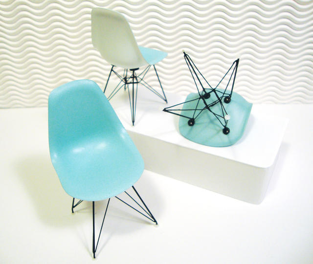
To fabricate a shell chair, Yurkovic looked to his industrial design experience with vacuum forming, a process that's often used to mold plastics. He sculpted a master form of the chair, then heated a piece of plastic until it was malleable, then turned on his shop vac to shrink the plastic around the form. As it cools, it takes on the master form's shape. For the wire base, which in reality is composed of metals with different diameters, he took brass wire and re-created the thickness to be proportional to the original. "I'm really keyed into knowing those details," he says. Since he owns many of the chairs and pieces that he makes miniatures of, he could constantly refer to the original to ensure that every detail was spot on. The finishing touch? 3D-printed plastic gliders at the bottom of each leg.
Yurkovic is currently working on a wood base for the chairs. It took him six days just to study the original dowels and learn how to carve them to just the right silhouette. "Miniatures demand that all the details are right," he says. "Midcentury design was all about simplicity. The details are few, but they can be marvelous and they have to be executed to the nines."
While staying faithful to the exact proportions of original designs is typically a rule of thumb, he takes some artistic license. Charles and Ray Eames used molded plywood on the doors of their Storage Unit, which is adorned with slightly recessed circles. When Yurkovic tried to replicate that molding process in miniature, he noticed the detail was lost, so he opted to render in in relief instead.
"You have to bring in your creative sense of style and judgment, weight, and balance," he says. "A lot of it is intangible—you just know when it looks right. It's constant tweaking, just pushing to keep going and drive the design to perfection."
One of Yurkovic's chairs typically fetches about $250, which is in the ballpark of some of the "official" midcentury modern miniatures produced by Vitra. (A Vitra Eames rocker miniature is $225, and it is larger than what Yurkovic makes.) While these pieces certainly aren't cheap, they tap into the desire for design fans to own some of their favorite classics, pint-sized.
"Being able to replicate reality and create your own reality drives a lot of collectors," Yurkovic says. "You can pick and choose from different artisans and put together these room vignettes. Maybe it's a fantasy vacation retreat, or a dream home, or inspired by something they see in a design magazine."
Though Yurkovic has perfected a handful of objects, he's eager to expand his craft to become more narrative-focused. Recently, he produced a scale model of a Mindy Project set in tandem with Scala. "Even people who aren't into miniatures can appreciate that this TV stage has been re-created down to the last detail," he says.
Yurkovic is also keen on pushing miniatures beyond their status as quirky collectibles. "A lot of us who do this professionally are actively working on elevating this to a higher art form," he says. "It's more than just the arts and crafts side."
More than 79 million people read BuzzFeed every month and the media company has built an empire on OMG-Cute-Fail-WTF moments that give bored desk jockeys some reprieve from their menial jobs. Predictably, its new office in New York City reflects the editorial content that's carried the brand—memes, emojis, '90s pop culture, food porn, and then some—for better or worse.
To Chris Rushing, BuzzFeed's senior art director and the person in charge of directing the company's branding, supergraphics made sense to channel the business's culture into a spatial context.
"BuzzFeed is loud—it's not subtle," Rushing says. The architecture firm that designed the office, which is spread across six floors, originally proposed red striped decals across all the windows in the office (red being BuzzFeed's signature color). "If it was the same color and pattern everywhere, it would be boring."
After Rushing and Gabrielle Rubin, BuzzFeed's senior director of corporate real estate & facilities, conducted an office poll to get ideas for the new office, they noticed some repeating themes. Rushing then translated them into sets of illustrations to communicate what the brand is about. For example, its New York origin led to a set of icons about the city (think street names where the company once had offices, subway cars, the Statue of Liberty); emojis, which are popular with readers; memes that were milestones in the company's growth, like Pizza Rat and blue-and-black dress; and '90s pop culture, which is big with the staff (mostly millennials).
Walking into the office is like getting hit in the face with Internet slang. Thankfully, the graphics are all removable vinyl decals so the company can remove the outdated lingo (who really says ROFL anymore?) and references when the next generation of employees takes over. Until then, #OMG.
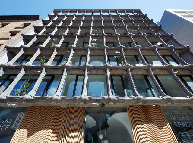
The residential building is a mashup of SoHo's classic cast-iron facades and the biomorphic genius of the Catalan architect.
It's common for architects to talk compare buildings to bodies—bones stand in for framing, skin for cladding, and nerve center for the mechanical system. But XOCO 325, a new condo in SoHo by the New York–based real estate, design, and development company DDG literally looks skeletal—and it's morbidly magnificent.
Referencing human bones in design isn't new. Catalan architect Antoni Gaudí (1852–1926)—whose buildings look like they were pulled straight from an LSD-fueled fever dream—often nod to osseous forms. Casa Batllò, one of his wildest designs from around 1904, is clad with ceramic mosaics, has an undulating roofline that looks like the ridged back of some fantastical sea creature, and balconies that look like skulls. More recently, architect Santiago Calatrava has made a name for himself through designs that look a lot like fish skeletons.
"It balances modernity with the historic," Joseph A. McMillan, Jr., CEO of DDG, says of XOCO 325's structure whose warm-gray facade looks like it's composed of hundreds of bones and knuckles. "What we have here is very referential to Gaudí, but distinct in materiality."
The building is in SoHo, which is famous for its cast-iron facades—an industrial fabrication technique popular in the 1800s that made classical architectural flourishes, like columns and cornices, cheaper to produce. To pay homage to the 19th-century style, but coax it into the 21st, the architects looked to aluminum. The metal looks like cast iron, but is much lighter and easier to handle. "It hearkens back to the old but it's much more malleable," McMillan Jr. says.
[credit[Photo: Robert Granoff]
To fabricate the components—some of which are over nine feet tall—DDG enlisted a foundry in Walla Walla, Washington, that big-name artists like Jeff Koons, Maya Lin, Matthew Barney, and Kiki Smith entrusted to produce their work. While the foundry was no stranger to technical complexity, the shear volume was a challenge since the foundry mostly produces smaller runs and one-offs—and DDG required 352 individually cast components. Moreover, achieving the textured "burlap" finish that gives the facade subtle shadows and gradations added a layer of difficulty. The builders then assembled the pre-fabricated components, which are mounted flush with the building's glass curtain wall.
Elsewhere in the structure, there are other nods to the organic world—like the carved wood front door, natural stone finishes in the units, and floors milled from wood grown by Benedictine monks in Austria. While the developers hope this sensibility makes the building more exciting and livable for its residents, it's also a strategy to stay a step ahead in NYC's competitive real estate market. "All of our buildings have a strong opinion," McMillan Jr. says. "The organic nature of the entire form makes the building successful and better design makes for better business."
In the 1950s, American citizens sent Eisenhower unsolicited designs for the new flag. One made the cut; nearly 3,000 didn't.
The Star Spangled Banner has had many iterations since Betsy Ross's first design. The American flag's 50-star design as we know it today became official in 1960, but one of the most interesting—and lesser known—chapters in its history came about during the Eisenhower era, when the government was contemplating how to incorporate Alaska and Hawaii.
Americans were so interested in their future flag that thousands of people submitted unsolicited designs to the president for consideration. Old Glory, the inaugural book of the L.A. publisher Atelier Éditions, chronicles 50 of those crowdsourced concepts.
Kingston Trinder, a New Zealand-born writer and the co-director of Atelier Éditions, has long been interested in American history. In researching the current flag's backstory, he discovered that it was designed by a high school student named Robert G. Heft for a class project in 1958. "Officially no competition for the flag's design then was ever enacted by the Eisenhower Administration, although of course such patriotic flag-making was wholly encouraged, [except by] many irate American flag manufacturers, who now possessed thousands of obsolete 48- and 49-starred American flags," Trinder says.
Trinder was so fascinated with the "spontaneous submissions" from the 1950s that he trekked to the Eisenhower Presidential Library in Abilene, Kansas, where the original drawings—about 3,000 in all—are stored. He and Pascale Georgiev, editor and co-director of the publisher, picked the best ones for Old Glory.
Georgiev especially admires the submissions from school children. "Their collages are quite lovely in their minimalism," she says. "Also, there were so many that were beautifully watercolored, which added textures and nuances to the flag. One that stood out was by Harry A. Froboess, which features a Statue of Liberty holding a flaming torch along side the red and white stripes—it's really beautiful and intricate.
Crowdsourced design has become a sore subject, these days. Rarely does it produce anything good except for a publicity stunt: New Zealand recently held a competition for a new flag that it ultimately rejected. The AIGA has issued a public letter railing against spec work in the wake of the Tokyo 2020 Olympics logo competition, which was fraught with plagiarism accusations.
"I'm an admirer of the egalitarian nature of crowdsourcing, yet often less than enthused with what it actuality yields," Trinder says. "As a native New Zealander, witnessing firsthand the extraordinary, questionable, and wholly terrifying designs for consideration as our new flag, I confess, I began to question the validity of crowdsourced flag design. Weaving the wheat throughout with the chaff isn't necessarily the best methodology—although a vox populi is always more preferable to a mandate, come what may."
Interestingly, crowdsourcing seemed to work for the United States in the '50s. Chalk it up to democratic idealism. Flip through the designs in the slide show above.
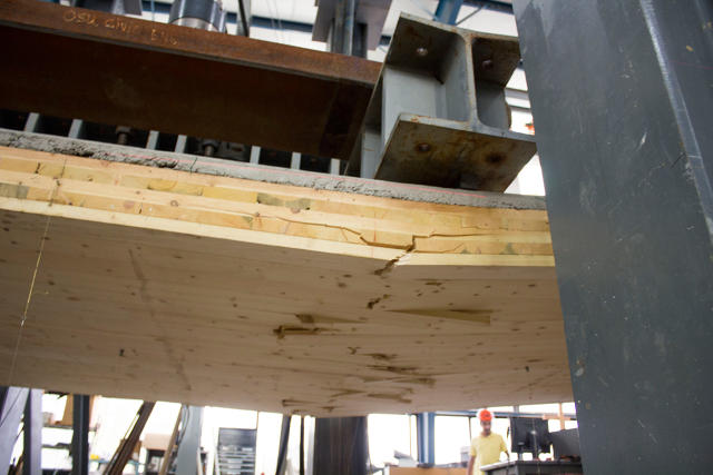
"Every design firm out there is trying to find more sustainable ways to build—it's a good business practice," says Benton Johnson, a structural engineer at SOM. Johnson has been working with Oregon State University to develop and test these new mass-timber structural systems, hoping that his research will help mainstream what's currently an alternative and novel construction methodology.
On August 8, he completed the first test of a full-scale mock-up of the system. The results, which showed that reinforced wood framing can be just as robust as conventional building techniques, are the latest step toward making mass timber more commonplace in the U.S.
One of the challenges of constructing tall mass-timber buildings—meaning between 10 and 20 stories—is negotiating stringent building codes, which haven't evolved at the same rate as technological advancements in building science.
Some cities do allow performance-based building design, which lets architects and engineers use alternative materials and techniques as long as they prove that they meet the same requirements as prescriptive codes. In an industry where time equals money, this route can be expensive and challenging so clients and builders often opt for the established route—meaning steel and concrete in the case of skyscrapers—over the experimental one.
In the bigger scheme of things, Johnson and SOM are attempting to create an entirely new classification of building, which could subsequently make its way into building codes. But the first step is proving that this technology is structurally sound. He's already published two reports in the past three years (funded by the Softwood Lumber Board) on his proposed mass timber system, to prove its legitimacy.
"We want to be able to go toe-to-toe with conventional building technology so owners are going to be able to select timber structures not because of aesthetics or novelty or sustainability, but because they're economical," Johnson says. "If you [make the monetary case], the other stuff is gravy. Costs the same, has a lower carbon footprint, and looks great? It's a winning combination."
So how does Johnson's system work? To design a more sustainable building using mass timber, he had to first tackle its biggest problem. In a high-rise, up to 75% of the materials may go toward the floor structure. "That's where the carbon is," he says.
He and his team came up with a floor structure composed of engineered timber with concrete reinforcement. The concrete is used to strengthen the areas where the timber is bolted together since joints are typically the weakest point in a structure. A thinner concrete layer over the timber provides acoustic insulation and mimics the type of finish most commonly found on floors in high-rises. The general idea is to make the span as stiff as possible so it won't sag, bounce, or buckle under heavy loads then test how much weight it can withstand until it breaks.
While Johnson and his team have worked with the Oregon State University to test small versions and components of the system, they hadn't yet tested a full-scale mockup to see what would happen at the building scale. Its structural test of the concept earlier this month represented the first full-scale test, using a mock-up floor slab measuring 8 feet by 38 feet. Then the team placed it on a rig that was outfitted with an actuator to apply force onto the slab. They outfitted the slab with sensors to detect how much it moved—or the displacement—under pressure.
At twice the required load, the system showed no movement. "The connection was still intact and behaved with full stiffness," Johnson says. "This is good news, because when you go beyond what's required by code, it maintains the integrity [of the system.]"
Then, Johnson and the OSU team continued to apply more weight to the slab. At eight times the weight of what builders are required to accommodate by code, the slab sagged. When the load reached 82,000 pounds, the slab broke beneath the point where force was applied and a tension rupture expanded through the rest of the floor, as the researchers expected.
"This is like if a 10-foot-deep swimming pool was placed on top of the slab—you'd never see that type of load [in situ]," Johnson says. "But the reason it's important [to go beyond the requirement] relates to the fire-resistant part of the design. Wood chars in a fire and you lose strength in the system, which still needs to receive capacity to support occupants and firefighters."
In the end the test was successful, and after crunching the numbers, Johnson and his team found that it exceeded code requirements by 30%. However, it didn't behave exactly as they expected. The team tried to build the slab economically, meaning with as few composite connections as possible, which translates to less overall stiffness. They expected to see more concrete cracking at the connection when they applied the code-required full load. "The cracking was superficial," Johnson says. "Now we can optimize the design and save materials elsewhere."
It's a major step forward in taking mass timber mainstream, but the research process is far from complete. Johnson plans to continue to test the structural system even further, especially with respect to fire performance. "It's not enough to have one test [of the technique] or one building [that uses the technique], you need a backlog of precedence," he says. "We were pleasantly surprised by the test. We had a good margin of error and good prediction results. It shows that the proposals we've been working on really do work—the concept we're working toward, using reinforced concrete to supplement timber is valid."
As more research into mass timber construction accumulates, whether from SOM or other entities, the closer we'll come to mainstreaming of wooden high-rises.
Mishka Henner painstakingly stitches together Google Earth images to reveal the eco-disasters caused by feedlots.
To Belgian artist Mishka Henner, the most telling perspectives on our planet are shot from the stratosphere. "Satellite images allow us to make sense of vast infrastructures that are otherwise hidden by their scale," he says. "They are the elephant in the room."
For his project Feedlots, a photographic series on the large-scale livestock industry in Texas, Henner combed through images from Google Earth and stitched hundreds of screen grabs together to create the final images. While the project emerged in 2013, the photos have continued to mesmerize the art world: They currently appear in Aerial Imagery in Print, an exhibition at MoMA that closes on September 11, and in The Edge of the Earth: Climate Change in Photography, a forthcoming show at Ryerson University, in Canada.
Tascosa Feedyard, Bushland, Texas (Detail)
In Henner's photographs, we get a rarely seen glimpse of the realities of meat and dairy production in the United States. Though it's not immediately apparent what the subject matter is, upon close inspection, thousands of cows come into focus and we recognize the black and brown grids in the landscape as swathes of manure, which pose environmental risks such as air pollution and seepage of bacteria, nitrogen, and phosphorous into the water supply. Seeing the feedlot runoff collect into crimson and acid-green pools is enough to make you go vegan.
Henner's photos are a remarkably potent animal rights statement—one that arguably sparks more thought than the slaughterhouse photos we typically associate with the movement. They have a beautiful hook, that quickly turns horrific. "All art is a form of personal activism," Henner says.
The Bauhaus is nearly a century old, but it still has a lot to teach today's designers.
Of all the influences from the past 100 years, the Bauhaus—the venerable art and design school founded in 1919—has had the most enduring impact on the world, from the modern products and furniture we buy, to the graphics we see, and the architecture we inhabit. Yet while scholars have pored over the school and deconstructed its teachings for decades, many untold stories still wait to be unearthed.
The new microsite is a valuable design resource that makes the pieces accessible to the entire world. It's intended to be a portal into the Bauhaus's work and a study tool to help inform further scholarship into the institution's legacy and impact. (In fact, Bauhaus superfans take note: anyone can make an appointment to view any of the holdings first-hand, assuming that they're not on loan.) Robert Wiesenberger, a curatorial fellow at the museum, developed the online collection, which involved making sense of the 32,000 Bauhaus-related pieces in the collection: categorizing, interpreting, and adding just enough context to orient visitors to the site.
"First and foremost, the Bauhaus was a school of art and design—and it was filled with contradiction," Wiesenberger says. "I really wanted to surface objects and provide a little context. Since there are already shelves and shelves of books about the Bauhaus, I didn't want to regurgitate a history; however, if the subject is new to someone, there's a primer."
We asked Wiesenberger to share a handful of unexpected design lessons to be gleaned from Bauhaus objects in the Harvard Art Museum's collection.
In the age of unlimited digital storage, it's easy to forget that purposeful documentation is important. It's more than just taking a snapshot on your camera phone as an afterthought—it's about annotation and being conscious of what you're recording in notes so that you can trace the development of an idea.
"Most of what we know of the Bauhaus's output is from the photographs taken at the school," Wiesenberger says. "The architecture changed, suffered damage, or was destroyed; though many of the products were intended for mass production, they often only ever existed as one-off prototypes or in limited quantities and have been lost along the way. Luckily, some Bauhäusler—the term for people attending and working at the Bauhaus—captured the school's work photographically, both for artistic reasons and to help the Bauhaus commercialize what was made there."
"The most brilliant of these artists was Lucia Moholy, the wife of Lázsló Moholy-Nagy, whose precise, dead-on depictions of objects are still some of the most-circulated images from the school. Yet even so-called 'objective' documentation is not neutral, either: Many decisions are made behind the camera, and Lucia's name was effaced from the historical record in part by Walter Gropius, with whom she entrusted her negatives when she fled Germany."
Few of us are diligent diarists; however keeping track of everything can help designers today—and in the future. If it weren't for Lucia Moholy and her obsessive photography, we wouldn't have as much knowledge of the Bauhaus since many of the physical objects are lost.
[Image: Harvard Art Museums/Busch-Reisinger Museum]
Everyone loves a rager, even the serious rationalists at the Bauhaus.
"The Bauhaus famously threw incredible parties," Wiesenberger says. "For the 'Metal Party' in 1929, guests clad in shiny homemade costumes slid in on a chute beneath mirrored orbs hanging from the ceiling. Oskar Schlemmer's stage workshop, and the metal workshop run by Marianne Brandt, were especially active in the planning. But it wasn't all just fun and games: Walter Gropius, the school's director, knew that parties were essential in letting off considerable steam for hard-working and often conflicting Bauhäusler, as the school was full of big personalities with big ideas who often locked horns. Parties helped everyone remember they were part of the same team."
Design is rarely a solo endeavor and team-building can go a long way in helping to facilitate the conversations that may lead to a creative breakthrough.
"It's kind of an avant-garde disco ball, designed to create kaleidoscopic colored light effects," Wiesenberger says. "But this, one of the Hungarian Constructivist's proudest achievements, didn't emerge from his head fully formed. Rather, he claims that the idea began its gestation in 1922, and it went through multiple versions before its first exhibition in Paris in 1930. But he wasn't finished with it then, either, and he made many later alterations to optimize its 'light-modulating' effects, for example, substituting in matte or glossy pieces of metal."
"The Light Prop was a new kind of art, made without the artist's hand, and industrially fabricated like Minimalist art would be in the 1960s. Moholy-Nagy worked with two engineers to design and construct the device, which was built with funding from Germany's AEG corporation. His name does not appear anywhere on it, but one engineer's name, Otto Ball, does. Like Marcel Breuer's iconic tubular steel club chair, which was first prototyped by a plumber, Moholy-Nagy, the 'universal artist,' still knew when to call on outside help."
Just as Breuer and Moholy-Nagy looked to experts from different trades to fuel innovation, designers of today can stand to be open to collaboration from other fields rather than walling themselves off in their respective industries.
Contemporary design is notorious for established rules and having a base in function, research, testing, and strategy. Fantasy, as superfluous as it sounds, has a place, too.
"Paul Klee, born in Switzerland but seemingly from another planet, wasn't an obvious choice as an instructor at the Bauhaus, a school dedicated to pragmatic design and building," Wiesenberger says. "Of course the Bauhaus wasn't always this way, and was founded on utopian ideals and the legacy of German expressionism, but Klee's continued presence there—for a decade he taught form and color to entering students—was essential to the school's character well after it dedicated itself to a 'union of art and technology.' Klee's playful drawings channeled nature, poetry, architecture, music, and even magic—Apparatus for the Magnetic Treatment of Plants references the 18th century pseudoscientific idea of animal magnetism while lightly satirizing the machine. Klee enjoyed the reputation of a mystic—though he was certainly a rationalist—and his operating on an entirely different plane from the school's functional program only enriched students' experience at the Bauhaus."
Perhaps the most poignant lesson: while today's designers have access to advanced tools and materials, everyday surroundings and economy can fuel the next great idea.
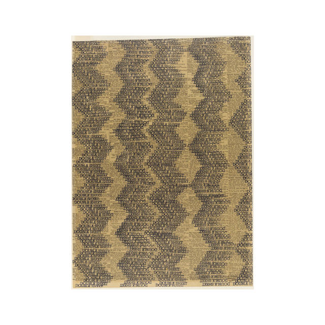
"Ruth Asawa, a California-born Japanese-American artist, who learned drawing in a Japanese internment camp, went to Black Mountain College to study with former Bauhaus master Josef Albers," Wiesenberger says. "Without money for art supplies—like Albers had been in his student days in Weimar—Asawa exemplified her mentor's credo, of 'minimal means, maximum effect.' Like all students at Black Mountain, Asawa worked on campus to help the school run: While posted in the laundry room, she made rubber stamp drawings on newsprint. This one repeats the text 'Double Sheet'— a double-meaning of both linen size and the folded-over newspaper format. This exemplifies Albers's lessons of radical economy, transparency, positive and negative space, and the meandering patterns he gave as assignments. As a kind of typographic textile, these works anticipate Asawa's more famous hanging wire sculptures."
As we grapple with the need to be more resource efficient, the simplest things might end up having the greatest potential.
A city's skyline is like its fingerprint—a composition of architectural silhouettes that's unique for any given place. Artist Yoni Alter has used the urban fabric of places like London, New York, Tel Aviv, and Melbourne as fodder for gorgeous, prismatic prints and now he's parlayed those graphics into a memory game in the Shapes of Cities game for iPhones and iPads.
Alter's posters feature monotone architectural landmarks—the greatest hits from a city—layered on top of one another in a way that preserves their relative scale. In a print of San Francisco, the Transamerica Pyramid—William Perreira's 853-foot-tall post-modern masterpiece—towers over the Golden Gate Bridge, which stands at 746 feet and dwarfs Coit Tower at 210 feet. In the game, players see an image of structures at their relative scale, and are prompted to take a mental picture. After tapping the image, the buildings' heights change and draggable dots appear above each one. You then adjust the heights and try to get as close to the original graphic as possible. As you drag each dot, the respective building's name appears.
For people familiar with a skyline, the task should be a breeze. For Brooklyn, where I live, I scored 96/100. For Memphis, where I've never traveled, I got 90/100, and I earned an embarrassing 42/100 for Istanbul. Pro tip: taking stock of the shape of each building is important—there are about six or seven in each image—but noting the color is key for cities whose skylines are less diverse than others. Try it yourself by downloading the free Shapes of Cities app from iTunes.
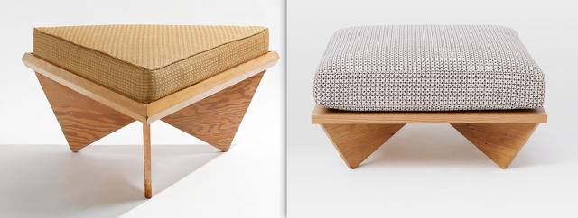
The line between paying homage to a design classic and outright piracy is fuzzy.
Recently, the furniture giant West Elm and the L.A.–based design studio Commune released a collection of furniture and accessories with a midcentury-inspired sensibility. But as some bloggers were quick to point out, the "midcentury-inspired" looked more like a midcentury rip-off. The ensuing debate has raised pertinent questions about design plagiarism: Where do you draw the line between paying homage to a design classic and copying it? How close is too close?
On August 6, the design gallerist Patrick Parrish published comparisons between the new items from West Elm alongside furniture classics by icons like George Nelson, Hans Wegner, and Charlotte Perriand on his blog; many of the new pieces are dead ringers for the older works. As Parrish—who is a design expert and possesses more knowledge about furniture than the average consumer—pointed out, the Commune Low Cushion Ottoman shares the same inverted pyramid legs as a Bruce Goff c. 1957 ottoman. The Commune Tufted Ottoman looks eerily like Danish designer Kaare Klint's c. 1933 ottoman. Parrish then made six more comparisons—and the likeness is uncanny in all of 'em. Mere coincidence?
On the left, a stool by midcentury designer Bruce Goff; at right, West Elm and Commune's stool. [Bruce Goff Stool: via Sotheby's]
"Some people felt that [our designs] were too close to the real thing to the original," says Roman Alonso, one of Commune's cofounders. "I think that's something people need to be careful with [saying] because [the furniture pieces referenced] are part of design history. We all look at the past and we look at our heroes and whatever we love. Hopefully we're bringing newness through that knowledge and experience."
Alonso acknowledges that the collection treads into derivative territory, though he believes that Commune was acting more from a point of honoring the innovations that historic designers contributed to the canon. "Maybe we did get a little too close to those people, and now I look back and I'm a little uncomfortable by it," he says. "I really don't feel like there was anything done with any other intention than to bring really great things and design at a more accessible price to bring into their homes."
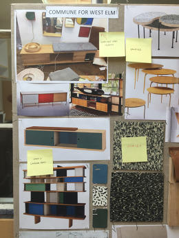
Tracing their design process, and how ideas are molded into finished consumer products, offers some insight into how the project veered into questionable territory.
An inspiration board from Commune shows the myriad influences in a single piece.
Alonso explains that when West Elm invited Commune to design a collection, the only directive was for the team to create pieces that the studio's designers would like to have in their own homes. It was an opportunity to create affordable items that have the same eclectic, California-modern aesthetic Commune instills in its residential interiors—typically commissioned by wealthy clients. "We've never been snobs about design and recognize that good design comes at all price points and sometimes from the most unexpected sources," Alonso says.
The 1.5-year-long design process began with inspiration boards that featured pinups of their favorite things; works from the Eameses, Perriand, Jean Prouve, Richard Neutra, Rudolph Schindler, and Frank Lloyd Wright made cameos. "There might be between 5 and 20 references to create one piece of furniture," Alonso says. "But the first thing is always function—how it's used and how it may fit into an environment. Then we look at the design, how it's put together, and how it's built."
The Kangaroo chair by Pierre Jeanneret (left) inspired the West Elm and Commune Sling chair (right).[Kangaroo Chair: via 1st Dibs]
For the Commune Leather Sling chair, Alonso says he and his team mined a number of influences. The overall idea originated in the classic Mexican Butaque chair—a form that Alonso recalled from his childhood growing up in Latin America. He also admired the work of Clara Porset—a Cuban-born designer who worked with Luis Barragan but is little known. That reference, and particularly the stitching she used, made it into the final piece.
The inspiration board also included images of the Kangaroo chair Pierre Jeanneret designed for Chandigarh. Meanwhile, to inform the Commune Storage Bench, the designers looked at the Eames Storage Unit, and Perriand's modular Nuage shelving for Cassina.
Charlotte Perriand's Nuage shelf for Cassina (left) and West Elm and Commune's Storage Bench (right).[Nuage Bookcase: via Cassina]
The iterating that occurs when the realities of mass production come into play also influenced the final pieces. After Commune made its preliminary sketches, the fabricators weighed in on whether or not they were structurally sound and mass producible at the price point West Elm wanted. Materials changed, silhouettes were simplified, and entire products got nixed. Eventually, the 100 or so designs that Commune sent to West Elm were whittled down to the 30 or so objects that are on sale.
The conversations between Commune and the fabricators, West Elm and the fabricators, and West Elm and Commune made it difficult to keep track of the distance between inspiration and finished pieces. "In the effort of making [the design] better, it becomes close to where you started, and you don't remember how you got there . . . [The design] becomes yours during the process, but you've had the heroes in mind, so the inspiration goes through so many filters that then it becomes yours by process but is shared with them through history," Alonso says. "And we've been up front about that. We credit these people."
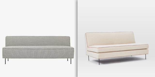
A sofa by Greta Grossman (left) and one by West Elm and Commune (right). [Modern Line Sofa: via Gubi]
It's true that Commune lists a few of the design heroes that influenced the collection on its Tumblr, but none of these references and credits made it into the final West Elm materials. Alonso says he provided a "narrative" of each piece to West Elm. "Unfortunately control over their marketing material is not in our hands," he says. "They choose the message for their channels."
We asked West Elm about its policy of reviewing designs for potential copycats. A company representative issued the following written statement: "We believe in the value and impact of design collaborations. We chose to work with Commune based on their signature Southern California expression and casual living style. We also believe in design integrity in everything we do, whether we design the product, as is the case with nearly 90% of our assortment, or in collaborations like we did with Commune where they led the design process."
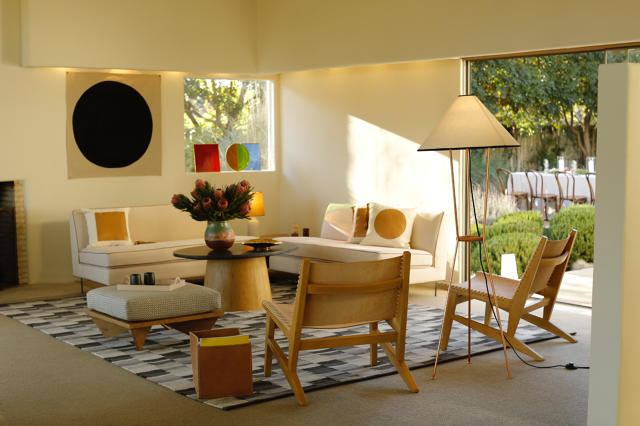
The West Elm and Commune collection was conceived as everything the designers would want in their own living room.
Plagiarism is reprehensible, but the market supports it, unfortunately. Corporations have copied artists for a long time. Yet this year, design theft by large corporations has become a major issue, and rightly so.
For example, a group of independent artist have mobilized against Zara, which is accused of stealing designs from over 20 artists; in response, one illustrator even launched a website where people can buy the originals. Last fall, Ikea famously lifted from midcentury designers, too, in the name of low-cost furniture. Meanwhile, earlier this month over 100 designers issued a statement in support of Apple in its suit against Samsung for the Korean company's use of its patented design features. Their argument? Design is directly linked to a product's success—and it needs to be protected.
Another challenge with protecting the intellectual property of older pieces is that design patents expire after 14 years and utility patents after 20, so it's open season on borrowing some details. Some countries, like the United Kingdom, are taking steps to ban replicas of design classics. With Commune and West Elm, the differences are enough that nothing could be considered a replica.
It's one thing for a small-scale designer to make a couple of custom pieces that reference classics, but when a multimillion-dollar business gets involved, the motivation seems less about paying tribute to an icon than pure profiteering, regardless of the original intent. The contradiction here is that West Elm prides itself as a champion of original, independent design.
We'll probably never know who's to blame in this debacle, but it raises many questions about the state of design and authorship today. Is borrowing from the masters a way to raise awareness of their enduring genius—an "imitation is the sincerest form of flattery" move? Or is it a savvy business strategy? Are the fans who call out these similarities simply being overzealous? Intellectual property as it relates to design is becoming more nuanced, and the debates more sophisticated. I suspect that there are many precedent-setting cases to come in the near future.
In the end, while Commune says it wasn't trying to outright replicate the work of famous midcentury designers, the references are close enough to cry copycat. For customers looking for easy-to-find, relatively affordable furniture that nods to their favorite classics, the price cut comes at the expense of ethics.
[All Photos (unless otherwise noted): via Commune]
Open offices aren't going anywhere soon. But an experimental sensor network and app from NBBJ might make them more tolerable.
The offenses of open offices are numerous and well-documented: noise, frigid air (and its cousin, blazing heat), and productivity- and creativity-killing distractions, to name a few. The reality of rising rents and limited space means that open-plan workspaces won't go away completely. But the architecture firm NBBJ has a solution to make them more tolerable: an experimental sensor network and smartphone app named Goldilocks that lets workers find space in their office that's not too hot, not too loud, and otherwise just right.
The core proposition of Goldilocks, which began as an NBBJ hackathon project a year and a half ago, is: If you're going to work in an open office, why not pick a spot in the office that works for you?
About six months ago, NBBJ outfitted its New York City office with more than 50 sensors that detect light, noise, and temperature. The compact units clip to overhead lighting and send real-time data to a smartphone app, which launched two months ago. From the app, users can find places that meet their preferences—like bright, quiet, and warm—and the app will highlight areas in the office that match your desires.
"Buildings are the last black boxes of the information age," says Marc Syp, a creative technologist and design computation leader at NBBJ. He points out that while we have apps that tell us the weather, the best places to eat and drink, and give us the the ability to order a taxi from anywhere, once we go into buildings, our environment becomes opaque and we have little control over it and knowledge about it. "[Goldilocks's] value is really about giving the user control over their environment and understanding of their environment."
Sensor networks that offer diagnostics about a building do exist; however they're targeted to facilities managers, not to end users. Other architects have been experimenting with connected buildings, too. The Edge, an office building for Deloitte in Amsterdam, is outfitted with a complex network of 28,000 sensors that help maximize use of the space. For example, 2,500 employees share 1,000 desks, and the tracking system directs workers to free space and attempts to adjust the environment to their preferred temperature settings. A hospital in Minnesota uses sensors and location-tracking badges to streamline operations.
NBBJ doesn't track individuals with its app, as the company thinks the grander use patterns within a building will lead to more insights. "I don't believe that within our current ecosystem that we have much need for tracking individuals," Syp says noting that one of the most important elements of information he's interested in is noise levels, which have been shown to cause stress and decrease productivity. "The real value in terms of the data for this scale and these questions is the aggregate understanding of the use of the building, so understanding the use patterns at a macro scale . . . It's easy to say 'big data' [is the answer to solving problems], but interpretation is the most difficult part."
That said, Syp does see a future where data tracked at an individual level could make buildings function even better for their users if it feeds into a machine-learning model.
"Imagine having a 'Netflix recommendation' engine for workspaces if your phone knows your circumstances," Syp says. "It has your sensor reading; it understands that on four separate Wednesday afternoons you've searched for a particular space. Perhaps the system learns about that—it might send you a notification that the space you normally like on Wednesdays is available. That's the kind of direct avenue we see this kind of technology moving, or an interesting opportunity to explore."
Since the project is in its early stages, NBBJ is still gleaning insights from the data sets pouring in. One of the early findings revealed that a common preference for the app's users is warm, quiet spaces. "It's not an earth-shattering finding, but it's an interesting one," Syp says. The firm is still figuring out how to best incorporate the data into spatial planning for future projects, and some of its clients have expressed interest in incorporating the technology into their projects. While the "Netflix of workspaces" is still highly conceptual, Goldilocks may more immediately lead to fine-tuning the HVAC settings in the office—a move that will likely go a long way to make people happier about their environment, or at least let them shed their desk blankets and heaters for good.
Correction: An earlier version stated that NBBJ outfitted its office with more than 100 sensors; the number is over 50, but less than 100.
If you've bought anything from Marimekko, you have this woman to thank.
Influential writer, planner, and retailer Jane Thompson died Tuesday, Metropolis magazine reports. In addition to shaping modern industrial design criticism as founder of I.D. magazine, Thompson and her husband built the modern "lifestyle" design retail model, introducing dozens of European brands—like Marimekko and Alvar Aalto—to American consumers in their store Design/Research. In 2010, she won a National Design Award for Lifetime Achievement—like winning Best Picture at the Oscars.
Twenty Over Eighty, a recent book by Aileen Kwun and Bryn Smith (Princeton Architectural Press, 2016) featured an interview with Thompson about her life's work, excerpts of which are re-printed below with permission.
What was your first job?
I went to the Museum of Modern Art right out of college. I had spent a summer as an intern researching in the theater and dance department for a production I was making for my thesis at Vassar. I decided that that was where I wanted to be: this is modern, this is new, this is everything. I was raised modern—not because of my parents, but because of the imaginative people that I came in contact with.
In those days, if you wanted to work at MoMA and you weren't already a curator, you had to get in through the secretarial pool. During my senior year, I studied shorthand for six months, then I went to MoMA to apply. They gave me a test and said, "Okay, you're in." Then they gave me my first assignment: "There's a man down the hall who wants you to take a letter, his name is Philip Johnson." I didn't know Philip Johnson; I didn't know much about architecture. In any case, I went and I did the letter and I guess it was okay, because the next day he asked me to come to the architecture department to be the secretary. To be a fly on the wall there and see everything that was happening—everybody who came and went, the exhibitions that were being made—it was an absolutely great education.
Did you feel any trepidation, being thrust into the design world?
I wasn't smart enough to be scared. I was just curious, and it was a very nice group. At the time, Philip Johnson decided to build a modern house, by Marcel Breuer, in the garden. He built the house and then assigned me to be the docent. It was a formative experience. People came in and said, "What's this about? Open space, no walls? No doors on the bedroom?" Well, there's a reason for that, and let's think about it. It made me realize how boxed in we were by our architecture, and if you'd never seen it before, modern was really weird. But people warmed up to it, very enthusiastically. Open space just makes you feel a lot better, doesn't it? It lifts your horizons.
What was it like being a leading woman in a predominantly male field?
I never saw a woman in a design office in all those years. Except maybe Betty Reese, who was a PR person for Raymond Loewy. Design was amazingly devoid of women. Mary Roche, the editor of Charm, asked me to talk about this in an article titled "Working in a Man's World," but I have to say I've never had any problems dealing with a totally male population, at any level or job.
Why do you think your experience was different, in that it was relatively free of difficulties?
I think because I was talking about things men wanted to talk about: the magazine, the field. I met them on their level, and I knew a few things they didn't. No one was aware that women were having a problem breaking in because they just weren't around; the women's magazines all had women staff concentrated on domestic design.
Later I did take a position on women with respect to design. Women know more than men, and they can see more than men, but they must apply their senses: their sense of family, and their sense of relationships. Because these count in the way you design.
How has your position as an outsider—a critic, a woman, a self-described "architect without a portfolio"—informed your work?
I prefer that role, and I've played it all along. The outsider perspective is something most architects don't have. That's what we did with the magazine: we showed products and things that we loved that designers didn't know about. For example, when we wrote about pots and pans, we didn't write about how pretty they were, but we said this one has good, even heating. And the handle works, too. We evaluated the actual performance. We didn't do it scientifically, but we used the damn thing.
Education has been a consistent thread throughout your life, from your interest in Gropius and the Bauhaus to your work in schooling in Vermont and the Aspen International Design Conference. What are your thoughts on the evolving state of design education?
Because there are so many teachers in my family, early on I got into questions of how you think about creativity, how your mind works. In design, you use your hands and therefore you're considered a tradesman. In art, you use your brain and therefore you're an artist. And that's just totally wrong! Your hand is the biggest conductor of information to your brain. If you feel the material you're not a tradesman, you're infusing your brain with the material you're going to use. Your senses are important.
All the education that I've done—for the school in Vermont, and in studying the Bauhaus—was about sensory training: you're going to touch this material, you're going to form it, figure it out. That's how you're going to understand your medium. You can communicate with color, and with form, but not if you aren't used to using your eyes.
What advice would you give yourself at the beginning of your career?
Wake up sooner. You think you can take another 10 years because you've got all your life, but it'll get away from you. You need those years to figure out what you're going to do and get started. Learning something early gives you a sense of competence, control of some sort. You are learning how to deal with your environment, with what you're making, with people and how they live their lives. There's so much distraction.
Now it's a visual world, but only if you're looking at something and figuring it out and putting it in your brain. That's my feeling. Get somebody interested, be an apprentice—it's the way you discover yourself. You and yourself by testing many different things.
What are your biggest motivators?
I find longevity proves something. Accomplishing any change in a city—other than a developer coming in with a billion dollars and ripping everything down—really making it work, takes long-term energy. The long-term aspect lets me think much more deeply about what truly needs to be done. That's been the scope of my career. People are so limited in their ideas of what they're capable of. You have to make a battle plan for everything you're doing in order to get through all the obstacles. And there are a goddamn lot of obstacles.
The first students will pass through the doors of the new Sandy Hook Elementary School on August 29.
Heading back to school is a familiar fall ritual for most kids, one that's filled with excitement for the year ahead and lament for the end of summer vacation. But at the newly rebuilt Sandy Hook Elementary School in Newtown, Connecticut, it'll also be imbued with the emotional weight of the shooting on December 12, 2012, that killed 20 children and 8 adults in one of the worst acts of violence in U.S. history.
This fall, after razing the original low-slung 1956 brick building and receiving $50 million from the state of Connecticut to rebuild, Newtown has a new elementary school. "This is a school to nurture and grow young members of our society," says Jay Brotman, an architect managing partner at Svigals + Partners, the New Haven-based firm that designed the school. "As architects, we aspire for opportunities like this, to build a meaningful symbol that serves a community as well as a global emblem."
It's a beautiful building. With a wavy roofline, wood-and-fieldstone cladding, large expanses of glass, and plenty of art, it aspires to be a safe, inspiring, and welcoming space that celebrates the town's natural beauty rather than to evoke one catastrophic event from its 311-year history.
Of course I, like the other reporters who visited the school in July on a media tour, was well aware of what happened in 2012. I was hunting for as many of the subtle safety and security interventions as I could find. Yet as we walked through the building, the architects pointed out all of the thoughtful touches intended to enrich the kids. Inside, visitors are greeted with colorful murals and monumental expanses of stained glass; a lethargic turtle swam in a tank of water. It's a school I would've loved to attend as a child. The security measures, by contrast, are subtly embedded in the design. If I were a student walking across one of the school's "footbridges" above a number of below-grade rain gardens, for example, I would imagine it as a ceremonial crossing into a castle, not as a stealthy way to limit access to the building's perimeter.
The building represents a delicate balancing act on the architects' part, between security and functionality in the educational spaces—and ensuring that aesthetics don't take a back seat, either.
Newtown is tucked into a hilly landscape draped with trees. Sandy Hook—a village within the town—derives its name from a nearby hook-shaped geological feature carved out by the rivers in the area. The natural landscape factors heavily into the town's persona, and its beauty is a point of pride for the residents. All Svigals + Partners had to do was take a look around for inspirational fodder to inform the design.
"We wanted the school to reflect the community and the things that were important to them," says Alana Konefal, the project architect.
The rolling horizon is referenced in the sinuous roofline and ripple effect of the two-toned hardwood cladding the building's facade. A rain garden that naturally filters stormwater abuts the facade and is planted with native botanicals. "It's the intersection of identity and sustainability," says Julie McFadden, an associate principal at Svigals + Partners, about the landscape feature. Footbridges traverse the rain garden to provide access to the building. The bioswales—a landscape feature that collects rainwater so it can be absorbed by the earth rather than flood storm drains—slope down almost like a moat.
While the lush plants and boulders are lovely, they betray one of the stealthy security features in the building—serving as one of several subtle physical barriers between the building's perimeter and people.
There are three courtyards behind the building planted with trees, shrubs, and grass, which offer outdoor space for the kids and faculty to use. The outdoors make their way inside, too. In the atrium, the architects designed tree trunk-like beams to support the structure. The top half of the double-height windows are composed of vibrant stained glass that casts an abstract canopy over the space. A kinetic leaf sculpture by local artist Tim Prentice dangles overhead. A mural of flying ducks—which used to wander around the campus before construction and were the unofficial school mascots—adorns the walls. In the cafeteria, green acoustic tiles hang from the ceiling like foliage. Lastly, at the end of the building's two wings is a breakout space dubbed the "tree house" where teachers can hold class or students can use for reading or studying.
"We were so inspired by the landscape that we wanted to feel the outdoors when inside," Konefal says.
When I first read about Svigals + Partners'strategy for rebuilding the school, it seemed very ambitious to think that the design could "hide" the security measures into the structure. I figured that the design would change a fair amount, as is the case with most architectural projects; surely administrators or policy wonks would clamber for heavy barbed-wire gates or hulking metal detectors. But when I drove up the newly built entry road to the campus and the school gradually came into view, I was pleasantly surprised—the structure looked exactly as the illustrations promised, from the squiggly silhouette to the wood rain screen and verdant landscape.
To Svigals + Partners, the linchpin of the school's success was embedding air-tight security features in the architecture without it reading as unwelcoming. At a press conference, one reporter compared the school to "a gentle fortress."
"I don't see the fortress part of it myself," Brotman says. "I think that it's open, you see glass everywhere, it's accessible to nature."
Many of the school's safety measures—that the architects and school were willing to disclose—are centered around "natural surveillance," which focuses on offering plenty of sight lines from inside the building to the surrounding campus and also within the structure. This essentially turns everyone in the building into a sentry that can alert the administrative staff if anything seems amiss.
Svigals + Partners rerouted the driveway into the school, so there's only one way for cars to enter or exit the campus; they all need to be approved before proceeding past the security gate. Fences line the campus's perimeter, but they're set back into the trees and shrubs, away from the building so as not to be obtrusive. The parking lot is divided into separate areas for staff and visitors to ease traffic flow. The school bus pickup and drop-off is directly in front of the doors—providing another spatial buffer to increase visibility. From inside, staff can see who's approaching the building without cars potentially obscuring suspicious people.
The building's footprint is shaped almost like a capital "E"; the front of the building holds the administrative offices, cafeteria, music and art rooms, and tech lab. This lets the staff keep a watchful eye on the parking lot courtesy of large windows, which are composed of bulletproof glass. The classrooms are in three wings that extend toward the building's back.
Some features are directly linked to legislation spurred by the shooting. During Sandy Hook's construction, Connecticut adopted safety standards for all new school construction in the state. Many of the design details Svigals + Partners incorporated into the structure were part of the "checklist," such as lockable doors on every classroom, having unobstructed ground-level views outside, separating kindergarten and pre-K play areas from the other grades, and locating playgrounds at least 50 feet away from areas that public vehicles access.
All of the design features—from security measures to the building's personality—resulted from carefully choreographed community involvement. Brotman firmly believes that community participation was the most important element in the project. Achieving a design that was sensitive to the recovering community hinged on welcoming the town into the school's planning and concepting.
From the project's outset three years ago, workshop groups—which included teachers, administrative staff, parents of students in the district, and first responders—collaborated with the architects. "[Through this type of] process is the only way that we can create a building that is reflective of the community," he says. "The community's issues and concerns all come out during the process of speaking with them. It's getting that community together, and making sure we're all on a level playing field. You leave the experts outside."
Community involvement in the design was the first step in rallying the town behind the concept. It familiarized the town with the building, it gave the participants ownership over the concept, and turned people into advocates for the building every time they'd talk with their neighbors and friends about the process. "Those 'ambassadors' [or workshop participants] helped us ensure that the entire community knew what we were doing and that this school results in something they would be proud of," Brotman says.
The architects also hosted a workshop series called "KidsBuild!," which invited children into the design process. In addition to receiving a lesson in the basics of construction, they also contributed artwork that would be woven into the campus. The flags flying on light poles illuminating the approach to the school feature illustrations from the kids.
Inside, the school is a microcosm of a town. When people enter, they pass by a "Be Kind" mural composed of ceramic tiles that some of the kids created into the central corridor, referred to as "Main Street." The classroom wings extend perpendicularly from the hallway so that everyone has to walk through it—a way to familiarize the student body with their peers who may not be classmates.
The architects used a "neighborhood" metaphor for the wings, as well, and designed the classroom thresholds to subtly reference houses. There's a "porch" over each door and colorful floor tiles signify doormats. Cubbies are placed near each door as if it was a mudroom. Each of the classrooms has an adjoining door so that the teachers can communicate if need be. (Though not explicitly mentioned, these are surely a security measure.) Windows into the classrooms emphasize the constant hum of activity that will take place in the school. One of the most stand-out gestures is a narrow, double-height corridor that lets students on the second floor peer into the music room. With a gabled ceiling clad in wood and stained glass windows on the far end, it feels positively serene—almost church-like.
There isn't a brash architectural gesture or wacky experimental flourish in the school. There won't be a memorial on site. As much as possible, the administration wanted the space to feel like a regular school without a burdensome history. "It felt like a normal project, but with so much compassion," Konefal says.
It's been four years since classes have been held at Sandy Hook. This fall about 400 students from kindergarten to fourth grade will pass through its doors; only 35 of them (who are now fourth graders) were at the school when the shooting happened—a fairly small number due in part to the fact that most students have moved on to middle school. About 60% of the faculty and staff will be returning, too.
The real test of the design's merits will happen when they start to inhabit and use the space. But the architects did right by them in building a beautiful shell that, above all else, is a vibrant site for learning.
[All Photos: Robert Benson Photography/courtesy Svigals + Partners]
With their audacious aesthetics and quirky details, Japanese houses are some of the wildest structures on the planet—a byproduct of the country's competitive real estate landscape. Land is subdivided into oddly shaped parcels and there's virtually no resale market; the average lifespan of a house in Japan is 30 years.
But in Okazaki, a city about 180 miles southeast of Tokyo, the Beijing-based architecture firm MAD chose to renovate a residence on the plot of land rather than raze it, turning it into a new kindergarten.
MAD preserved remnants of the original prefabricated wood structure and essentially capped it with a sculptural, igloo-like dome clad with white asphalt shingles. The firm calls the exposed wood beams a "symbolic memory" of the house. Leaving traces of the previous structure speaks to the ephemerality of buildings—and the importance of history.
"People always talk about sustainability for architecture in terms of technology and materials," Ma Yansong, principal of MAD, says. "But I think cultural sustainability is also important. Architecture is all about time and life. Soul, spirit, and memory are all fundamental for human beings and they should be the most important functions for architecture, too. If we simply talk about technology and materials, and ignore the nature of architecture, that'd only make architecture a product, which will become outdated very quickly and eventually will mean nothing."
For MAD this design was all about giving young minds plenty of food for thought and fuel to stoke their creativity, all in a comfortable space. To create the sense of home, it helped that the structure was formerly the residence of the school's directors, siblings Kentaro and Tamaki Nara.
"When I met with the client, he wanted to tear down his own house to build a kindergarten," Yansong says. "I was moved by his determination and devotion. Before that they had run a private nursery in their own home for years, therefore the emotional bond between the community, the client's family, and the kids is very strong and special. It's family-like. This is the 'memory and soul' I want to keep in the kindergarten. That's why I decided to keep the wood structure—the subtleness and feeling of familiarity would tell you that this place has a soul."
In the new structure, students' desks are situated beneath the wood framework of the old building—it feels like a clubhouse within larger shell, which Yansong likens to a "mystical cave." Elsewhere, thoughtful details abound: students peer into the sky through porthole windows, ride an outdoor slide from the second story to the playground, and have story time in a reading nook where bookshelves are built into stadium-style benches. The interior is flexible, with few defined uses. "Children are like blank paper," Yansong says. "Instead of having a space with clear definitions, I think it'll be interesting to provide freedom to the children to define the space."
Yansong and MAD hope the school's adventurous design leaves a lasting impression in the students' minds in the future; in the present, it surely stands to make the kids excited to trek to class every day. The architects ought to earn an A+ for that effort alone.
The Museum of Neon Art lovingly saves signs that are old, broken, or abandoned. Selfies are another issue.
The lights are dim inside the Museum of Neon Art (MONA) in Glendale, California, setting a dramatic backdrop for the glow emanating from dozens of vintage signs suspended from its ceiling and hung on its walls. With their splashy lettering and whimsical shapes, the individual pieces advertise everything from barbecue restaurants to bowling alleys. They speak to a bygone era—and a dying art.
To Eric Lynxwiler, a curator at the museum, preserving and showing these neon signs connects us with our not-so-distant past, and reminds us how our cities once looked.
"It's important to remember where we were," Lynxwiler says. "A lot of people assume that what we have today [with respect to signage] is what it's always been; however, we once had these fantastic, electric pieces of signage dotting the nation. We lose a something inspirational when signs disappear. It's important to keep this culture alive for people to reminisce and wax nostalgic."
MONA was founded in 1981 and relocated multiple times in the L.A. area until it closed in 2011, while it prepared for the construction of its permanent home. The new 8,400-square-foot building by Shimoda Design Group opened in November 2015. In addition to having wide open space that can accommodate the collection—some signs are as wide as two garage doors and require cranes to move—the structure is customized to have plenty of outlets on the walls, ceilings, floors, and columns, and features its own mini power plant—the museum draws about four times the energy as a typical American house—to ensure that it never blows a fuse keeping the signs illuminated or HVAC system running.
Over the years, MONA pulled signs from dumpsters, saved them from the wrecking ball, and accepted them as donations from people who believe that everyday signs of the past should be elevated to an art form. MONA has also faithfully fixed many of them along the way, and when space to store the behemoths ran out, trusted friends and family with room to spare graciously volunteered to keep the items safe. The museum is also at work on an education lab that will let visitors see how its conservation team fixes the deteriorated wiring, broken bulbs, and peeling paint that plague many of the aging relics.
"We don't have a particular neon signage design type that exemplifies us as Angelenos, but we do have huge quantities," Lynxwiler says. "As a city, we grew up with the automobile and all signage in L.A. is based on the driver, not the pedestrian—we craved neon. Every business began to compete with one another with a sign on the door, then in the window, then on top of the roof. L.A. once had visually clogged streetscapes awash with bright, shiny color. In my eye it was gorgeous."
When MONA brings a sign into its collection, it evaluates it on three criteria: how it looks, the technical difficulty required to fabricate the sign, and its cultural significance.
"All of these qualities are malleable and reflect our personal opinion," Lynxwiler says. "Aesthetics is the easiest. Is the sign pretty? We got to have it. Does it show technical merit? Like tube bending revealing the artist's hand, animation, if the use of tubes or the color combination is something really spectacular. Then there's the cultural importance, which is truly in the eye of the beholder." Cultural significance is one of the most difficult for the museum's curators and directors to agree upon. Even if someone is willing to donate a sign MONA, the high cost of restoration (sometimes in the tens of thousands of dollars, as was the case for the sign from Grauman's Chinese Theater) and spatial constraints of storage means that many are passed over.
The popularity of neon signs comes and goes, and today's resurgence in popular interest has led to some unexpected challenges. While the handlers and conservationists haven't broken a single bulb after any of the signs have come under MONA's stewardship, fans of the museum have caused some accidental damage. "Our crew has done great," Lynxwiler says. "They're working with giant pieces of metal that weigh multiple tons, are filled with electricity, and covered in glass—what they're doing is insane. It's the guest who break [the bulbs]. We're trying to figure out a way to get people from feeling too familiar with the signs, but in an iPhone society, everyone wants to take selfies and they back up into the signs." That said, the selfie issue validates MONA's cultural value and shows how fascinated people are with the vintage neon signs.
"What we are saving is an art and a craft," Lynxwiler says. "Every glass tube is made by hand. Even if we don't know the artist—none of these is signed—we want to celebrate the fact that it was made by a craftsperson. They selected a design, a color, a bending technique, and animated this piece. We want to make sure this dying art form stays alive in perpetuity."
Bored by too-serious design? Andrew Neyer's pieces mix minimalism with a dash of quirk.
Napkin holders that look like books, bookends that look like worms, a pendant that's strung like a yo-yo—these are a few of the whimsical pieces in Cinicinnati-based designer and artist Andrew Neyer's line of housewares.
"My design process is heavily influenced by my art practice and fascination with word puns," Neyer says. "Combining minimalism with humor is just a natural extension of my personality. When you add whimsy to clean, modern design it humanizes the forms."
Case in point: Neyer's Olympic Barbell pendant riffs on the look of gym weights; an organizational valet for stowing keys and mail called the "Helping Hand" is shaped like a hand; a Kleenex dispenser called "Taffy" makes the tissue look like a candy wrapper.
Cuteness may be frowned upon by the design establishment, but it's an under-explored attribute and one that some believe holds the key to more responsible consumption. "I don't necessarily think that design is too serious, but rather it's that seriousness creates wonderful opportunities for surprise," Neyer says. "It's the perfect setup to crack a smile."
Forget the cloud—the internet is more tangible than you think.
Loading a web page seems simple enough: Type in a URL, and content appears. It's easy to forget that for that information to appear, it had to travel through a complex infrastructural network buried under our streets and embedded in our buildings. As computing becomes more reliant on the cloud, we're increasingly removed from the physicality of the internet.
The web's abstraction made Ingrid Burrington—a technology and politics writer whose work has appeared the Atlantic, The Nation, ProPublica, the San Francisco Art Quarterly, and Dissent—curious about the tangible systems that support it. A few years ago, she embarked on a project to document the infrastructure of communication networks in New York, where she lives. Burrington bills the resulting book, Networks of New York, as a field guide to the complex and layered communications systems that operate in the sprawling metropolis.
In addition to offering essays that give readers a crash course in how the internet actually functions, the book acts as a manual to the everyday infrastructure that fuels the internet. From deciphering the secret language of construction workers' spray paint markings on the pavement, to uncovering the meaning of various manhole covers that lead into the tangle of communication systems underground, much of this infrastructure is hidden in plain sight.
We spoke to Burrington to learn more about how she researched these stealthy, seemingly invisible networks.
Co.Design: How did you become interested in the internet's infrastructure?
Ingrid Burrington: I started primarily thinking of the architecture of the internet and with the frustration with the visual vernacular that currently exists for representations of the internet. Like in 2013, when all of the Snowden stories started dropping, you'd have this good reporting and these stock photos of like a black screen with green letters. I didn't know what the internet looked like, and I didn't think [it looked like] that. I wanted to find out what I wasn't seeing.
Initially, I was looking at it more from the angle of, "who are the companies and corporations?"—looking at office park architecture sort of stuff. But the second you start looking into things related to the surveillance industrial complex and the companies who contract out to the NSA, and the second you start poking around Northern Virginia, you start to notice all the data centers. And it became hard to ignore the fact that this military industrial apparatus couldn't function without all of this other infrastructure that's also part of my everyday life. That became a more compelling topic and story to me maybe because it touches so many things and is so vast.
Networks of New York author Ingrid Burrington[Photo: Jonathan Minard]
There are numerous art projects that attempt to visualize the internet, like revealing the Wi-Fi signals, or here's what Google's hidden data centers look like. The web is something that exists in our homes and offices, but it's kind of invisible because our notion of it is that it's wireless. But it's also got incredibly complex systems that are out of sight and out of mind, in a way.
Yeah, and I think that the internet is often something that's somewhere else. Even if you have the internet in your house, where the internet lives is shorthanded to a room with servers in it. One of the things that kind of drove me to the book's approach was realizing that I wasn't just going to be able to get into a lot of those places that get visualized as the hidden server rooms and the secret buildings. I have a lot of photos of the outside of buildings where I wasn't allowed inside.
In New York, which is a very dense city and has a lot of old infrastructural elements, I find that looking at the internet's infrastructure is a way to appreciate a lot of the everyday aspects of the city. Walking down the street in the city, it's easy to take for granted how many things need to happen and function just for me to check my email on the street corner. Looking at all sorts of spray-paint markings emanating from a manhole cover, or noticing a little flock of cell towers on a roof, and just starting to take in all of those elements, is a nice reminder that the seamlessness of what I do with my phone stands on top of years and years of infrastructural development.
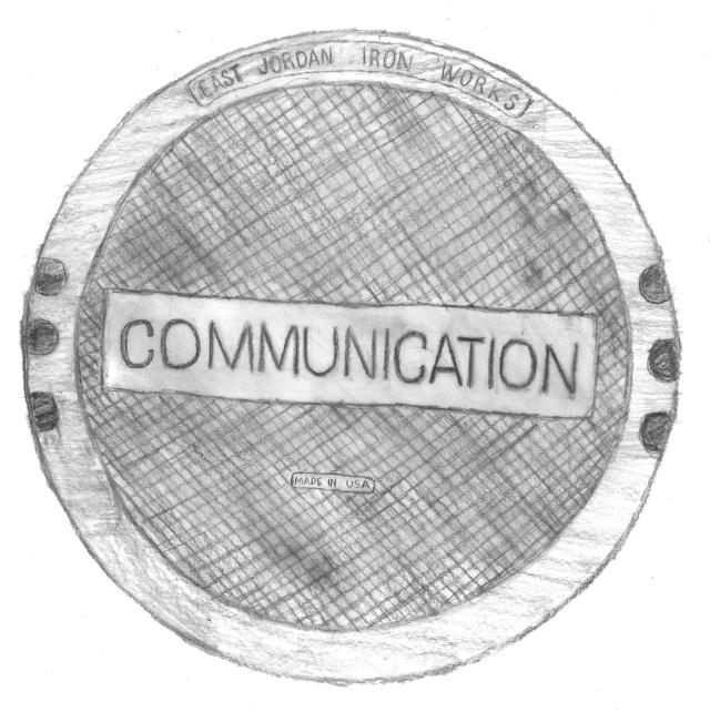
The manhole covers embedded on city streets lead to different underground networks. This one signals that communication infrastructure—aka cables for telephone and internet—lies beneath.
What was your research process like? What are some of the most interesting things you uncovered while working on the book?
Like the internet's infrastructure, the information is similarly hidden in plain sight, like in old franchise agreements. If you know the right way to key your Google searches for PDFs on a government website, you can find a lot of old paperwork that has a lot of relevant old histories. A lot of this info is public, but it's not necessarily super accessible to the public.
I learned a lot by chatting with people working in manholes. Generally when I see people working, I just run up to see what's going on, which sometimes weirds people out. But most of the time, when you have a job where most people by default try to move around you, the idea of someone wanting to know about what you do and thinking that it's interesting is sometimes refreshing. Some telephone people are totally happy to tell me what they are doing. People who are much closer to the actual infrastructure were very forthcoming and friendly and able to chat. It probably helped that I'm like a small girl. I once asked if I could take a photo of an open manhole somewhere in Brooklyn and some guy said: "You're not a terrorist, are you?"
In the book's introduction, you wrote: "In the span of three city blocks, I can find out where the fiber optic cables are buried, who owns the cables, and where the surveillance cameras are." What visual clues are you looking for?
A lot of it involves doing the two things as a New Yorker you're not supposed to do, which is look down and look up.
My favorite thing to look for when identifying where parts of the internet exist on the street is definitely the spray-paint markings. That's something that's usually placed on intersections in advance of street excavation work. Before somebody goes to work on a gas line, the markings are illustrated so they don't accidentally knock out the power grid because they didn't know this cable was buried there. So those markings are all color-coded based on a national, agreed-upon standard. Orange spray paint signifies telecommunications. After I first saw the chart that broke down what each color means, it became really hard not to pay attention to the spray paint on the ground and to decipher it. Before, I probably wouldn't have thought twice about it.
Other things that I look for when searching for indicators of networked objects or systems in a streetscape are above pavement level, like different types of antennae. A lot of times there are different networked objects and sensors that are part of the N.Y.C. transit system. The Department of Transportation (DOT) has like this really amazing complicated program for monitoring traffic, so looking for patch antennae and traffic cameras. [Editor's note: Patch antennae are flat and rectangular.] The NYPD cameras have patch antennae on them.
You commented that visualizing the scale of the internet is one of the most difficult things to do. How would you best describe its enormity and composition?
No one quite agrees what the internet is. The scale of just the physical objects spans the entire planet. You have things that are below the ocean, you have [satellites] that are in low earth orbit. And you have everything else in between. If you're just talking about things that are connected to the global internet, that's a lot of things. But if you want to factor in other networks—like the DOT using a network that's not really the internet but it's a networked system like the internet—the volume of objects is pretty daunting.
You point out that a lot of the newer internet infrastructure piggybacks on existing infrastructure for phone lines, which were then built upon telegraph lines. What are the challenges in maintaining this type of infrastructure and should the city be concerned about its current state and future resiliency?
The short answer to that is yes! They should care about it. But it's trickier with internet infrastructure insofar as the internet is increasingly accepted as a necessary public resource—or that, generally, the public needs access to it, as opposed to something that's optional, that you could live independently of. That hasn't been true since about 2004. So there's an understanding that it's a utility, but it's certainly not regulated the way a lot of utilities are, and it's not generally maintained the way utilities are.
Constructions workers' spray-paint code is often meaningless to passersby. But the symbol shown here stands for "fiber optic" cable, another piece of internet infrastructure, and reveals where they are buried underground.
In N.Y.C. you have a lot of public authorities that manage the transportation system and things like that. The internet is mostly managed by private companies that oversee the maintenance of the ducts that hold the cables. There's so much stuff buried at this point. It's unclear if it's all still working, but the anxiety and the thought of taking stuff out [for maintenance and potentially] taking down a network [in the process] is more unnerving. There's a great story from 2002 about the rebuilding of the Financial District after 9/11, and it's just about the telecommunication infrastructure. No one knew what any of these cables were doing—are they reconnecting something that was doing anything in the first place, or is it just a spaghetti pile?
One of the places where you can kind of see some movement on that problem is coming from a new class of franchises to run cable in New York City. You have to get something from the Department of Information Technology and Telecommunications called a franchise agreement, and there's a new franchise for information services, which means running purely internet services. A lot of these are smaller business-to-business type endeavors. Stealth is one of them, ZenFi is another.
I was curious about the process of just trying to get permits to run cable from one part of Manhattan to another. One of the companies basically had to go north in order to go south because the crowdedness of the duct meant that they could only put the cable in a certain way. The most convenient way to do it was deeply inconvenient. For a lot of these small information services companies, time literally is money. The more cable you have to lay, the more latency is going to be in the connection, the slower your connection is, the more upset your client is going to be because they're looking for the fastest speeds possible.
I think that whatever kind of advocacy or lobbying that's happening from those groups might contribute to dealing with the crowdedness of the cable ducts and the volume of old or dead material that's buried within the ground. In terms of thinking about improving connectivity, putting in new wire tends to be the default solution, but wireless is so much faster and cheaper."
Do you think the internet should become more like a public utility versus a private good?
It's such a hard question for me in terms of knowing how to balance what that public utility would be regulating. Going national, things probably wouldn't come out so great. Look at countries with state-level control of the internet and the volume of censorship that happens. It's probably not what you want. At the same time, the total absence of regulation—I was really really hurting after the Net Neutrality ruling and the possibility that it opens up to improve or increase regulation just for the sake of increasing access.
I think that there are a handful of cities, a lot of them are in the south, that have started creating municipally run cable services or networked systems. Chattanooga is the most famous one, which I think really works at a certain scale. I think that many federated services can work well with others. I would love a future like that, but the cards are stacked against that given how a lot of these dominant internet companies are almost beyond regulating at this point.
What about private tech companies entering the public infrastructure and networking game, like Sidewalk Labs and LinkNYC?
The scale and complexity of what LinkNYC is doing, [which is bringing fast, free Wi-Fi to the city], is really remarkable. I don't think it's something that the city of New York would be prepared to do on its own. The desire to contract out or set up a franchise agreement or turn it into an N.Y.C. core competency is up for debate.
I think there wasn't a very adequate conversation about the potential trade-offs or long-term consequences, like if what the city was going to get [from LinkNYC] was more beneficial to the city or to LinkNYC, and by extension to SidewalkLabs and Google.
There's this parallel I'm mentally drawing between LinkNYC and the city's early water system. I listened to one of the hearings to approve the LinkNYC franchise and somebody testifying said that access to the internet's as important as access to drinkable water. Maybe that's true; it's a bold statement. So back in the late 1700s N.Y.C. had a major water crisis, which came from the fact that access to drinkable water barely existed and people were getting sick—it was a bad scene. Aaron Burr got a charter from the city of New York to start a water company that would provide fresh drinkable water to the people, but he didn't do that because he was particularly benevolent—it was a really weird sideways way for him to start a bank to compete with Alexander Hamilton's Bank of New York. In doing this, part of the water company charter said excess profits could go to starting a bank, so he proceeded to run a really terrible water company.
This is a long way of saying that the city has agreed to the charter of LinkNYC to provide access to the public via this vast system of kiosks as this aftereffect of massive data collection and profit seeking through ads. I wonder to what extent [internet access] was the main concern—like what is the real business that's operating here. It's probably not going to give anyone cholera [like Burr's wood pipes did], but [it's] perhaps not entirely in everyone's best interest—or not in the interest they thought they were buying into.
The city kind of got a raw deal, I think. The estimates predicted they'll make $500 million over 12 years. It doesn't seem like that much money when you think about it. The question I think about, then, is how much money do SidewalkLabs and LinkNYC make? What's their estimate look like? What's the ratio? If giving up personal information and constant ad tracking leads to revenue that is then used to provide more money to the participatory budgeting process, great, okay—we get new basketball courts. There are trade-offs, but at this point, it doesn't look like it's going to distribute much more money.
What impact do you hope the book has?
One of the most exciting aftereffects of this book that I heard about involves a lawsuit filed against the city to try and get information about where internet cable is buried in the Bronx to make a case about digital divides in that part of the city. The city refused on national security grounds. My work was included as evidence. They said, "This isn't secret; someone made a tour guide for finding it." And they won. They didn't win purely on the grounds of the book, but they were able to get some of that data out, which will hopefully be helpful in the longer campaign to improve connectivity in the Bronx.
The lawsuit is something I never could have imagined, but makes me really happy. I think at a very baseline level, there's a general appreciation of the volume of labor that goes into what is seemingly everyday. Being able to look at the [construction] markup of an intersection and recognize the volume of stuff going on underneath the street, I find that very satisfying and humbling. It's something that's useful for remembering not to take parts of the city or the internet for granted.
Networks of New York (Melville House, 2016) is available August 30 from mhpbooks.com.
Subverting systems, tackling ethical issues, and questioning ownership: The latest crop of Dutch designers is no longer about ironic winks.
Agatha Haines's portfolio has 3D-printed organs, hyperrealistic (but artificial) flayed faces, and surgically altered infants. The collective We Make Carpets has a rug composed of 6,000 paper drink umbrellas. Formafantasma has vases and tables made from volcanic rock. The differences in these designers' work is obvious, but the less-apparent similarity is the focus of Dream Out Loud: Designing for Tomorrow's Demands, an exhibition of white-hot Dutch designers at the Stedelijk Museum in Amsterdam.
To Lennart Booij, a curator at the museum, all three projects embody the socially driven philosophy that will cement this generation's place in design history.
"I call this a Dutch makeover," Booij says. "What we have seen over the years in Dutch design is this specific ironic element, this twist that was a signature in Dutch design. To [me and the jury that curated the exhibition], it was a surprise that young designers are changing this attitude. They are much more interested in the story behind the design, the material: 'Is this sustainable?''What do I want to tell to the audience?'"
When the Dutch design collective Droog launched at the Milan Furniture Fair in 1993, critics were instantly excited by its brand of witty tongue-in-cheek furniture and defined a generation of practice in the Netherlands in the process. Until the late 1980s and early 1990s, when the designers in the inaugural Droog collection were starting to become active, the Netherlands was known mostly for graphic design, not products and furniture. The critics applauded the minimalist collection's dry humor, which was a rejection of the general excess of the 1980s. In the book Droog Design, MoMA curator Paola Antonelli said the collection "appeared to be design accidents": a stack of rags belted together to become a chair; a chandelier made from 85 standard lightbulbs and sockets strung together; a chest composed of mismatched drawers. It rejected austerity and celebrated wit. Subsequent designs in the late 1990s and early 2000s followed the anything-goes approach, and the objects became more elaborate and aesthetically provocative. The objects—often limited-edition pieces—fell between the intersection of design and art and quickly entered the domain of galleries. Often, the conclusion to a piece's story would be as a showpiece in a wealthy collector's trophy case.
The luxurification of design into an art object came to define the last couple of decades. "It was only there to create the impression of luxury in a gallery setting," he says. "We saw the younger generation coming with inventive ideas and strategies to start another conversation." The new generation of Dutch designers is intent on producing pieces that are mechanisms for social progress—in addition to creative expression.
As Booij sees it, the economic crisis between 2006 and 2008 catalyzed the recalibration of Dutch design. Many of the designers represented in the show were students at the time and were confronted with a sea change culturally and politically. There was distrust in the global capitalist system; new means of fabrication challenged the notion that mass production by large corporations was the only way to create consumer goods. Additionally, study after study proving the effects of climate change turned global warming into an international conversation; a reaction to the consumptive behavior—and resulting environmental degradation, like pollution—followed.
The Netherlands isn't the only country to grapple with the fiscal crisis that impacted the globe, but one of the differences Booij points out is how the government responded. "I don't know the situation in other countries, but I do know that the economic crisis in our country was debated heavily in a more societal context regarding the need to overthink our systems," he says. "It was Richard Sennet with his book the Craftsman in 2008 who pointed out the need to regain power as a designer over both the innovation and the production process. and [Dutch sociologist] Saskia Stassen, his wife, who acknowledged the need to change the financial systems in order to obtain a more sustainable future."
Sennet and Stassen's ideas were taught and discussed at the Dutch design schools—and students took note.
"A lot of young designers think that the big structures we've been building in the western world are coming to the end of their cycle and we have to reinvent the systems," Booij says. "The great breakthrough of 'high' Dutch design of the 1980s is a clear signature, but the younger generation is building on its shoulders—they're more creative and more open to new approaches in how they produce and the materials they choose. They feel responsible for the whole process, and that's absolutely promising."
Technological advancements, like 3D printing and synthetic biology, have fueled the work of many designers in the show. But rather than exploring tech for tech's sake, it's a tool for expression.
"[The designers] embrace them as long it helps them to fulfill their dreams and as long they can master the technology and [use it to] control the production chain," Booij says.
Digital Artifacts, a 2014 project from Design Academy Eindhoven graduate Bart Hess, imagines how technology can fuel personal expression and upend the fashion industry through print-on-demand garments. Instead of relying on outside designers and retailers for clothes, individuals could create their own. The "cyborg couture," as he calls it, is produced by melting wax over a pool of water and using a mechanical harness to slowly dip a human body into the substance. As the wax cools, it yields a sculptural form that looks like fabric. Hess imagines the process to be like 3D printing directly onto human skin.
Marjan van Aubel's dye-sensitized solar cells turn renewable energy into a thing of beauty and shows how an everyday object like a window could be rethought as a mechanism to wean ourselves from fossil fuels.
How technology can spur more sustainable behavior comes into play on Next Nature Network's The In Vitro Meat Cookbook, a collection of recipes that uses lab-grown meat—a way to produce meat that some scientists view as more sustainable than feedlots and more humane than slaughterhouses. The goal of the project isn't to make synthetic meat tasty or commercially viable; rather it's an invitation for us to take a hard look at the current system of food production.
Similarly, Agatha Haines's engineered body parts aren't necessarily about the functionality of the organs themselves, but about the questions that arise with the ability to design humans. "She's opening a debate as this medical research is already happening," Booij says. "Designers, like Haines, are aware of ethical debates, and they want to be a part of it."
While high-tech design is a through line in many of the items in the show, low-tech objects provide a seemingly skeptical counterpoint to the rapidly digitizing world. The convenience of technology comes at a price, whether it's in the form of unethical labor to product consumer goods, the pollution that results from industrial manufacturing, or big business keeping intellectual property close to the chest instead of making it part of our collective understanding.
Jesse Howard's Transparent Tools project shows how common household appliances—like toasters—could be produced by individuals rather than solely from big companies. "He is underlying how we have 120 years of technical knowledge that can still be owned by a company, but it's really such simple technology that you can make the products yourself and own [the knowledge] yourself," Booij says. "It's all about bringing ownership to the consumer instead of being dependent on corporations."
Similarly, Fairphone, a company founded by Bas van Abel, aims to increase transparency on manufacturing by showing consumers that it's possible to ethically produce electronics. Mineral mining—which is critical for electronics manufacturing—is often carried out by slave labor. Van Abel is offering knowledge about the supply chain and through selling the phone—which was designed by Seymourpowell—he hopes to show bigger manufacturers that there's demand for socially responsible design.
So you may be thinking, what do wax garments and DIY toasters really have to do with the reality of design—are they all still conceptual one-offs destined for a pedestal, but now with loftier intentions?
"This is a debate right now—are these just gestures or designs that can be used?" Booij admits. "The first thing to underline, in product design is there are evolutionary steps to be made. The Eameses started in the military with a wood splint, and it took them years to adapt the process into a final plywood seat. No one would judge the first prototype; you have to give designers time to make the steps. The first bike didn't have a chain, and it took 40 years to get there."
So while Marjan van Aubel's exact stained-glass windows might not make it into our houses today, it could be a showpiece in the living room of the future. (We'll shy away from hot-wax apparel, however.)
"I hope the exhibition dares people's minds," Booij says. "There's a very big hunger for a society where imagination and creativity are more present than it is today."
See more experimental Dutch design in the slide show above.
Harvard's soft 3D-printed robot is fueled by chemical reactions.
Octomom: Frightening. Octobot, the first autonomous soft robot: Adorable. 3D printed by Harvard researchers from a malleable material and powered by chemical reactions, the robot moves without the use of electronics.
One of the biggest robotic design challenges today is liberating machines from the rigidity of electronic systems, especially in the case of wearables, which need to move and flex right along with the human body. To design a soft robot, engineers at Harvard's Wyss Institute for Biologically Inspired Engineering looked to the anatomical structure of octopi, since the aquatic creatures are capable of remarkable dexterity and strength despite having no skeleton. (Octopi are a longstanding inspiration for roboticists.)
The Octobot was fabricated using a combination of 3D printing, soft lithography, and molding. Though there aren't any electronic circuits inside of the 'bot, it's designed with the concept of circuitry in mind: its movements are fueled by a reaction that turns hydrogen peroxide into gas, which flows through hollow channels inside. The channels route the gas through the robot, inflating sections like a balloon—causing it to move.
"One longstanding vision for the field of soft robotics has been to create robots that are entirely soft, but the struggle has always been in replacing rigid components like batteries and electronic controls with analogous soft systems and then putting it all together,"professor Robert Wood told the Harvard Gazette. "This research demonstrates that we can easily manufacture the key components of a simple, entirely soft robot, which lays the foundation for more complex designs."
The researchers hope that this relatively basic robot—which basically just moves its legs up and down—could be developed into a more sophisticated design, like an Octobot that swims and crawls. Harvard's Octobot isn't likely to creep into product design immediately, but the concept opens the door for more scientific exploration into how 3D-printed soft materials and chemical reactions might fuel the next breakthrough.
[All Images: via Lori Sanders, Ryan Truby, Michael Wehner, Robert Wood, and Jennifer Lewis]
Here's what made the Scandinavian design emporium's chair an instant classic 40 years ago.
With its bentwood frame, cantilevered seat, and curved backrest, the Poäng chair is one of Ikea's most recognizable pieces. The Swedish furniture maker has produced over 30 million Poäng chairs since it debuted in 1976, and it continues to sell about 1.5 million every year—the company's bestselling armchair—not bad for a design that's settling squarely into middle age.
So what, exactly, made the Poäng a commercial success and an instant icon for Ikea? The secret lies in a genius concept that's been gently updated with the times. The company doesn't normally put individual designers in the spotlight, but for the Poäng's 40th birthday, it did.
Japanese designer Noboru Nakamura is the creator of the Poäng. He came to Ikea in 1973 to learn more about Scandinavian furniture—and there, he collaborated with Lars Engman, the director of design at the company, on a chair that would use plywood veneer construction. In a video interview, Nakamura, who left Ikea in 1978 to start his own furniture company, describes how the chair came about.
"I learned by experience that a cantilever consisting of a U-shaped structure could, with a person, swing to some extent with the use of molded plywood, and I wanted it to swing in an elegant way, which triggered me to imagine Poäng," he says. "A chair shouldn't be a tool that binds and holds the sitter; it should be a tool that provide us with emotional richness. [Poäng] creates an image where we let off stress or frustration by swinging. Such movement has meaning and value."
The final silhouette resembled Alvar Aalto's Model 406 chair of 1939, but in lieu of a webbed or caned seat, the Poäng sported thin upholstery.
"While the design has remained largely unchanged since its inception, this iconic product has undergone some alterations to make it more accessible, more affordable, more relevant, and to increase the quality," says Mark Bond, deputy range manager of living rooms at Ikea.
There have been tweaks to the upholstery color and pattern to keep the chair relevant with consumer tastes, but the biggest change happened in 1992. The chair's seat was originally made from tubular steel, but in the early '90s, the company switched to an all-wood frame and also narrowed the size. This allowed the chair to be flat packed—a move that reduced the price by 21% for customers (it's actually less expensive now than it was when it launched). That same year, Ikea changed the chair's original name, Poem, to Poäng.
"The evolution has always been design-focused, thinking of this product not as a fashion item but rather adhering to and improving upon the classic design," Bond says.
Considering that the Poäng routinely shows up in houses, apartments, dorm rooms, and anywhere you need to kick up your feet, Nakamura's emphasis on an emotionally rich chair—and Ikea's affordability-minded engineering—have proven to be a winning combination. To honor the design, the company is selling a limited-edition version of the chair, with a grasscloth-like cushion cover much like the inaugural offering had in 1976, starting in September.
Like the recently opened Ikea museum, that fanfare around the Poäng's design shows how the furniture company is beginning to demystify some of the genius that's contributed to its history—a welcome change that gives some of the most ubiquitous products in the world the same pedigree as pieces that cost many hundreds of dollars more.
Base Design crafted an identity for JFK's Terminal 4, showing how spatial branding can improve a harrowing user experience.
Airlines invest a lot of time and money in trying to make travel little bit more bearable—and enjoyable, even—with streamlined booking, tony lounges, and better designed service trays, to name a few. But what about improving the experience of airline terminals?
With long lines, confusing layouts, and a frenzy of harried travelers rushing around for their gate or to get a Starbucks fix, navigating the terminal is easily one of the most stressful parts of a journey. JFKIAT, the operator of JFK's Terminal 4, hoped that a rebrand could boost customer experience, and enlisted Base Design to hatch a plan.
T4 is the only privately owned airport terminal in North America. While the Port Authority of New York and New Jersey is responsible for the rest of JFK, T4 is privately managed by JFKIAT—which meant it likely didn't have to jump through bureaucratic hoops to green-light the branding project or allocate financing. The problem for the designers at Base was twofold: establishing a distinct identity for the terminal, and communicating JFKIAT's service philosophy to passengers: T4 should yield excitement, not anxiety.
"They wanted to express their core belief of 'don't worry, be happy,'" says Min Lew, a partner at Base.
While T4's wayfinding has to adhere to Port Authority guidelines and under Base's purview to change, the firm conceived of complementary graphics that would add a more human touch to offset the austerity. "From the perspective of building the Terminal 4 brand, we're more in the category of personality," Lew says. "And if we can delight the passengers along the way, we should . . . The brand essence is about guiding and delighting."
Base's team commissioned a custom font that looks like outlined block type. "We wanted to reflect the physical space so it's open, modern, and light and we wanted the identity to harmonize with that and be a part of that family," Lew says. (The letterforms also nod to the pattern of airport tarmacs.) The logo—which consists of the letter T and number 4—was born out of the notion that the terminal was "for" its passengers. Base rendered the numeral in a rainbow gradient to show the duality of the terminal's persona: It's reliable and provides good service, but does so with a human touch.
The signage celebrates place and aims to excite passengers about the city. Banners feature quotes from famous New Yorkers, facts about the city, and photographs of famous landmarks. The language is conversational. While the mandated Port Authority signs may have an arrow next to a generic icon representing food, Base's signs say, "Shopping? Dining? This way" and sport whimsical illustrations. Since the terminal is long, other signs offer passengers an estimate of walking time in minutes to reach a specific destination. In the ticketing area, signs bid travelers bon voyage. "These subtle, yet personal, messages make you feel like T4 cares about its passengers," Lew says. "And a human tone of voice offers an authentic sense of space."
The project is unique, in part because of T4's unique status in the airline industry. While individual airlines have kitted out the sections of airline terminals they operate, like JetBlue in Newark and Virgin America in San Francisco, Base's rebrand is terminal wide. It's about relaying the service ethos of an entire building consisting of dozens of airlines, not just an individual carrier.
For Base, the visual emblems are only the first step in a continually evolving process—that, one day, could involve branding all kinds of sensory experiences. "How we can make travel more enjoyable is a hot topic and there are so many things we can do," Lew says. She sees an opportunity to explore scent and sound, two overlooked elements in branding, which might eventually become part of T4's identity. "As you're walking through the hall, you're stressed—could you use sound or smell to tap into the senses [to make it less stressful]? These are active conversations as we evolve the brand and explore how it fits into this core belief of informing and delighting."
Say you're at baggage claim. As you wait for your suitcase to careen down the chute and onto the carousel, a plume of soothing lavender essential oils permeates the air, alleviating the anxiety of potentially lost luggage and melting away the tension of being squashed in a too-tight airplane seat. The gentle hum of music drowns out the cries of a screaming infant. Beautiful pictures of the city you're visiting hint at the sights you'll see and a sign welcomes you to the metropolis.
That scenario looks, smells, and sounds a heck of a lot nicer than many airports. Branding can yield a better travel experience—and as airlines rush to utilize it, many terminals could stand to embark on their own projects, too.