The venerated Italian designer Achille Castiglioni (1918–2002) is known for elegant creations infused with a bit of wit and a healthy respect for common objects. For example the Mezzadro stool, one of his most famous pieces, is based on a tractor seat. Throughout his prolific career, he produced lighting, furniture, utensils, and much more, in addition to being a respected industrial design professor.
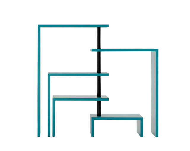
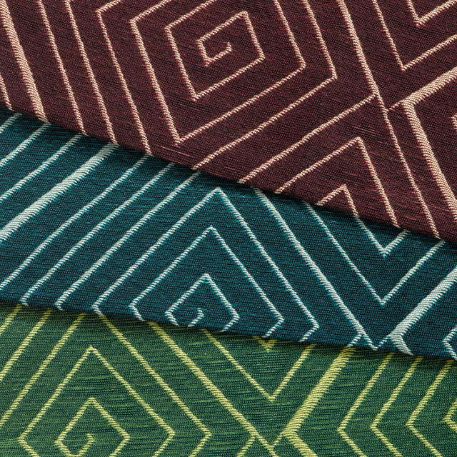
This year, the luxe furniture brand Zanotta reissued his Joy bookcase, originally from 1989, in a deep burgundy or teal hue. You can swing out shelves, which are set on a central axis, to offer storage when you need it and tuck them back in when you don't.
Clever as the piece is for its space-saving merits, it references one of Castiglioni's earlier inventions in form. It was a multi-purpose bench and stool he originally designed for his young daughter so they could see eye-to-eye, as equals, when sitting together—a very democratic notion and one that surely made a child feel as important as one of the grown-ups. Both feature L-shaped constructions that pivot along a post, but that's where the similarities end: the bookcases are a decidedly un-democratic $3,500 for a five-shelf version and $5,300 seven-shelf option; both are available from DDC.
Beauty is in the eye of the beholder and for Sung Jang, an industrial designer and professor at the University of Illinois at Chicago, it's the subject of his research on why we perceive certain abstract forms positively. He's boiled it down to two concepts: elegance and extravagance.
"Elegance is what I call efficiency between effort and result," he says. "When big things are achieved by seemingly small effort, elegance occurs. Extravagance is when effort is displayed at full scale. There was a joke when I was going to school—'when in doubt, paint it red, make it big, and make a shit load of it.'"
In his ongoing project called Mobi, Jang explores the dueling parameters of elegance and extravagance. "It creates complexity with the simplest of ideas: repeated modularity," Jang says.
For the first time, Jang explored Mobi at an architectural scale and built a 24-by-9.5-by-8-foot structure for This Is Not A Duet, an exhibition at the design gallery Chamber on view through July 3. To put it into perspective, its footprint of 230 square feet is about half the size of a typical NYC studio apartment and a hair smaller than the microunits under construction in the city. A team of several people spent two days assembling more than 18,000 units to complete the design.
Jang wanted the individual modules to be self-supporting and so he arrived at a triangular, pyramid-like form. "There's a subtle reference to natural things in the curvature of each unit," he says. The pieces are injection-molded, semi-opaque polypropylene and snap together. Jang and his team have built tables, chandeliers, and even a massive 24-foot-long whale (which appeared at Volume Gallery in Chicago) with Mobi modules.
Jang remains undaunted by the manpower and shear quantity of pieces involved with this installation, and wants to do something even bigger for the next round. "I think it'll do well as temporary architecture, large public art, where public interaction with the environment is present."
With rising rents, a short supply of housing, and more people flocking to cities, it's no wonder that micro-dwellings have become a zeitgeisty solution for modern living.
In Big Little House (Routledge, 2015), Houston-based architect Donna Kacmar chronicles the economic forces, changes in legislation, and architectural icons that laid the groundwork for the pint-sized designs of today. Projects range from a 70-square-foot writer's cabin in rural Oregon, to a 650-square-foot Pasadena pool house, to a multi-family Seattle infill project with three 1,000-square-foot units.
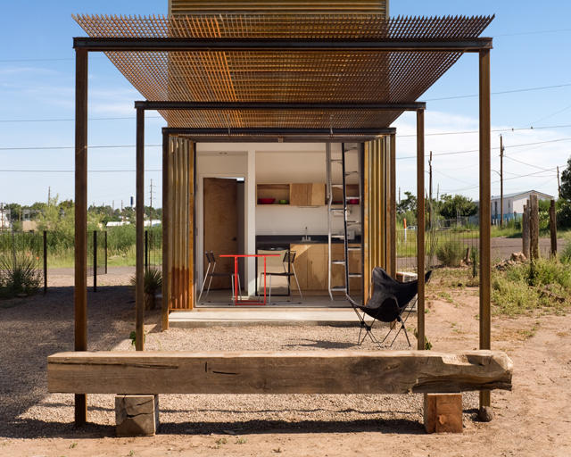
08.06 Marfa 10x10-looking in from under the trellisChris Cooper
"The recent economic crisis made people consider alternative living spaces out of necessity," says Kacmar, who resides in a 1,500-square-foot townhouse she designed 18 years ago. "There is also much more diversity in the make up of current households A traditional three-bedroom, two-bath house is just not needed by most households but remains popular due to ideas about resale."
Plenty of gorgeous photos stoke serious house envy and the rigorous analysis grounded in the philosophical underpinnings of what it means to "dwell" and how architects and theorists have explored this concept sets the book apart from a Tumblr. Kacmar is a professor at the University of Houston so it's no wonder she takes an academic approach. She argues that the economy of small spaces allows for a deeper, undiluted understanding of an architect's sensibility.
"These projects are more than merely small," Kacmar writes in the book's intro. "Their limited scope simply allows for more clarity as we study the strength of the ideas expressed." And for the folks who are fortunate enough to be in the process of designing their own home, there are handy floor plans for reference.
A "bigger is better" mindset is on its way out and as Kacmar shows, a modest scale packs a mighty punch. "I think we can still have what I call "big" architecture in smaller buildings—a house that uses materials in particular ways, has a clear strategy for bringing in light and connecting to the exterior, and accommodates our lives in very specific ways," she says.
When you get a new shirt or pair of pants, the process is typically the same. Browse your favorite online or brick-and-mortar store, hem and haw over how it makes you look (great, of course!), add to cart, checkout. The retailer has decided what items are on offer and you're limited to the designs someone else has deemed worthy enough to produce.
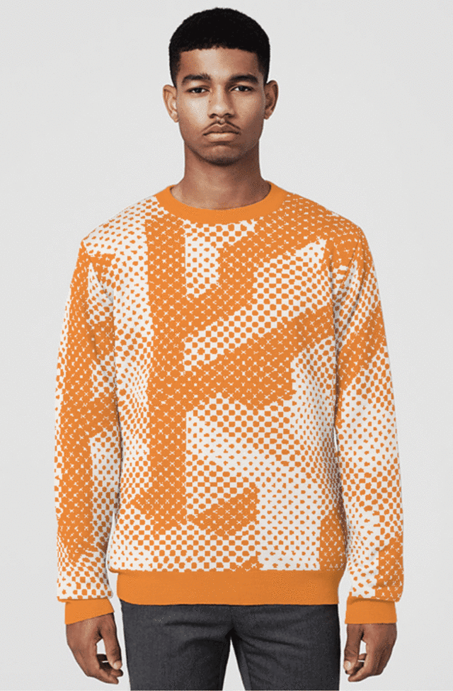
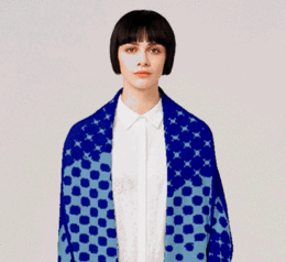
Knyttan, a startup based in London, wants to throw a wrench in this ecosystem and bring mass customization to the world of fashion.
"Designers creating products have been on a pedestal where they made all the decisions; now customers are allowed to change things to their liking," says Hal Watts, a cofounder, along with Ben Alun-Jones and Kirsty Emery, of Knyttan.
Here's how it works: Visit Knyttan's website, pick an article of clothing (the brand started with knitted scarves and sweaters), select the pattern and color combination you want, and use an online tool to tweak how it looks—you can adjust the pattern's placement, the line weights, and invert the colors if you please.
The digital file is sent to a computer-controlled Stoll knitting machine—the same equipment that's used by some of the largest clothing manufacturers around the world—and woven using 100% merino wool. Knyttan's shop is located in Somerset House—a neoclassical building in the heart of London—and the production takes place right there, under one roof. The finishing touch: an embroidered label listing your name as a designer.
"Clothing is tricky since manufacturing is outsourced to developing countries," Watts says. "Fashion brands don't have as much control over the supply chain compared to other industries, like electronics. There are big problems with minimum order volumes and lead times are long. It's challenging for small- and medium-size designers."
With this system of on-demand production, it's just as easy to make one item as it is to make 100.
Knyttan seeks to empower customers in the creative process but it also provides a valuable platform for emerging practitioners to break into the industry. The company hand-picked the group of fashion and digital designers represented in its inaugural line, which includes Moniker, an Amsterdam-based interaction and media design studio; Nicolas Sassoon, a designer known for animated GIFs; and Holly Halkes, a fashion student. "They're experimental and comfortable with allowing customization of their work," Watts says.
While "mass customization" has been a fashion-industry buzzphrase for a few years now, Knyttan has been able to address pain points that other companies haven't been able to conquer: lead time, the ease of using customization tools, and flexibility with production. For example, it takes about four weeks to get your hands on pair of shoes ordered through Nike iD and they're still made overseas. Knyttan's scarves take about 20 minutes to fabricate and sweaters take about 1.5 hours. The company also developed software that makes the knitting machines more nimble and the customization tools on its website are delightfully uncomplicated.
Another hurdle is the crisis of choice. With too many options, the end result could skew toward the Frankenstein end of the spectrum. Knyttan controls the variables so the process is foolproof. There's room to experiment, but no matter what you do, the end result will always look good. "I think that's the most difficult side of things, how much freedom to give a person to affect their product," Watts says. "You don't want to give them a blank canvas and no parameters. Some won't have the needed skills."
Knyttan initially launched its site last year just to test the concept and prove that it works. So far it has sold around 500 units direct to consumers. Now the project is on hold as the company focuses its energy on hiring more people and making the systems more efficient and scalable. Knyttan just closed a round of seed funding—they did not disclose the amount—to expand the business and will relaunch in fall 2015 with an expanded roster of collaborators.
"We have an ambitious plan to change the industry," Watts says. "Right now, we call it 'mass customization,' but I think that's how everything will eventually be made. Customers want a unique element to the products they buy. It's becoming the norm for the industry. For example, the Apple watch has something like 10,000 permutations (editor's note: it's actually closer to the hundreds) on its website. Everyone will want a say in the products they purchase. That's how it was until mass production began. We're at a point where technology can reintroduce customization into mass production." Watts estimates that this paradigm shift will occur in the next decade.
Knyttan's goal to be a key player in the fashion revolution and its efforts to rethink domestic production are ambitious; however, the initial prices range from a $120 scarf to a $300 sweater—a heftier sum than most people are comfortable dropping on a single item, and a fact that's not lost on Watts. "Customers are aware that the reason H&M can sell a jumper for $9.99 is due to slave labor," he says of the fast-fashion industry. "There's a balance between how much consumers pay and the cost to produce locally. People are willing to spend more for higher quality and for ethical production. Reactions have ranged from 'this is too expensive' to 'this is great.'"
Whether or not you end up buying a piece from Knyttan when they reveal the new big-name collaborations and start shipping this fall, the site is pretty fun to play with. Try your hand as a clothing designer here.
Correction: An earlier version of this story incorrectly stated the source of funding. It's "seed" not "series C."
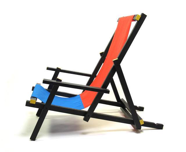
A 3-D interpretation of de Stijl—an early 20th-century Dutch movement known for rationality and using straight lines, primary colors, rectangles, and cubes—Rietveld's chair deploys simple forms and basic colors. The original was made from wood and has fairly simple construction to make mass production a cinch. (If you think it looks eerily like a 3-D Mondrian, you're not far off—the painter was a practitioner of de Stijl.)
Mal's version remains faithful to the hues and geometry of the 1917 design, but thankfully takes some liberties: in lieu of a hard wood seat, the Clap has a comfy sling made from heavy-duty canvas. It's available for $659 from mal-furniture.com.
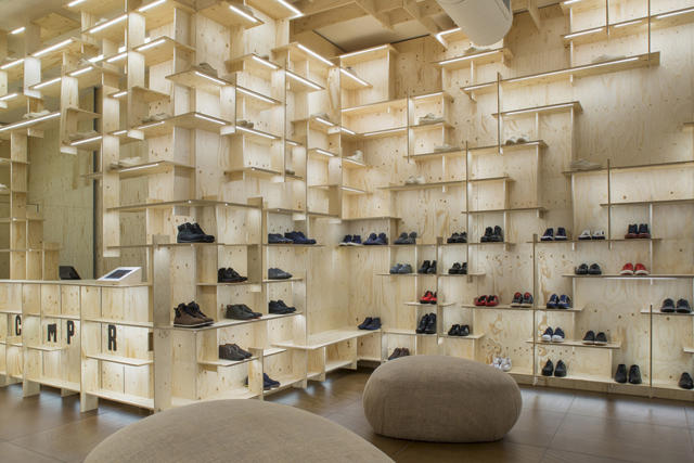
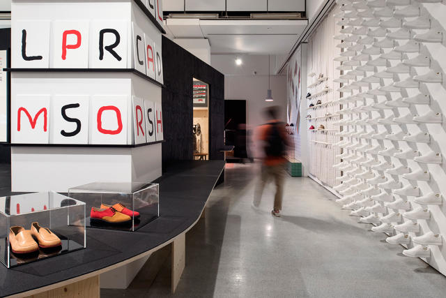
Since Lorenzo Fluxà Rosselló founded the Spanish shoe brand Camper in 1975, it has become a global design powerhouse with inventive retail spaces, bold advertising campaigns, and big-name collaborations. Nendo, Shigeru Ban, Kengo Kuma, the Campana Brothers, and Hella Jongerius have all worked with Camper in some capacity, whether it's masterminding a brick-and-mortar storefront or lending their sensibility to a pair of sneakers.
"Camper has flourished from Rosselló's strong direction," says Nina Due, head of exhibitions at the Design Museum in London, which is currently staging an exhibition on the brand. In Life on Foot, the museum explores how Camper has cemented itself as a design-led brand (even when its products can be pretty heinous). Here's how the company did it.
Creative Vision
When Camper set up shop during the post-Franco regime, "there was an appetite for doing things differently," Due says. Rosselló came from a family of shoemakers and brought years of expertise with him but added a modern twist. "Camper was using the traditional ways of bespoke craftsmanship, but they added humor to shoes that hadn't been seen in the past."
03-Shoe-PELOTAS_ARIEL-16002-193_1995
Collaborations
Though the model of "Designer X for Brand Y" isn't unique to Camper, the company has successfully navigated the terrain to carve out a distinct identity. "They have a really good eye and exceptional ways of working with designers," Due says. "Designers can express their ideas, but their result is very much a Camper product…the brand is very knowledgeable in how to commission."
Because the company is family-owned, it's able to be more flexible and nimble in its operations. "We spoke with a lot of designers who worked with Camper," Due says. "And while it is a global brand, it works in a relaxed way when it comes to commissioning. It's about giving designers carte blanche from the outset to create a story they fell will captivate customers."
While Camper has some repeat offenders in its list of collaborators, the brand continually works with new talent and keeps commissioning new designers. In the case of retail stores, they have a cap on how many can be designed by a person or firm so as not to saturate the Camper ecosystem with a singular vision. "It's about giving a different flavor and experience to the retail spaces," Due says. "It's a strategy to bring freshness and novelty to the company. Lots of big brands have megastar designers, but the ongoing commissioning gives Camper an edge that other brands would die for."
Camper Together with Kengo Kuma (Montenapoleone, Milan)
Messaging
Camper's home base is Majorca, Spain, a popular vacation destination. This has informed the company's international approach to advertising. You'll see ads in English and Spanish. Moreover, Camper isn't afraid to take liberties with marketing. For example, its Walking Society campaign from the early 2000s shows how the company isn't just concerned with the shoe as a product, but how it factors into the experience of walking. "Camper is wiling to be provocative to a point where you don't see other brands willing to go," Due says.
Camper-Life-on-Foot-Jill-Tate-04Jill Tate
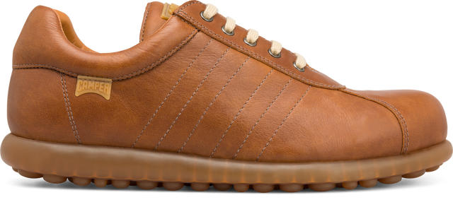
Experimentation "They have an attitude where they dare to fail to succeed," Due says. From a production standpoint, Camper has experimented with biodegradable plastics, man-made composites, and natural materials. She points out how there are more than 100 variations of the best-selling Pelotas shoe. "The materials, the stitching, the laces, etc. are all variations that offer up a different product. It shows something about the enthusiasm and willingness to push and push and try new things."
The playgrounds of today, with their plastic jungle gyms and foam mats, are a far cry from designs built during the days of fewer regulations and personal injury lawsuits. Take the playgrounds constructed for the British housing developments of the 1970s. Hard-edged, rough, and made from concrete, they had little in the way of guard rails or safety elements. Unsafe? You bet. (And many have been demolished over the years as they were deemed unsuitable for play.) But instead of dictating what children should do, they were spaces tailored for open-ended exploration.
A new installation by artist Simon Terrill and the collective Assemble for the Royal Institute of British Architects revisits these old designs, whose abstract forms mirrored the architectural philosophy of surrounding Brutalist structures.
"These unconventional structures encourage children to take risks, to explore,"Terrill wrote in a Guardian story about the post-war designs, like the Churchill Estate, that informed the exhibition. "There is an element of danger which you might not get in soft play areas today."
Assemble, recipient of a prestigious Turner prize this year, and Terrill pored over archival photographs and ephemera from the RIBA archives to inform their design. The historic case studies include Churchill Gardens in Pimlico, the Brunel Estate in Paddington, and the Brownfield Estate in Poplar. Then, they recreated elements from the playgrounds at full scale using foam, a "safe" material that won't cause scrapes and bruises. The pastel hues correspond to the different densities of the material and the speckled texture is reminiscent of the bush-hammered concrete that was used on the original playgrounds.
"It's something between an architectural object, a sculpture, and a theater set," Terrill says of the exhibit, which is on view from June 10 to August 16, 2015. Visit architecture.com for more info.
Google has conquered search, email, document-sharing, maps, and more (fashion, of course, remains a work in progress). Now, it's turning its eye to cities. The New York Times reports that Google is starting and funding Sidewalk Labs, a new independent company "that will pursue technologies to cut pollution, curb energy use, streamline transportation and reduce the cost of city living."
At the helm of the venture is Daniel L. Doctoroff, former deputy mayor of New York City for economic development and former chief executive of Bloomberg L.P. Doctoroff and a team at Google developed the concept for Sidewalk Labs, which has a decidedly techno-optimistic approach to solving urban problems. As Google CEO Larry Page wrote in a blog post yesterday:
Sidewalk will focus on improving city life for everyone by developing and incubating urban technologies to address issues like cost of living, efficient transportation and energy usage.
Google isn't the first to tackle cities through technology. As the Times points out, major academic institutions are leading research in this area, and companies like IBM and Cisco are using big data to help improve cities' efficiency. Sidewalk Labs, however, would be geared toward things like bike sharing—"technology platforms that people can plug into for things like managing energy use or altering commuting habits."
It might take a company with coffers as big as Google's to overhaul cities at a grand scale. We'll eagerly follow Sidewalk Labs' efforts.
The story of how the kitchenware brand Pyrex first entered America's kitchens reads like a tall tale. The saga began in 1913 when Corning scientists were investigating new applications for the heavy-duty glass that was originally used for railroad lanterns.
In 1914, Betsy Littleton, the wife of a Corning scientist, took a battery jar made from Nonex—what Corning called its temperature-resistant borosilicate glass—and used it to bake a sponge cake. She marveled at how the cooking time was shorter compared to conventional cookware (which would've been metal or ceramic) and how the glass allowed her to monitor how the cake was doing on all sides.
"Corning has a long history of retooling things and moving them into different areas," says Regan Brumagen, the co-curator of America's Favorite Dish: Celebrating a Century of Pyrex, an exhibition on view at the Corning Museum of Glass until March 17, 2016. Through personal narratives, over 300 objects, and vintage marketing materials, the show demonstrates how the brand made multi-purpose cookware that performed fantastically in a variety of circumstances, shaped the modern kitchen, and looked darn good in the process.
Corning tweaked and refined the material, and in 1915, the company launched the inaugural 12-piece line of Pyrex, which consisted of casseroles and baking dishes in assorted sizes.
"It was a hard sell at first since Americans thought cooking in glass was freaky-sounding," Brumagen says.
When the product hit store shelves, it was well received, but regarded as a luxury object because of cost. To stoke sales, Corning retooled the formula and process to make production more efficient. It also ramped up marketing campaigns that emphasized the unique material properties that caught Betsy Littleton's eye: that glass heated more quickly and evenly than metal and it was transparent. "You could literally 'see what's cooking,'" Brumagen says. "Pyrex also came out right before World War I and during the war metal was in short supply so there was a patriotic drive behind buying the product."
Corning's strategies worked and by 1919, the company sold more than four million Pyrex cookware items.
Pyrex's spirit of innovation didn't stop at material research. In 1929, Lucy Maltby, a home economics professor, joined the company. In 1931 she established a test kitchen that incorporated customer feedback into product development. For example, she advocated for practical modifications to products—like adding handles to cake pans and making cookware shapes that fit into ovens more easily—and basing design on the challenges that real-world home cooks (mostly women at the time) encountered.
The next shift in materials came in the 1940s when Corning introduced opal glass—which was initially used as military mess ware—into the product line. In a move to further boost sales, Corning launched colors into the product line. "It was a response to consumers who said, we love our Pyrex, but we're bored with clear glass," Brumagen says.
Pyrex's durable yet refined materials, striking colors, myriad shapes, and decorative graphics helped to spawn the oven-to-table category of products.
"The most important change that came with Pyrex was the idea of going from the oven to the table, then from the table to the refrigerator, to the freezer," Brumagen says. "Cookware could be utilitarian, but always beautiful. Making cookware become something you would be proud to present as a hostess was rare."
Pyrex enjoyed popularity through the 1950s, 1960s, and 1970s, but Corning's next material development was akin to a nail in the coffin for Pyrex. With the introduction of Corning Ware—oven-to-table pieces made from a glass-ceramic material that was more durable than Pyrex—and Corelle—dinnerware made from a glass-laminate—Pyrex became less popular. "Pyrex stopped being as profitable a line and petered out by the 1980s," Brumagen says. "But who doesn't still have a Pyrex measuring cup?"
Indeed, you'd be hard pressed to find a kitchen in the United States without at least one Pyrex product in it. Today, the brand is under license by World Kitchen, who manufactures products under the Pyrex name in Charleroi, Pennsylvania. In the 100 years since Pyrex launched, its products have become wildly collectible, and some are on the second-hand market in the ballpark of $500. Time to start rummaging through Grandma's cabinets.
Over the course of his 35-year career, the brilliant British designer Jasper Morrison has created everything from alarm clocks to furniture and kitchenware and has collaborated with a number of brands including Alessi, Cappellini, SCP, Muji, and Sony, to name a few. Every piece he makes reflects an acute attention to construction and materials; nothing feels overdesigned. His first-ever retrospective, hosted by the Centre d'Innovation et de Design au Grand-Hornu brings these objects together to offer an in-depth look at his vision and the breadth of work his studio has produced.
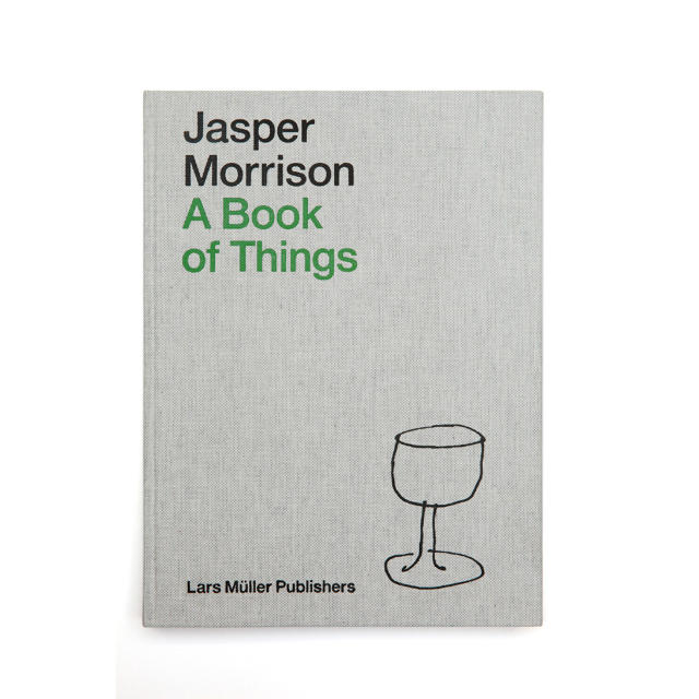
Morrison titled the exhibition "Thingness," which he says is "the quality that makes a thing good at what it does." (He also has an accompanying monograph out from Lars Müller called A Book of Things.) To produce the installation, he revisited his archive of documents, prototypes, and sketches. "I enjoyed appreciating the consistency of my work over all those years and seeing that even the early work had something, though I was just beginning," he says of the process. We emailed him a few questions to learn more.
Kento Mori
Co.Design: How has your perspective and sensibility changed over the past 35 years? Jasper Morrison: Not much, it's a little less poetic and a bit more realistic these days.
What is the first thing you ever designed?
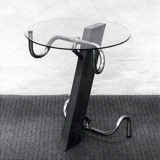
The Handlebar table in 1983.
What is your daily work routine like?
It varies a lot as I am often traveling, and I have offices in London, Paris, and Tokyo. The closest I have to a routine is in Tokyo, where I spend the most time. I prefer to have the morning to be out and about and do any small things I need to do, like go to the post office or to the bank or to buy a book. I start work after lunch and work to 7 p.m.
What is your biggest challenge as a designer?
Maintaining a healthy interest in the subject.
What's your most prized possession?
One of them is a Le Corbusier wooden box I bought several years ago from the Paris furniture dealer Philippe Jousse. They were made for the Maison du Brésil, a kind of cultural center by Le Corbusier for his Cité Universitaire in Paris.
What is the worst job you've ever taken, and what did it teach you?
Lighting the very difficult fire in an antique shop in London as a teenager. The fireplace was difficult and the owner of the shop was a bad-tempered monstress. It taught me to find out how to get things right as quickly as possible!
If you weren't a designer, what would you be?
I might be still working in the antique shop.
A Book of Things by Jasper MorrisonLars Müller Publishers
/Photot: Jasper Morrison Studio
What is the biggest challenge facing the world that design can help solve?
The lack of common sense in dealing with its problems.
How is our increasing acceptance and use of technology changing how industrial designers approach product design?
It's been about 15 years since I gave away my drawing board (which I regret) and we do things in 3-D on computers these days. We are considerably more efficient and precise, and we are able to have much more control over the finished article, which, thanks to the on-screen editing process, is a much more refined result than it used to be. We also work much faster than before. It requires an effort to keep a grip on reality but otherwise it's a huge advance.
Designing chairs and tables isn't exactly rocket science, but Jessica Banks has the creds to make you think that's the case. After earning a master's degree from MIT, where she was in the Humanoid Robotics Group within the computer science and artificial intelligence lab, and teaching in the university's civil and environmental engineering department, she left academia and founded the furniture company Rock Paper Robot.
Banks opened up shop in the Brooklyn Navy Yard and started developing pieces with technical twists. Her Float table, for example, is composed of wood cubes that seemingly hover in air. That bit of visual trickery comes courtesy of tensile cables and what the company describes as "classical physics applied to modern design."
"Furniture was an unchanging genre of artifacts," Banks says of her motivation to add a mechanistic element to tables and chairs. At the most recent International Contemporary Furniture Fair, New York City's annual design show, she introduced two new pieces: the Ollie table and chair.
Far from wanting to design for novelty's sake, Banks set out to solve a common problem when it comes to static objects: versatility. "I was trying to design a surface that someone can use anyway they want or at any length," she says. The Ollie table mounts vertically against a wall, rolls out when it's needed, and discreetly folds back when it's not. When closed, it sticks out less than four inches so it meets ADA requirements for commercial spaces. The frame is made from sturdy and lightweight aluminum and the top can be customized.
The furniture makes the most sense in space-starved apartments is the most obvious, but Banks sees more applications. "Even if you don't have a small place, you might want a humongous banquet table one day or a shorter one the next and for your furniture to accommodate all those situations," she says.
Banks initially envisioned residential consumers as her base, but then thought on a larger scale. "With transformable furniture, we can influence how spaces are being used," she says. "Clasrooms, retail spaces, pop-ups. I think it's possible that it could even help with revenue streams. If you're a food and beverage space, there are certain times you need to accommodate more flow, or times where you need to accommodate more people. You can modulate your environment and optimize those patterns."
Seating came after the table. "I didn't set out to do a chair," she says. "There are a lot of folding chairs in the world and because of that very fact I was reluctant. However, if you have a table that folds flat against the wall, someone will ask about the chairs. Then I thought we needed some chairs that will disappear as well." The Ollie chairs can support 300 pounds and pop open thanks to a proprietary mechanism with internal spring hinges. A string connects key points and when it's pulled, the chair folds flat. It's about an inch think, depending on the surface material you choose, so it'll stow nicely under a bed, sofa, or in a closet.
Seeing the furniture quickly pop into place is a sight to behold and surefire crowd pleaser, which adds a welcome element of levity to an industry that tends to take itself too seriously.
"If I can make someone excited or smile, it's like I can give them a moment of being a child," Banks says. "It's great marketing because when you have a visceral effect, you make more of an indelible impact. If everyone could feel that rejuvenating moment more ofter, they would be a lot nicer."
The collection is expected to go on sale in October 2015 and pricing is available on request.
For her latest collection, the French design doyenne Matali Crasset took a hyperlocal approach with a social message. If you must get your retail fix, why not feel good about who benefits from the sale?
Along with craftspeople from the Meuse area of northeastern France, Crasset designed a tableware set that helps support the Vent des Forêts art center along with regional woodworking traditions. In lending her eye for contemporary product design, she's introduced a new market for the craftspeople's skills.
Crasset has worked with the art center before to create a series of vacation cabins. Visitors can stay and feel immersed in the forest and get an appreciation for the natural world. The plates and bowls mirror the sentiment.
The pieces are made from sycamore wood harvested from forests in the area. And while they're sturdy, they're not dishwasher safe. Find them on Crowdy House, an online marketplace and platform for designers and makers to launch products, for $44 each or $124 for a three-piece set.
Before there was Candy Crush, Bejeweled, and Angry Birds, Solitaire was the game of choice for most non-gamers. In fact, Microsoft has included the program with every Windows operating system since 1990. Designer Susan Kare—who masterminded Apple's original icons—created the graphics used in the first iterations of the cards and now she's lent her expertise to a tangible product from Areaware that's based on the original digital iteration.
"It's really fun to see the leap—familiar onscreen images taking on a 'life' of their own," Kare says. "Solitaire is my favorite phone game, and my affection for it probably dates from childhood, when my mother taught me how to play with cards. I often play on long flights but have to delete it afterwards to avoid temptation."
For the original 1990s on-screen deck, Kare used an IBM PC. "I remember using a Microsoft Paint program with 16 VGA colors and saving the .bmp files on a 5.25-inch floppy disk, which I still have," Kare says. "This project obviously wasn't designing a physical deck from scratch, but rather imagining how to feature familiar images in a new way with a nod to their heritage."
Since Solitaire doesn't use Jokers, Kare never designed them for the computer game. Now, 25 years after the game launched, Kare has finally completed a full deck. She worked with Photoshop to create a pixel image for the matching Jokers, then converted the pixel image to a vector file in Illustrator. The process was "a bit easier with all the new features than with paint programs c. 1990," Kare says.
"I enjoyed collaborating with Lisa Smith and Blair Prietz at Areaware on the project," Kare says. "Together we explored a lot of subtle differences in card materials and packaging to find something a little different—and just right—to incorporate the classic images in a new and physical way."
The cards are available for $14 from areaware.com.
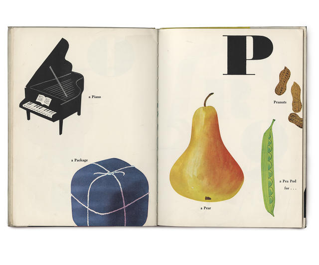
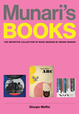
With some books, reading on a screen is virtually the same as on paper. Swipe or turn a page and you'll see words organized into sentences organized into paragraphs organized into chapters. Not so with the work of Bruno Munari (1907–1998), an artist, graphic designer, inventor, futurist, and all around maestro of visual language.
"Munari did not just work on books; he was interested in and tried out the full range of artistic possibilities (painting, sculpture, design, graphics, teaching, poetry, writing, photography, film, entertainment), but throughout his career, books were his personal diary in which he noted down his experiences, an authentic register of events," art historian Giorgio Maffei writes in the introduction to Munari's Books: The Definitive Collection of Book Designs by Bruno Munari (Princeton Architectural Press, 2015)
Guardiamoci negli occhiTurin: Angelo Candiano, 1979
Munari's books were not only objects to behold, but to experience through different materials, types of binding, experimental typography, illustrations, and colors, to name a few of the techniques and tricks he employed. Maffei's monograph shares the vibrant, unconventional books Munari designed starting in 1929 until a posthumous publication from 1999.
Supplemento al dizionario italiano
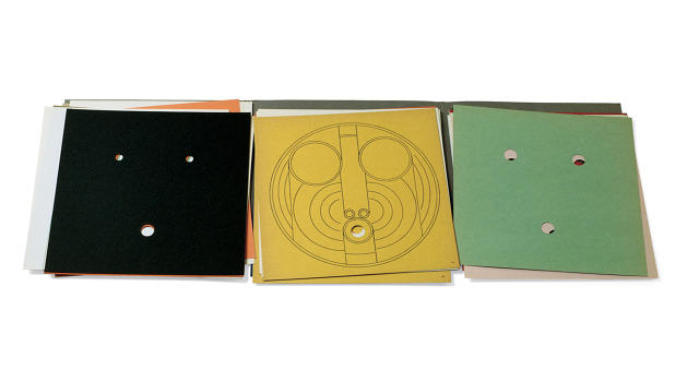
His Libro Illeggibile series, for example, was an exercise in trying out "all visual communication options and printing techniques that didn't involve words," Munari described. Some of the books were bound with staples or thread and featured pages solely of prismatic paper or of tracing paper festooned with geometric lines.
Abecedario de MunariRome: Emanuele Prandi, 1942
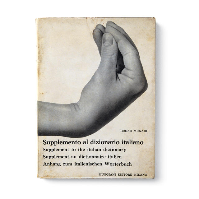
In addition to exploring books as art objects, Munari used them to communicate cultural ideas. In Supplemento al Dizionario Italiano (1958), he gathers photographs of common Italian hand gestures and unpacks what they mean.
Munari's children's books remain among the most popular and are still in print today. In Bruno Munari's ABC (1960), one of his alphabet books, he offers a mix of objects, leaving it open for kids to build stories around them. Munari said in 1981: "These messages are not supposed to be finished literary stories like tales because that would have a repetitive and uncreative influence on the child...Before it's too late, individuals must be taught to think, imagine, dream and be creative."
"Studying Munari's work opens the mind and addresses the history of design without any dogmatic prejudice," Maffei said in an email interview. "Munari still teaches us that there is no distinction between art and craft, and that there is no hierarchy of importance in his work."
Maffei's survey of Munari's books and storytelling genius is easy to get lost in. Seeing the wealth of creativity present in printed matter might also make you ditch your e-reader and beeline straight to the bookstore.
The Mumbai-based architect Charles Correa has passed away according to a BBC report. He was 84.
Born in Mumbai in 1930, Correa was a champion of a vernacular, regional brand of architecture whose structures entered into a dialog with the surrounding city, culture, and environment. "The work of Charles Correa Associates seeks new and eloquent ways to express the cultures in which we live,"states his firm's website.
Correa earned his Masters of Architecture degree from MIT, and over the course of his career, designed museums, hotels, public buildings, commercial spaces, single- and multi-family residential projects, and monuments. While his work can be found in countries around the globe—his most recent projects include the Ismaili Center, in Toronto, and the Brain Science Center on the MIT campus—Correa is known for leaving an indelible mark in India, designing the Gandhi Memorial in Gujarat, the Kala Academy in Goa, and the Bharat Bhavan art center in Bhopal, among many others.
Over the course of his career, Correa received numerous awards including a RIBA Gold Medal and the Aga Khan Award for Architecture. He also authored numerous essays, many of which were ahead of their time.
In one particular text, Correa wrote that "a good architect does not have to be fazed by working under severe economic constrains, however drastic they might be,"he wrote in the mid 1980s. "Having perforce to use only the humblest materials, such as mud or sun-dried adobe bricks, need not prevent him from creating a joyous and triumphal piece of architecture."
Today the Museum of Modern Art announced that it brought the Rainbow Flag, a key emblem of gay rights, into its collection. "We're proud the MoMA collection now includes this powerful design milestone, and there's no more perfect time to share this news than during global celebrations for Gay Pride Month,"curator Paola Antonelli writes on MoMA's blog.
Gilbert BakerPhoto: FREDRIK PERSSON/AFP/Getty Images
The announcement includes a detailed Q&A with the flag's creator, artist Gilbert Baker, for the MoMA archives. "I was a big drag queen in 1970s San Francisco," Baker told MoMA. "I knew how to sew. I was in the right place at the right time to make the thing that we needed. It was necessary to have the Rainbow Flag because up until that we had the pink triangle from the Nazis—it was the symbol that they would use [to denote gay people]. It came from such a horrible place of murder and holocaust and Hitler. We needed something beautiful, something from us."
Baker made the first flag in 1978 when he was 27 years old. It wasn't a solo project, and he worked with a team of 30 friends and volunteers to make the first flags. "We took over the top-floor attic gallery and we had huge trashcans full of water and mixed natural dye with salt and used thousands of yards of cotton—I was just a mess [from the dye], but [it was] beautiful fabric, organically made," he says. "I wanted to make it at the center, with my friends—it needed to have a real connection to nature and community."
Apart from being an effective mood setter, candles are pretty superfluous in the modern era. As objects to behold, though, candlesticks present an opportunity for designers to flex their creative muscle.
Curse the Darkness—a riff on an Eleanor Roosevelt quote saying that "it is better to light a candle than to curse the darkness"—featured dozens of impressive designs. Some participants in the group show opted to go the practical route by incorporating storage for matches within the designs, others got experimental with materials, and some made things that were just downright gorgeous. The pieces are all one-offs, unfortunately, and not for sale.
"All of the products I'm putting out are things that weren't out there before and I think are necessary," Adjaye says. "Ultimately I want the freedom to have the widest choice to express my design ideas."
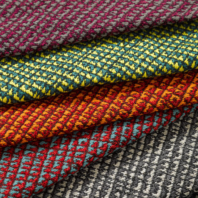
The collaboration began about two years ago when the Cooper-Hewitt Smithsonian Design Museum invited Adjaye to curate an exhibition based on its collections ("David Adjaye Selects" is on view from June 19 to February 14, 2016). The show features traditional textiles from Central and West Africa, which got the museum thinking about creating a product based on the installation. At the commercial interior design show NeoCon, which ended yesterday, KnollTextiles and Adjaye launched the resulting collection.
Co.Design: You've recently released a few furniture pieces. Tell us about translating your perspective into products. David Adjaye: Over the last five years I've turned my attention to more human-scale objects. It's been fascinating. It's something I wanted to do but wasn't sure if I could. Knoll were really great in allowing me to enter this field.
My architectural projects are about unfolding different modernities and trying to understand how we live in the world now. Furniture is part of that language for me. Trying to make furniture that will fit within that narrative feels like the right extension. Between making very large projects—which are taking a long time, like seven to eight years—working with furniture seems like the appropriate thing to test new ideas. I can work at a different speed.
What are the biggest shifts in how we live today, and how does your furniture respond?
It has to do with the blurring relationship between formal and informal life. We blur a lot more now. Sometimes we want things to be formal but we want them to be aesthetically casual, which is a complete contradiction. It's blurring our public and private lives. We want workspaces that are also like play spaces or leisure spaces. We don't want them just to be formal, functional workspaces. These things are all contributing to a very different paradigm about how we want the things around us to perform.
The beauty of design is it's always evolving and shifting.
Tell us about the KnollTextiles collection you just launched at NeoCon. What was the most exciting part of the collaboration?
Some talk about fabric and textiles as being the foundation of architecture and urbanism. Philosophically, the idea of the city was about bringing people together very closely and that relates to weaving. Fabric brings material close together and makes a bind. There's a lot of philosophical meditation on that and the notion of cities.
I have a philosophical relationship to it and I am very interested in craft and the craft traditions impaired over time through textiles and weaving. I wanted to look at different material effects and see if I could make a range that had different possibilities across it, from abstraction to figuration—very figural pieces to very abstract, very notational pieces.
First you see the product, wonder about what you think you're seeing, come closer, see something else. The fabrics change scale and perception depending on your relationship to it spatially.
Was there a specific weaving technique that inspired the collection?
It's everything from basket weaving to reed weaving to the weavers of Nigeria. It's not something in particular; it's the idea of how textiles are brought to market and to people.
I also really wanted to capture the the presence of the human hand, which is important in weaving. "Misssteps," like pulling of string, gives things a look that's a bit more antique to create organic relationships pursued through 21st-century digital technology.
I found real joy in this idea going back to the 1950s and 19th century of weaving that acknowledges mistakes and aestheticizes them as a kind of virtue rather than a problem that needs to be eradicated. I wanted to bring that back into textiles. Yes, we embrace technology and modern processes, but we don't lose the quality that makes it human and really beautiful.
[Editor's note: The human element, for example, is represented in the Harare wallcovering in the slide show above. It has the appearance of hi-low random slubs, which occurs in weaving. The digitally printed Kusami design mimics the look of hand-painted fabric.]
Like the fabrics, the Prism collection for Knoll—which includes a lounge chair, table, and stool/ottoman—also won a NeoCon award this year. Can you tell us about developing the pieces?
Prism was launched conceptually at the same time as the Washington Skin and Bone chairs but it took a while to perfect. It plays into this idea of the geometry—the diagonal and the diamond—whereas the Washington Skin and Bone was about supporting the body effortlessly in a sitting position.
Prism is really about creating podiums for the body. It frames you and it's incredibly comfortable. When they're empty, they look sculptural and powerful in the space. They don't look like ubiquitous furniture; they contribute character to the environment.
When you're thinking about covering your furniture, do you think about it the same way as if you were applying skin to a building?
Putting fabrics on furniture is different than putting skin on a building. To me they have to play a tonal and textural sort game with the environment I'm trying to create.
When I'm thinking of furniture and textiles, I'm thinking about the notion of atmosphere as emotional spaces for human beings. Buildings are, in a way, abstractions of how you organize building elements whereas a fabric is about atmospheres and human emotion. That's really the critical thing.
Speaking of projects that take many more years than developing a fabric or furniture collection, how are things progressing with the National Museum of African-American Culture?
It's so exciting that after seven years it's finally being finished. The exterior skin is entirely on it. If you go past the Mall right now, you'll see it shimmering in the light. It's very exciting for me to see. There's a lot of work going on in the interior right now. We're finishing the interiors and public spaces for an opening predicted to be in May 2016. The building will be complete by the end of the year. I'm very honored to work on this project. It's been an extraordinary journey.
Your name has been in the conversation about Obama's presidential library. Is that something your firm is undertaking?
There's been no discussion on architects for that project. We'd all love to be part of it but there's nothing. They've just decided on which city [Chicago] and we hope that somebody will get a call for this amazing project.
How are your projects in Africa coming along?
We're working on several master plans. We just finished a design hub in Lagos, Nigeria, called Alara. That had a soft opening but is fully launching in September. We're working on commercial projects in South Africa and cultural projects in Ghana, Gabon, and Rwanda. We're also working on a large project for the World Bank headquarters in Dakar, Senegal. We're thrilled to be part of the reimagining of the architectural world on the continent.
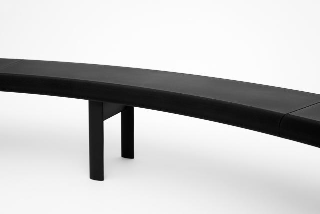
"Innovation is a dangerous term," says the Los Angeles–based designer Jonathan Olivares. "It's often mistaken for what's new. Charles Eames said, 'Innovate as a last resort.' I hope what we're doing here isn't in the innovation category as much as adaptation or appropriation."
At Volume Gallery, in Chicago, Olivares launched a new bench he designed with Zahner, an architectural fabrication company that specializes in mind-bendingly complex, digitally designed metal components, like the torqued facade of the Cooper Union, in New York City, by Morphosis and the perforated screen enveloping the de Young Museum, in San Francisco, by Herzog and de Meuron. After reading an article Olivares wrote about the untapped potential of applying architectural manufacturing to the furniture industry, Zahner invited the designer to visit its Kansas City, Missouri, factory and have an open-ended meeting about what they could do. "We took [technical] knowledge that Zahner had developed for the last decade to new applications," Olivares says. "It's important to cross-pollinate."
A year and a half later, enter the Aluminum Bench.
"The bench comes out of a point of view that says the web enables designers, architects, and people to adapt things to their own needs," Olivares says. Using ShopFloor, a web-based software platform Zahner developed, people can design their own version of the bench in 3-D and price it out, in real time. The tool solves a couple problems present in the contract furniture market: flexibility, price transparency, ease of use, and accessibility. Professional designers can use the tool to create seating that meets the exact specifications of a project and all safety and durability requirements—for example finding a bench for an oddly shaped space—and non-professionals can have the exact same access.
The online design tools are based on arcs and lines. Olivares set minimum parameters for the bench's height, width, and curve radius, and lets the user configure the rest. "Designers work on systems and there's a lot of legwork that does into customizing those systems," he says. "We've developed a system that customizes itself. The designer becomes about conceiving and editing parameters."
To show the myriad possibilities, Olivares worked with a typographer to create an "alphabet" of shapes to show just how creative you can get with the software.
"I'm the designer of the bench but I don't want to be the designer of the bench's shape," he says. "With the program, you could be the designer."
The finished design is powder-coated and made from cast-aluminum legs with an aluminum honeycomb seat. The profiled edge is made from an extrusion Zahner developed for building facades. Everything is manufactured in the United States. "I do like to think about the bench in terms of creating social spaces," he says, when we asked how the bench might be used in, say, an office. "One chair allows people to sit down, two chairs allows a conversation. There's a real social dimension to the bench. Anytime I look at a bench, or a semi circular bench, you have people looking at each other or sometimes not at each other. People create their own social spaces."
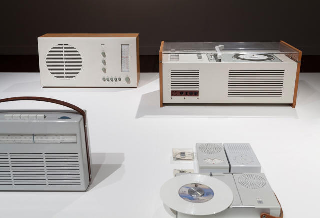
The Paris gallery Espace 24b recently concluded the first retrospective in France of the venerated German designer Dieter Rams. Called Less but Better—taken from one of Rams's 10 principles of good design—the exhibition corralled about 70 works from Rams's career, treating visitors to a smorgasbord of hand-held electronics, audio systems, furniture, and modular storage. Curated by Yves Couchaux, Grégory Mesrié, and Ivan Mietton, the show detailed the pioneering spirit of Dieter Rams and offers tangible examples of the manifesto he created in the 1970s to outline his philosophy.
"For sure the 10 principles are still true today and will be for a long time," Mesrié says. "It is not easy to make something as good as [what] Mr. Dieter Rams [made], even if abiding by his 10 principles."
In an interview with documentary filmmaker Gary Hustwit republished on Co.Design, Rams had the following to say about his 10 Principles of Good Design. "I'm actually very surprised that people today, especially students, still accept them," he says. "I didn't intend these 10 points to be set in stone forever. They were actually meant to mutate with time and to change. But apparently things have not changed greatly in the past 50 years. So even nowadays, they are still accepted."
More so than accepted, the ideas are veritable scripture for today's designers, who can still learn from Rams's work, even the lesser-known, obscure items he either designed himself or oversaw as the chief design officer at Braun. Here's how.
S60 Razor
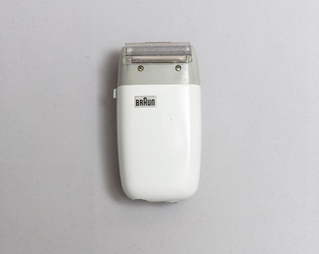
Rams's first principle is that "good design is innovative.""Technological development is always offering new opportunities for innovative design," he wrote. Braun, where he was the chief design officer from 1961 to 1995, designed many electric razors and continually refined the product over time.
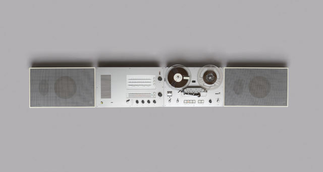
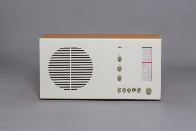
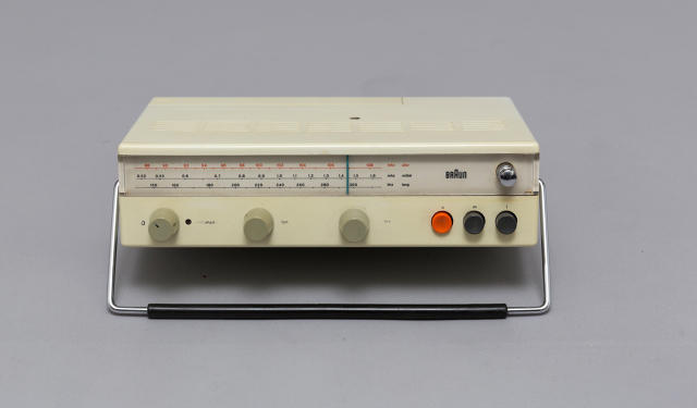
TS 45, TG 60, L 450 Hi-Fi System
The second dictum is that "good design makes a product useful." In the case of the hi-fi system, each of the components serves a purpose. It also mounts to the wall to free up floor space and can be configured however the user wants. "Good design emphasizes the usefulness of a product whilst disregarding anything that could possibly detract from it," Rams wrote. At the time, hi-fi systems often mimicked the look of furniture. There's no mistaking what the Braun system is for.
RT 20 Tabletop Radio "Only well-executed objects can be beautiful," writes Rams about his third principle, "good design is aesthetic." Take for example the RT tabletop radio. It has a restrained presence, simple controls, and wood housing.
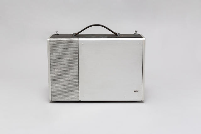
T 1000 Short-Wave Receiver
With a front that opens when the receiver needs to be used and closes when it doesn't, Rams demonstrates his fourth principle: "good design is unobtrusive." Rams explains, "Products fulfilling a purpose are like tools. They are neither decorative objects nor works of art. Their design should therefore be both neutral and restrained, to leave room for the user's self-expression."
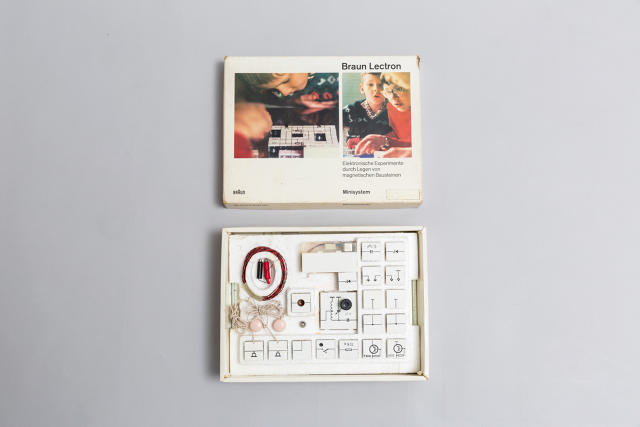
Lectron Kit "Good design makes a product understandable" is Rams's next principle. "At best, it is self-explanatory," he says. The Lectron from Braun teaches kids about how circuits and electricity work.
Urushi Collection
We turn to one of Rams's most recent designs to illustrate his principle that "good design is honest." He goes on to explain, "it does not make a product more innovative, powerful, or valuable than it really is." For the Urushi collection from 2012, Rams worked with a Japanese manufacturer to design lacquerware. It doesn't purport to be anything other than a stunning object. "For me it's the perfect evidence that the 10 principles are still working 50 years after they were written," Mietton says. "They can be adapted to producing a luxury object, a field opposite of industrial design."
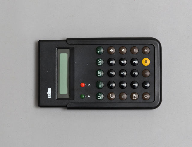
ET 66 Calculator "Good design is long-lasting" is the next principle. "Unlike fashionable design, it lasts many years—even in today's throwaway society," Rams wrote. Braun debuted the ET 66 in the late 1980s and reissued it in 2013—proof that good design transcends decades.
T 52 Portable Radio "Good design is thorough down to the last detail," wrote Rams of his seventh principle. This radio's carrying handle doubles as a stand—clever!
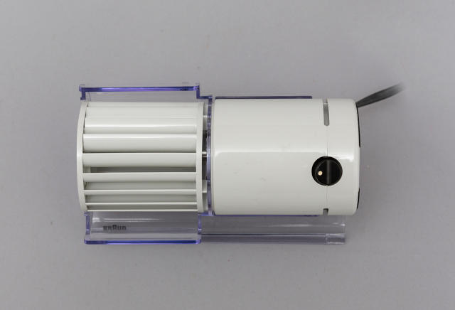
HL Desk Fan
While this might be a stretch, a fan uses less energy than an air conditioner. Considering that temperature control in large spaces, like an office, is far from efficient and therefore isn't optimizing energy use. "Good design is environmentally friendly," Rams writes. "It conserves resources and minimizes physical and visual pollution throughout the lifecycle of the product." Ditch the A/C and get one of these instead.
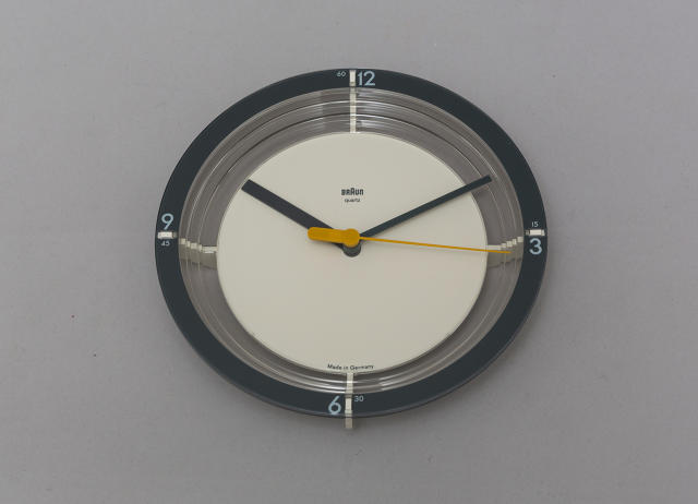
ABW 21 Wall Clock
The exhibition's namesake is the 10th principle: "good design is as little design as possible." This could be said of all of Rams's work as a designer and creative director. "Less, but better—because it concentrates on the essential aspects, and the products are not burdened with non-essentials," he wrote. For example the ABW 21 wall clock by Dietrich Lubs features a restrained face to help it blend into its surroundings. All you need on a clock is to see the hour and minute hand and those elements come to the fore in this design.