In the 1970s, good design became federal policy.
The federal government doesn't stray too far from a few familiar topics when it comes to its agenda: the economy, health care, national defense, immigration, reproductive rights. But for roughly a decade not long ago, good graphic design was a national priority—and the story of how it became one is a forgotten chapter of design history.
In the 1970s, federal agencies and departments like the National Park Service, the Environmental Protection Agency, the United States Postal Service, the Department of Transportation, and NASA overhauled their visual identities and communication systems. Suddenly, famous designers like Lella and Massimo Vignelli, corporate identity pioneers Ivan Chermayeff and Tom Geismar, wayfinding guru Lance Wyman, and Raymond Lowey all had an expanded influence at the national level. And they welcomed the challenge.

"Our country was somewhat immature, compared to older more established societies where design was entrenched," Richard Danne, one of the graphic designers behind NASA's famous "worm" logo, along with Bruce Blackburn, says. "We felt this was 'important work' and were willing to invest excessive hours and energy to improve the nation's public face, enhance the agencies' esprit de corp, and support and improve federal efficiency."
This era of design has been lionized over the past few years; one Kickstarter campaign to reprint the NASA standards manual earned nearly $1 million, sparking a resurgence in vintage standards manuals from the period. Yet while the logos and identities are beloved, there's an untold story in the architect behind it all—Richard Nixon—and how those decades-old ideas still influence the government today.

For Nixon, Art Was Good Politics
The unexpected "hero" in this story is none other than Richard Nixon. Federal design fell under the purview of the National Endowment of the Arts, and its evolution is closely tied to the growth of the fledgling agency.
In 1969, the first year of Nixon's presidency, Leonard Garment—a liberal advisor to Nixon and lifelong arts advocate—wrote a memo outlining why he thought "support for the arts is increasingly good politics." By making a meaningful increase in funding from around $15 million to $40 million, Nixon could assuage negative opinions from some of his critics, Garment argued:
In our country, cultural affairs represent an area of under-attention as compared to our technology. By providing dramatically increased support for cultural activities, you may gain increased respect from groups which have hitherto not been favorable to this administration. For an amount of money minuscule in total budget terms, you can demonstrate your commitment to "reordering national priorities" and to emphasizing the quality of life in our society.
During his administration, Nixon doubled funding to the NEA. Garment was correct about the return on investment: The 1971 federal budget was $897 billion dollars, making the $40 million NEA budget just 0.04% of spending (today the NEA and NEH comprise 0.02% of spending), but the money made quite an impact. The robustly funded NEA connected government agencies to designers and architects, which brought about projects that enriched cities across the country and internal design changes that made government operations more efficient.
Another pivotal Nixon move was appointing Nancy Hanks as chairman of the NEA. She was a powerful and persuasive arts advocate and was instrumental in expanding the NEA's scale and scope. She turned the agency into a vehicle for redesigning government itself.
In a 1971 memo to the heads of federal departments and agencies, Nixon wrote: "It is my urgent desire that the growing partnership between government and the arts continue to be developed to the benefit of both, and more particularly to the benefit of the people of America . . . I believe that we all can find that the arts have a great deal more to contribute to what we in government are seeking to accomplish—and that this will be good for the arts and good for the country."
Hanks, who served from 1969 to 1977, ran with the mandate from Nixon and established the Federal Design Improvement Program in 1972. Most of the agencies told Hanks they wanted better graphics and better offices, so she divided the program into two parts: the Federal Graphics Improvement Program (active from 1972 to 1981) and the Federal Architecture Project (active until 1977). These two game-changing initiatives introduced design en masse to the government.
While both good graphics and architecture were emphasized in the '70s, the focus on visual communication petered out after several years while architecture remained on the presidential agenda under Reagan. But for a few years, under Hanks's watch, the government's approach to graphic design underwent a revolution.
Government Gets A Crash Course On Design
Forty-five agencies received new identities under Hanks's Federal Graphics Improvement Program. They included now-ubiquitous symbols of government and infrastructure, like the NASA visual identity by Danne & Blackburn, the Department of Transportation symbols by the AIGA, the U.S. Postal Service logo, and the standardization of federal highway signs.
"[Graphic design] was the lowest hanging fruit," Jason Schupbach, director of design and creative placemaking programs at the NEA, tells Co.Design. "We published several books on the basics of graphic design for agencies. The NEA's role was about saying, 'we understand the field, who's important, and we understand how to find people and how to procure.' That's the key thing. Most agencies did not know how to procure a designer."
To publicize what design could do for agencies, the NEA hosted four conferences it called "Design Assemblies." Over 1,000 designers and bureaucrats participated in the first assembly, in 1973. The same year, Chermayeff edited Design Necessity, a compendium about federally initiated visual communications, landscape architecture, industrial design, interior design, and architecture projects, intended to underscore how design could improve government.
The book highlighted projects like the National Park "Minifolders," which reduced the size of brochures and clarified their formatting; the Internal Revenue Service's graphics program, which helped recruit new employees and clarify the taxpaying process through redesigned forms and instructional booklets; and the United States Postal Service's graphics standards manual (and its Raymond Lowey-designed eagle emblem).
The tome also demonstrated 10 key points about the role of design in government, most notably that design could save agencies time and money, and improve their efficacy and performance. "Design is an urgent requirement, not a cosmetic addition," the list states, and "the absence of design is a hazardous kind of design. Not to design is to suffer the costly consequences of design by default."
While designers had a powerful champion in Washington in Nancy Hanks, and bureaucrats had orders from the president to take design seriously, those who responded to this call had their work cut out for them. Getting any project off the ground was a fragmented process that wholly depended on individual agencies—not to mention convincing officials about new ideas and unconventional solutions.

Bringing Order To A Messy System
The government's design problems often had to do with scale—how to make large operations, frequently spread across many offices and states, more efficient; how to communicate information to millions of people; and how to use visuals to clearly underscore its mission.
"The United States was considerably behind in terms of design's role in federal programming and how they dealt with visual language," Jesse Reed, one of the designers behind the reissued NASA standards manual Kickstarter, says. "It's not that these programs needed to be expressive or flourished, but they lacked visual authority, consistency, and all of the other traits you would expect from an organized body of federal activities."
It turned out the government's problems weren't all that different from non-governmental clients.
"What we've found over the years is that whether they're corporate or nonprofit, or governmental, they're not terribly different," Tom Geismar says. His firm, now named Chermayeff & Geismar & Haviv, is celebrating its 60th anniversary this year. "They're large organizations and a lot of the issues are very similar, especially where they have many parts and divisions and if they've changed course and new goals."
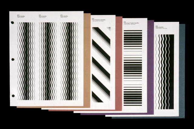
When the Environmental Protection Agency began working with Chermayeff & Geismar in 1977, it was eager to trim fat from its publications budget. The agency was spending millions on brochures, some of which were unnecessarily elaborate and were all designed from scratch. Additionally, the EPA only used a symbol for its logo—but the graphic designers added a wordmark, since the agency's initials were widely recognized and used.
"They really wanted a system and levels of fanciness for their materials that were appropriate for what the issues were about," Geismar says. "We not only refined the logo, but set up a whole system on how to do the brochures and make it much more of an automatic thing and not at the discretion of everyone out in the field. It actually ended up saving them—I forget how many millions a year—in funding."
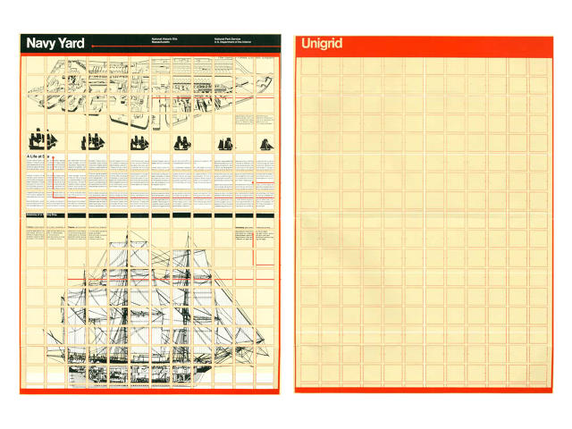
The National Park Service was facing a similar challenge in 1977, when it hired Vignelli Associates to streamline its printed brochures, pamphlets, maps, and posters, and develop a consistent approach to visual communications. Vignelli developed a device that would eventually be called the Unigrid System. It introduced modularity to the NPS's materials, so that every designer across the agency would know where to place copy and images. It's still in use today.

One of the most influential systems to emerge from the era was the Department of Transportation's Symbol Signs from 1974, which standardized pictograms for objects like elevators, stairs, mail, and telephones. "That happened because of someone at the Department of Transportation became frightened when there was a movement to adopt an international system he recognized as being terrible," Geismar says. "So he talked to the AIGA and Industrial Designers Society." Geismar chaired a committee fellow designers Seymour Chwast, Massimo Vignelli, John Lees, and Rudolph de Harak to figure out how to approach the system, which was eventually designed by Roger Cook and Don Shanosky. It, too, is still in use today.
For the most part, the experiences were positive—but there were tensions, as well.
An Uphill Battle
While the designers behind this nationwide movement were able to introduce visual consistency, clarify communication, and save money, the process was often fraught with challenges: agencies that weren't interested in redesigns, officials who weren't engaged, and bureaucrats who questioned the solutions.
"It boils down to individuals—for both good and bad [experiences]," Geismar says. He recalls one advocate in particular, Jack Masey, who worked closely with Geismar & Chermayeff on an 1960s exhibition for the United States Information Agency, and then on the visual identity for the American Revolution Bicentennial. He only learned later that Masey had protected them from some of the politics. "We learned later that there were huge issues [about the exhibition] brought up by congressmen asking, 'Why did you do this?' or 'How could you put this in?' We never heard about it during the process. You need a good insulator, especially in a governmental project when politics start becoming predominant and it starts to be very difficult to make it work."

Even designers of some of the most celebrated identities to emerge from the era had their difficulties negotiating bureaucracy. The NEA referred to the NASA program Danne and Blackburn designed as "the flagship of the Federal Graphics Improvement Program." It was one of the first redesigns to be initiated by the FGIP, and therefore the most important. "The NEA saw this agency as the key to a fast win," Danne says. "NASA was sexy, and if we could score there, other federal programs would follow."
However, since the organization was really 11 discrete, autonomous centers, they resented a doctrine coming from D.C. There was also tension about changing the logo. NASA's employees hated the redesign.
"At first this environment was stifling for us, but it improved considerably over time," Danne, who counts the project as the highlight of his 60-year career, says. "The content was so interesting and exciting, especially for me, that it kept us going. Compensation was very low, so you had to believe in what you were doing—that it was important and meaningful."
Danne, who, with Blackburn, also designed for the Federal Aviation Administration, the United States Army Corps of Engineers, and the Civil Service Administration, also recalls some agency heads as being disengaged in the process, ultimately leading to projects that were doomed to fail. However, some were more faithful to the programs they created. "The Corp of Engineers toed the line completely and honored both the scope and details of the program, but that's not too surprising as it's a quasi-military organization," he says.
Lance Wyman echoes a similar sentiment: The experience depended on the individual agency. "I've learned that good design depends on a good client, and when there's willingness to explore design," he says. "The federal government was a good client. They were anxious to understand the language of design, and we were eager to work with them."

Wyman's work for the government in the '70s included wayfinding systems for the National Zoo and the National Mall. However, he had his work cut out for him when it came to disproving a stereotype that icon-based wayfinding was "a system that was for illiterates," he says. While the National Zoo embraced this system of pictorial maps, the National Mall's new wayfinding was more complicated since it involved many more stakeholders, some of whom were skeptical. Icons are the lingua franca of design today, but in the '70s, they were still an emerging device. "People didn't take it so naturally back then, and you had to break your neck a little and you had to go around things like the 'illiterates' stereotype," he says.
Wyman has always been interested in designing for the public realm, so the challenge was worth it. "I've always tried to work that way in the streets, and it gets hard when the budgets aren't there," he says. "Corporate work has more security, but the satisfaction comes personally in the work that's on the street. The National Zoo and the National Mall were in pedestrian environments . . . When you're working with the city to become part of the urban image, that's where the government design work can be important—it creates a sense of place and a sense of pride."

The Golden Age's Multifaceted Legacy
The '70s birthed some of the most respected governmental identity systems, and a number of the design industry's greats helped to create them. But was this governmental graphic design's golden age?
"Yes, without a doubt," Danne says. "And a case can be made that the '60s through '90s were the 'golden age' for all graphic design. The profession has changed dramatically in the last several decades, but so much progress had already been made in that very productive period."
Geismar is skeptical of the designation. "Awareness of design and what design brought to them was certainly something new and something that sort of caught on and became reasonably widespread throughout the government," he says. "And all those people, like everyone else, had pride in what they and their organizations were doing. Whether it's designated a 'golden age,' I don't know." He thinks that some of the contemporary interest in the visual identities has more to do with nostalgia for the cultural relevance of the organizations, which could be true.
Designs from the era weren't universally loved at the time. NASA famously reverted back to the "meatball" logo that preceded Danne and Blackburn's "worm." In the '60s, Chermayeff and Geismar redesigned the Department of the Interiors' logo when the head was interested in changing the agency's name to the "Department of Conservation," but the seal—which looked like two hands embracing an abstract landscape—received a cold reception from the agency's employees, so it was short lived. As administrations change, graphics likely do too. And since graphics are more ephemeral than, say, architecture, they're easy to switch up.
"Frankly, I am more impressed by the WPA and National Recovery Agency for design consistency," critic Steven Heller told Co.Design over email.
To Jesse Reed, one of the takeaways was confidence in the work. "These agencies didn't perform user testing or see how well it did across various markets—they simply had a job to do," he says. "Designers like Danne & Blackburn solved for those utilities using thought and order, not trends or what works best on social media. Is all user testing bad? No—but pulling those resources on logos is wasteful. Stand behind the work you do, do it really well, and let design support the mission."
In looking back at his career and his work for the federal government, Geismar counts his work for the United States Information Agency as being more challenging. He and Chermayeff designed and curated an early '60s exhibition in Moscow on American graphic design. (This was during the Cold War-era cultural propaganda wars that gave rise to expositions about what life was like in the U.S. and sparked the infamous Great Kitchen Debate.)
"Through the graphic arts—which included everything from advertisements to record covers and book jackets—we showed life in America. What people were reading, what they listened to, the ads, the commercials, and packaging really gave a sense of the time to people who were really restricted in what they could see culturally since it was the height of the Cold War," Geismar says. "That was really interesting, as were the World's Fairs, because the questions were: What do you show? What is interesting? We were trying to emphasize creativity in America, in all aspects, whether it was going to the moon or photography."
When Wyman looks back at the federal design work he created throughout his career, he also holds his USIA projects in high regard. In 1966 he, along with George Nelson, designed the logo and graphics for the USIA's exhibition on industrial design. But he says the '70s "probably was" federal graphic design's golden age. "I'm not aware of anything that has come out so forcefully as [work from] the '70s," he says.

Could There Be Another Design Renaissance In Government?
Some of the identity systems developed in the '70s are still in use, and some were retooled—a natural consequence of changing political administrations and leadership. The real legacy of this era might not lie in the design itself, but rather in the processes design initiated, and the ambitions they represented.
"I've been delighted to find that young designers are fascinated and enthusiastic about design programs from the '70s, federal projects included," Danne says. He frequently gives speaking events around the country, and students and young designers in attendance share their appreciation for his work with him. "Much of what they do can be considered 'disposable' because it is for the web and thus is temporary. They create something for the internet, then it goes poof! I think they appreciate the depth and substance of the program as portrayed in these profound design documents. They seem to fully appreciate the integrity and commitment of both the agency client and design firm."
To Jason Schupbach of the NEA, it's all about demonstrating the importance of designers to the day-to-day work of an agency. "Really what emerged from that work—and the same as what happened with buildings—is eventually the agencies figured out they needed in-house designers," he says. "That has continued today. Most [agencies] have in-house graphic design teams."
Today, the effects of the NEA's role as a matchmaker of sorts between agencies and designers is still alive and well. When the Department of Housing and Urban Development was embarking on its Rebuild by Design competition—a two-billion-dollar resiliency initiative for the coastal communities of New York, New Jersey, and Connecticut—the NEA helped HUD write RFPs to design and architecture firms, worked its Rolodex to promote the competition, and assisted with organization. "There needs to be someone who can find design talent and handle paperwork to make sure [designers] show up," Schupbach says. "That alignment is an important role the NEA plays, and it came out of that moment [in the 1970s]."
Heller thinks the era's best lesson comes from having a strong design advocate in the executive branch. "Design has value," he says. "But it has to start from the top down. There should be a federal standard, a department or agency. Now it is too fragmented."
Meanwhile, Reed advocates a bottom-up approach for governmental graphic design. "I don't believe that graphic design is what solves inherent problems, but I do think that strong and consistent communication can go a long way, particularly in local government and smaller NGOs," he says. "The issue comes down to resources. These smaller organizations can't hire expensive New York City firms to design these programs for them—this is where our community needs to step in and start providing these services pro bono."
Right now, one of the biggest opportunities for graphic designers is the government's presence online. The Obama administration made this a priority and established the United States Digital Service to help fix the federal government's outdated and dysfunctional websites, but the work is slow going—and sorely needed. "To me, that's where the real energy is on good governmental graphic design," Schupbach says.
The current administration has been silent about what to do with the government's websites. If it chose to set a strong example, it could usher in another governmental design renaissance. A crappy website is a crappy website no matter what your political affiliation might be. By building upon the history of federally initiated graphic design in the '70s, any political leader could potentially spur another golden age of government design. There's absolutely no reason why "good design" should be confined to the history books.