Pantone Studio launches this week in the App Store and is targeted to digital designers and the color-obsessed.
From its humble roots as a printing company in suburban New Jersey to becoming the definitive language of color, Pantone has transformed into a global design force. But when your core consumers are print designers and the world is becoming increasingly digital, you look for new ways to sustain your grip on the industry. With the launch of Pantone Studio, a new iOS app, the company is offering a glimpse into its next ambition: becoming a software developer.
While Pantone has created apps before—like the MyPantone app launched in 2009—the company is hoping this new product will become an indispensable tool for designers who may never have to pick up one of its famous chip books or color forecasting trend guides.
"In our [market] research, we saw that designers are using mobile tools and they want their phone to be a platform for design and a hub for gathering inspiration," says Ron Potesky, senior vice president of Pantone. "If we're not mobile, we're not Pantone in 10 years. It's a must for us to be important and valuable to designers."

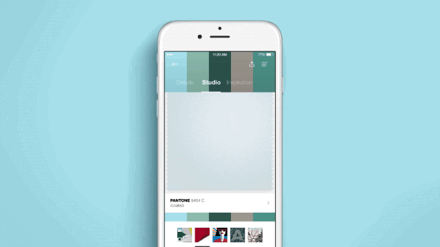
The Pantone Studio app aims to put everything the company is known for in your pocket. There are color guides with thousands of hues. A section of the app is dedicated to research, articles, and trend reports from experts at the Pantone Color Institute. But one of the most valuable features is the color picker, which is a more robust version of the MyPantone app's core offering: It essentially turns your phone into an eyedropper tool that dissects images and tells you their color composition.
Spot the perfect shade of pink in the wild? Snap a photo and use the app to tell you the RGB, CMYK, and Hex breakdown. If you link the app to Adobe creative Cloud—another one of the functionalities—you can send the precise information to your computer so you have it at the ready for a design project. If you're not certain exactly how to use the color, the app tells you different color harmonies to help you build a palette. Love the mixtures of hues in a certain image? The tool will make a palette based on the colors that appear in it.
Another feature, targeted to fashion designers and those who work with textiles, lets you look as a fabric swatch and move it around to see how the color and texture changes as if it were a 3D swatch.
"The app was building off of two fundamentals: inspiration and workspace," says John Noe, CEO of Rokkan, the design firm Pantone collaborated with on the app. "How does Pantone serve as a greater part of how designers find inspiration and how does Pantone bring work to life in a more fluid and seamless way given how designers think and make today."
Pantone Studio lets you save colors and palettes and share them with other users through the app or by linking it to your social media account. If you're hunting for your next stroke of inspiration, you can also browse color palettes other people use.
"It's moving from designing with color to designing because of color," Noe says.
Even those who aren't designers—like myself—will find something useful, or at least mildly addictive, in the app. When I was testing it, I quickly became obsessed with finding out the color values of everything in my apartment. Turns out my favorite shoes are Pantone 2126 CP, a deep blue hue. My favorite feature, however, was the app's Instagram integration that places color swatches over photos I've taken, which translates the mood of the image into colors.
"You start looking at the world around you differently," Noe says.
Pantone sees the app as a way to appeal to younger designers who might not be able to afford its expensive chip books or who may know the company for that offering, but who don't use it as a tool in their process. The price is structured as a subscription model that costs $8 per month (or $5 a month if you bill a year's subscription up front). It's steep if you're using it as a novelty and also considering that the color picker is only as accurate as the photograph you take; lighting and your phone's camera can turn blush pink into gray putty, as it did when I used the color picker with a shirt of mine. For precise color matching you'll still need a chip book, but replacing those guides is not the app's intention; it's a way to interpret the world around you through color as opposed to form. "We believe this is going to offer more value to the design audience and bring in a wider audience [to Pantone]," Potesky says.
Time will tell if this becomes a relevant tool, or just another app cluttering your phone.